Tips for mathematical handwriting
John Kerlkerl.john.r@gmail.com
Feb. 25, 2007
Now that you’re majoring in one of the technical disciplines (engineering, science, or math), you’re going to be spending a significant amount of time communicating in writing with others. You may find that previously unimportant details, such as crossing your z’s, now become essential — not only so that others can understand you, but also so that you can avoid mistaking your own 2z for z2 and so on. This is especially important if your handwriting (like mine!) is less than perfect.
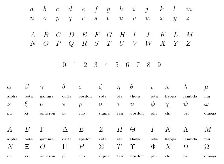
Before I continue, take a fresh look at our Roman alphabet, the digits, and the Greek alphabet:

Notice that these mechanically typeset symbols are all clear and distinct (except that lowercase omicron and most of the uppercase Greek letters look like Roman letters — we don’t use these “duplicates”).
When we write by hand, though, symbols can become ambiguous — we’re not machines, and things get a little loopy when we hurry. In prose, surrounding letters can disambiguate a questionable letter — e.g. you can guess that the fourth letter of hou*e has to be an s. But in mathematical expressions we mix symbols from different alphabets, in different orders, so context can’t assist us — and when we guess, we often guess wrong. So it now becomes very important that each letter be clearly recognizable on its own merits.
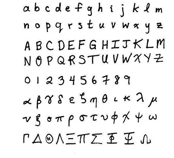
Here are samples, followed by the points I consider most important.

Lowercase Roman letters:
- Always make the lowercase l cursive — otherwise it looks like a 1. Make sure it’s taller than an e:
 ,
,  ,
,  . The lowercase l isn’t a good variable name to use (since it can look like a 1), but lots of people use it and so you’ll be seeing more of it.
 - Make a point come out of the top of the p, to distinguish it from a rho:
 ,
,  .
. - Put a loop on the q, to avoid confusion with 9:
 ,
,  .
. - Put a hook at the bottom of the t so it doesn’t look like a plus sign:
 ,
,  .
. - Put a tail on the u, so it doesn’t look like a v:
 ,
,  .
. - Keep the v and w pointy on the bottom so they don’t look like nu and omega, respectively:
 ,
,  ,
,  ,
,  .
. - Put a hook on the x to distinguish it from a times sign:
 ,
,  . In 3rd-semester calculus and onward you’ll be using the times sign quite often.
 - Cross your z’s. Else they look like 2’s:
 ,
,  .
.
Uppercase Roman letters:
- Put a significant bracket on the uppercase G — it can look like a C or a 6:
 ,
,  ,
,  .
. - Bar the uppercase I — else it looks like an l or a 1:
 ,
,  ,
,  .
. - Put a loop on the capital O so it doesn’t look like a zero:
 ,
,  .
. - Hook the X and cross the Z, just as for lowercase:
 ,
,  .
.
Digits:
- Don’t slash the 0. The Greek letter phi has a vertical slash; the empty-set symbol has a slanted slash:
 ,
,  ,
,  .
. - Put a loop on the 2 so it doesn’t look like a z:
 ,
,  .
. - Keep the top of the 4 open — if it closes up, it becomes a 9:
 ,
,  .
. - Make the top half of the 5 angular — else it looks like an S:
 ,
,  .
. - Cross the 7. Otherwise it can look like a hurried 1:
 ,
,  .
. - Don’t put a hook on the bottom of the 9 — otherwise it looks like a g:
 ,
,  .
.
Lowercase Greek letters:
- Many incoming freshmen aren’t accustomed to Greek letters, and substitute alphas with a’s, and so on. The fact is, though, you’re going to be seeing more and more Greek letters as you go on. Your mathematical world is growing — accept it, and learn to use this beautiful alphabet.
- Draw the alpha in one easy swoosh. Be careful it doesn’t look like a 2:
 ,
,  .
. - Put a long tail on the eta and mu to keep them from looking like n and cursive u, respectively:
 ,
,  ,
,  ,
,  .
. - Put a hook on the top of the lambda:
 .
. - The nu is a very bad letter — it looks like too many others! Unfortunately, lots of people use it. Include the hook on the left, and the point at the bottom, to keep it from looking like a u or v or upsilon:
 ,
,  ,
,  ,
,  .
. - We don’t use omicron — it’s identical to a Roman o.
- The upsilon is just as bad as the nu. Happily, not many people use it. Make sure it doesn’t look like a u, v, or nu:
 ,
,  ,
,  ,
,  .
. - Keep the slash in the phi vertical; keep the slash in the empty-set symbol slanted:
 ,
,  .
. - The lower-case chi is tricky, and unfortunately it gets used a lot. Make the upward slash far bigger than the downward slash to distinguish this letter from lowercase x and uppercase X:
 ,
,  ,
,  .
. - Keep the omega rounded to distinguish it from w. This one gets used a lot in physics courses.
 ,
,  .
.
Uppercase Greek letters:
- Most of these are indistinguishable from uppercase Roman letters. (E.g. a capital alpha is the same as a capital A.) So, we don’t use them.
- Make an uppercase H inside the uppercase theta. Nothing else distinguishes it from lowercase theta:
 ,
,  .
. - Bar the uppercase phi and psi, just as you would bar an uppercase I:
 ,
,  .
.
from Hacker News https://ift.tt/3aDe3nx
No comments:
Post a Comment
Note: Only a member of this blog may post a comment.