Here’s a funny thing about work: We spend more time with our colleagues than with our friends and family. Yet more often than not, we don’t really understand our co-workers—because being honest with one another is scary.
When a teammate’s lack of organization annoys us, we vent to others. When a boss says “this is fine” (not “this is great”), we wallow in anxiety. Many of us figure out our colleagues’ personalities, preferences, and dislikes through trial and error, not through explicit conversation.
This strikes me as a colossal waste of time, productivity, and happiness. Ignoring these issues just leads to confusion and frustration, and, in time, can wind up threatening your job performance (and your paycheck).
Thankfully, there’s a tool that every team can use to bypass workplace miscommunications and angst, helping to amp up every employee’s potential and morale from day one. It’s called a user manual.
Meet the “user manual”
In 2013, Ivar Kroghrud, co-founder, former CEO, and lead strategist at the software company QuestBack, spoke with Adam Bryant at the New York Times about his leadership style. Kroghrud revealed that he had developed a one-page “user manual” so people could understand how to work with him. The manual includes information like “I appreciate straight, direct communication. Say what you are thinking, and say it without wrapping your message,” and “I welcome ideas at any time, but I appreciate that you have real ownership of your idea and that you have thought it through in terms of total business impact.”
Kroghrud adopted the user manual after years of observing that despite individual dispositions and needs, employees tried to work with everyone in the same way. This struck him as strange and inefficient. “If you use the exact same approach with two different people, you can get very different outcomes,” he says.
The user manual aims to help people learn to adapt to one another by offering an explicit description of one’s personal values and how one works best with others. This shortens the learning curve for new employees, and helps everyone avoid misunderstandings.
Kroghrud says his team’s response to his user manual is 100% positive. “I think it just makes them open up. And there’s no point in not opening up, since you get to know people over time anyway,” he explains. “That’s a given, so why not try to be up front and avoid a lot of the conflict? The typical way of working with people is that you don’t share this kind of information and you run into confrontations over time to understand their personalities.”
Reading the interview, it struck me that it’s not only leaders who ought to write user manuals. Having worked at Bridgewater Associates, a hedge fund notorious for creating “baseball cards” for every employee—which list each individual’s strengths, weaknesses, and personality test scores—I know how helpful it can be to have a user manual of sorts for everyone on a team. So my editor and I decided to test it out.
How to structure the manual
The idea of describing all your personality quirks, values, and workplace desires in one page is overwhelming. To rein myself in, I followed the structure Abby Falik, founder and CEO of Global Citizen Year, used to write her user manual.
On LinkedIn, Falik describes how she “sat with questions like: Which activities give me energy, and which deplete me? What are my unique abilities, and how do I maximize the time I spend expressing them? What do people misunderstand about me, and why?”
Each section contains four or five bullet points. While points may overlap between sections, the goal is to stay succinct and specific. Given many workplace conflicts stem from differences between employees’ personal styles, these categories help ensure your colleagues (and you) understand not just who you are, but how to engage with you most productively.
Our experience: garnering relief and respect
While filling out my user manual, many responses felt run-of-the-mill: Interviews, first dates, and a life-long obsession with personality inventories have prepared me to recite how much I value honest, explicit feedback; personal relationships; and providing support for those I care about. And how little I can tolerate lying, pretense, or discrimination.
Fittingly, my editor (whom I chat with all day every day) wasn’t surprised by my “resume level” responses. Nor was I shocked by hers, which included collaboration, humor, courage, specificity of feedback, and tight deadlines. Obvious as these core values may be to those we spend significant time with, documenting them gives colleagues a mental rubric to check when confusion or conflict—like a blunt statement or missed deadline—arise.
But sections like “How to help me” and “What people misunderstand about me” pushed both of us to go deeper, acknowledging the insecurities that colleagues may not notice on a daily basis. These insecurities—the ones we’re good at hiding, and hesitate to probe in others—are the root of most workplace and personal struggles. While somewhat uncomfortable to document, sharing these descriptions was the most relieving and rewarding aspect of writing the manual.
As a chronically anxious person, I shared that I’m bad at compartmentalizing, so occasionally, personal struggles overwhelm and distract me at work. One way to help me is to create an environment where it’s okay for me to admit I’m anxious and ask for some space. Flexible deadlines are also useful, as is knowing that I can occasionally leave the office early to rest. Upon reading this, my editor validated these feelings, saying she too struggles with anxiety. She gave me permission to step out whenever things get over my head. Simple as this sounds, I felt a massive weight lift.
I also wrote that I’m an intense over-achiever, and tend to excessively critique myself when I feel my work isn’t up to par. To help, though it felt indulgent, I asked for praise when I do really well, as it motivates me to stay ambitious, and to be called out when I’m hating on myself. My editor admitted that she’d noticed this tendency, and would take a stronger stance next time I spiraled, as she knew I’d appreciate it, not be offended.
Lastly, as a naturally blunt person, I shared that people often perceive me as cold or single-minded. To help, I asked that colleagues let me know if I’m too brusque, and share their counterarguments, as the real sign of intelligence is “strong opinions, weakly held.” After reading this, my editor shared a concern that she wasn’t blunt enough with me. This was an excellent opportunity for clarification, as I told her I wouldn’t want her to change her communication style to match mine, and that I valued learning from her softer approach.
While my editor’s personal manual points are hers to share, they also facilitated invaluable clarity. For example, she wrote, “Help me protect my time. I have an easy time saying no to pitches, but when it comes to people asking for my help, I always want to say yes—so I can wind up overextended and overwhelmed.” Given I Slack her at least hourly, reading this point pushed me to inquire whether the frequency of our conversations is overbearing—a worry I’d always held. She assured me that it wasn’t, and we agreed to let each other know when we need space.
If anything, this process highlights the importance of including a call for feedback at the end of your manual. It’s essential to acknowledge that this is a living document, to be adapted as you get to know yourself and your colleagues better. I pulled from Kroghrud’s manual, which ends with: “The points are not an exhaustive list, but should save you some time figuring out how I work and behave. Please make me aware of additional points you think I should put on a revised version of this ‘user’s manual.'”
The takeaway
Fun and cathartic as our manual writing experience was, my editor and I couldn’t help but wonder how much time and stress we could’ve saved by writing and sharing these manuals seven months ago, when we began working together. What’s more, we considered how little we knew (and how much we wanted to know) about the dispositions and preferences of our coworkers.
Psychological safety—the ability to share your thoughts and ideas openly, honestly, and without fear of judgment—has been repeatedly proven the key to innovative, happy teams. Whether you’re a manager or young employee, writing and sharing a user manual has a clear business payoff. The better a team knows one other, the easier it will be for them to navigate conflict, empathize with one another, and feel comfortable sharing, critiquing, and building upon one another’s ideas.
Thirty minutes spent writing a manual can save hours analyzing and predicting what your colleagues like and hate. What’s more, if my experience is anything to draw from, sharing manuals with your colleagues will build connection, and make you feel less alone. I know I’ll take any opportunity to celebrate the fact that on the inside, we’re all a little bit crazy.
Why are some problems in medical image analysis harder than others for AI, and what can we do about them?
In a landmark paper [1], Alan Turing proposed a test to evaluate the intelligence of a computer. This test, later aptly named the Turing Test, describes a person interacting with either a computer or another human through written notes. If the person cannot tell who is who, the computer passes the test and we can conclude it displays human-level intelligent behavior.
In another landmark paper [2] a bit over a decade later, Gwilym Lodwick, a musculoskeletal radiologist far ahead of his time, proposed using computers to examine medical images and imagined
"[...] a library of diagnostic programs effectively employed may permit any competent diagnostic radiologist to become the equivalent of an international expert [...]."
He coined the term computer-aided diagnosis (CAD) to refer to computer systems that help radiologists interpret and quantify abnormalities from medical images. This led to a whole new field of research combining computer science with radiology.
With the advent of efficient deep learning algorithms, people have become more ambitious and the field of computer "aided" diagnosis is slowly changing to "computerized" diagnosis. Geoffrey Hinton even went as far as stating that we should stop training radiologists immediately because deep neural networks will likely outperform humans in all areas, five or ten years from now.
For a computer to be accepted as a viable substitute for a trained medical professional, however, it seems fair to require it to surpass or at least perform on par with humans. This "Turing test for medical image analysis", as it is often referred to, is close to being solved for some medical problems but many are still pending. What explains this difference? What makes one problem harder than the other?
This article presents an informal analysis of the learnability of medical imaging problems and decomposes it into three main components:
The amount of available data
The data complexity
The label complexity
We will subsequently analyze a set of papers, all claiming human-level performance on some medical image analysis tasks to see what they have in common. After that, we will summarize the insights and present an outlook.
Learning from medical data
Machine learning algorithms essentially extract and compress information from a set of training examples to solve a certain task. In the case of supervised learning, this information can come from different sources: the labels and the samples. Roughly, the more data there is, the easier the problem is to learn. The less contaminated the data is, the easier the problem is to learn. The cleaner the labels are, the easier the problem is to learn. This is elaborated on below.
1. Amount of available data
Training data is one of the most important elements for a successful machine learning application. For many computer vision problems, images can be mined from social media and annotated by non-experts. For medical data, this is not the case. It is often harder to obtain and requires expert knowledge to generate labels. Therefore, large publicly-available and well-curated datasets are still scarce.
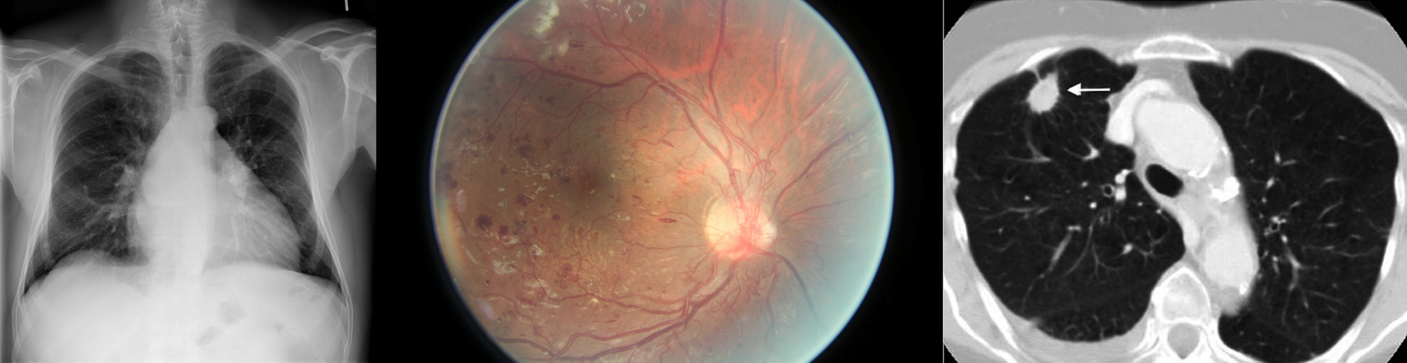
Figure 1. Large datasets are still vital for building high performing machine learning solutions. Public datasets such as the NIH Chest X-ray dataset (left), the Kaggle diabetic retinopathy dataset (middle) and the LIDC-IDRI dataset (right) were important for the development of AI solutions.
In spite of this, several (semi) publicly available datasets have emerged, such as the Kaggle diabetic retinopathy challenge [3], the LIDC-IDRI chest CT dataset [4], the NIH chest X-ray dataset [5], Stanford’s chest X-ray dataset [6], Radboud’s digital pathology datasets [7], the HAM10000 skin lesion dataset [8] and the OPTIMAM mammography dataset [9]. Example images of these datasets are shown in Figure 1. The availability of these public datasets has accelerated the research and development of deep learning solutions for medical image analysis.
2. Data complexity
Although the amount of available data is very important and often a limiting factor in many machine learning applications, it is not the only variable. Irrespective of the size of the data, feeding random noise to a statistical model will not result in the model learning to differentiate cats from dogs. We separate the data complexity into three types: image quality, dimensionality, and variability.
2.1. Image quality
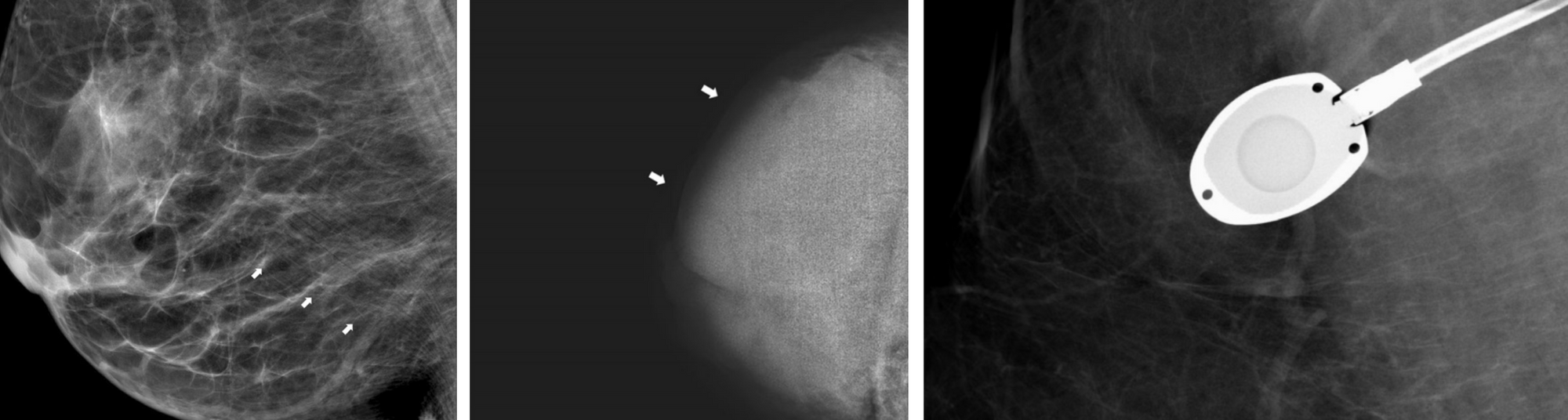
Image quality has been an important topic of research from the beginning of medical image analysis and there are several aspects that define it [11]. The signal to noise ratio is often used to characterize quality, though other aspects such as the presence of artifacts, motion blur, and proper handling of the equipment also determine quality [12]. For example, in the case of mammography, the breast can be misplaced in the machine resulting in poor visibility of important structures. The image can be under or overexposed and artifacts such as pacemakers, implants or chemo ports can make the images hard to read. Examples of these are shown in Figure 2.
There are many definitions of signal to noise ratio. From an ML perspective, one of the easiest is the fraction of task-relevant information over the total information in the image.
Figure 2. Examples of artifacts found in mammographic exams. Left: skin line artifacts, middle: underexposure, right: a chemo port (Images taken from [12]).
2.2 Dimensionality
The curse of dimensionality, a well-known problem from machine learning theory, describes the observation that with every feature dimension added, exponentially more data points are needed to get a reasonable filling of the space. Part of the curse has been lifted by the introduction of weight sharing in the form of convolutions and using very deep neural networks. However, medical images often come in far higher dimensional form than natural images (e.g., ImageNet has images of only 224x224).
2D images with complex structures, 3D images from MRI and CT, and even 4D images (for instance, a volume evolving over time) are the norm. Complex data structures typically mean you have to handcraft an architecture that works well for the problem and exploit structures that you know are in the data to make models work, see for example [13, 14].
2.3 Data variability
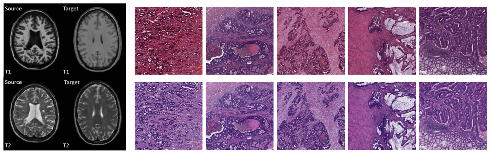
Scanners from different manufacturers use different materials, acquisition parameters, and post-processing algorithms [15, 16]. Different pathology labs use different stains [17]. Sometimes even data from the same lab taken with the same scanner will look different because of the person who handled the acquisition. These add complexity to the learning problem, because the model needs to become invariant, or engineers have to compensate for it by handcrafting preprocessing algorithms that normalize the data, employ heavy data augmentation or change network architectures to make them invariant to each irrelevant source.
Figure 3. Generalization of AI models for medical image analysis remains a challenge. Large variation between scanners, acquisition parameters, staining methods, recording conditions, etc. make it hard to build general AI solutions. Images taken from [16] (left) and [17] (right).
3. Label complexity
Although unsupervised methods are rising in popularity, most problems are still tackled using supervision, in which case we have another source of complexity: the labels. We again separate three factors: (1) the label granularity which describes the detail at which the labels are provided, (2) the class complexity which refers to the complexity of the output space, and (3) the annotation quality, which relates to the label noise.
3.1 Label granularity
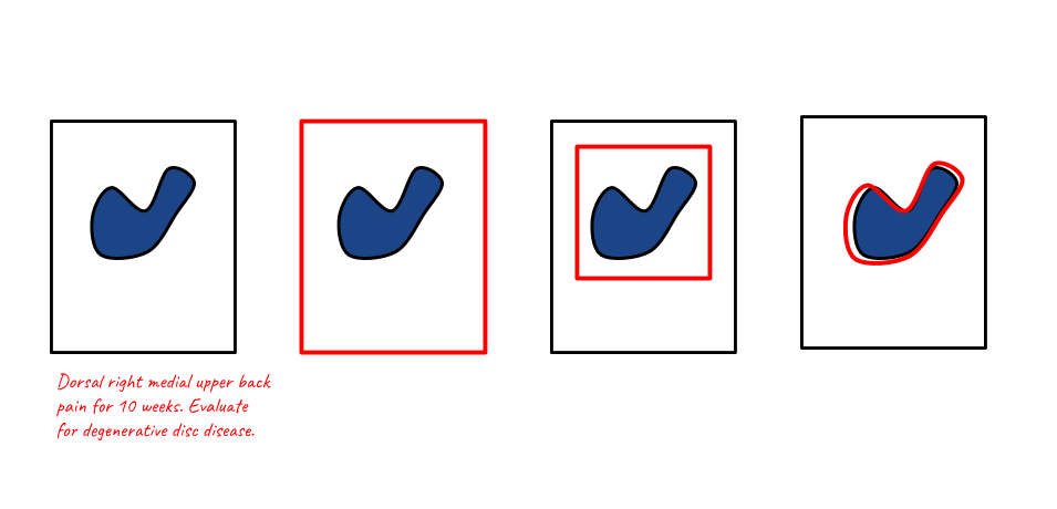
Data can be annotated at different levels of granularity. In general, the granularity of the label used during training, does not have to be the same as the granularity generated during inference. For instance, segmentation maps (a label for every pixel in the image) can be generated when training on image-level labels only (e.g., multiple-instance learning), reports can be generated when training on class labels only, class-level labels can be generated when training on pixel-level labels, etc. An overview is given in Figure 4 and the configurations are elaborated on below.
Figure 4. Overview of input and output types typically used in AI applications in medical imaging. Although granularity of the labels used during the training of the model is often in line with the granularity of the labels generated during inference, i.e., contour annotations are often used to generate segmentation maps, study level labels to do classification, etc., this is not always the case. For instance, a segmentation output can be generated using image-based labels, known as multiple instance learning.
Pixel level labels - Segmentation: In this setting the algorithm is supplied with contour annotations and/or output labels for every pixel in the case. In earlier medical imaging systems, segmentations were often employed as a form of preprocessing for detection algorithms, but this became less common after the ImageNet revolution in 2012. Segmentation algorithms are also used for quantification of abnormalities which can again be used to get consistent readings in clinical trials or as preparation for treatment such as radiotherapy. For natural images, a distinction is often made between instance-based and semantic segmentation. In the first case, the algorithm should provide a different label for every instance of a class and in the second case, only for each class separately. This distinction is less common in biomedical imaging, where there is often only one instance of a class in an image (such as a tumor), and/or detecting one instance is enough to classify the image as positive.
Bounding boxes - Detection: Instead of providing/generating a label for every pixel in the image, the annotator can also just draw a box around a region of interest. This can save time during annotation, but may provide lesser information: a box has four degrees of freedom, a contour usually more. It is difficult to tell the effect this has on algorithms.
Study level labels - Classification: Yet another simpler way to annotate would be to just flag cases with a specific abnormality. This makes a lot of sense for problems where the whole study is already a crop around the pathology in question, such as skin lesion classification and classifying abnormalities in color fundus imaging. This is much harder for other problems, such as the detection of breast cancer where a study is typically a time series of four large images and pathologies only constitute a fraction of the total study size. The algorithm first has to learn which parts of the image are relevant and then learn the actual features.
Reports - Report generation: Again, a simpler way to annotate is to use labels extracted directly from the radiology reports, instead of annotators. This type of label is sometimes referred to as silver standard annotation [18]. Learning from this data is likely difficult because natural language processing needs to be employed first, to extract labels from the report, potentially increasing label noise. Within this type of label, we can make one more distinction: structured or unstructured reports. In the first case, the doctor was constrained to a specific standard, in the latter case the doctor was free to write what they wanted. Whichever is best is an interesting debate: unstructured reports have the potential to contain more information but are more difficult to parse.
Figure 5. Illustration of different training and inference settings used in medical image analysis. The black square represents the study (which can be one or more images), the red elements represent the annotation, and the blue blob the abnormality. Left to right: text-based, study level based, region level based, and pixel-level based.
3.2 Class complexity
Number of disease classes
There is a difference between classifying images into two different classes or 1000 different classes. The first case means splitting the space in two separable regions, the latter into 1000, which is likely harder.
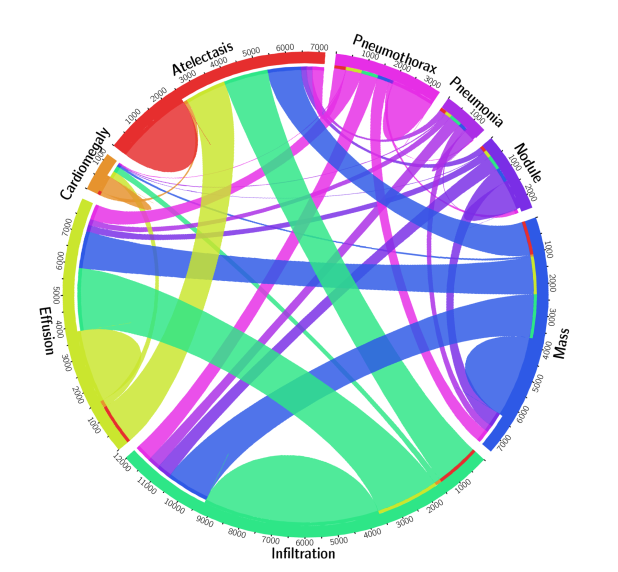
In many applications, for example, detecting abnormalities in chest X-ray, one sample can have multiple labels at the same time. This is illustrated in Figure 6, which shows a circular diagram of the co-occurrence of classes in the Chest X-ray 8 dataset.
Figure 6. For some problems in medical image analysis, (part of) an image can have multiple labels, which can make the problem more difficult to tackle for AI algorithms. An example of this is the classification of diseases in chest X-rays. Circular diagram representing the co-occurrence of disease classes in the ChestXray 8 dataset [5].
3.3 Label noise - annotation quality
Apart from the granularity of annotation, there is one more factor that can influence learnability and the eventual performance of the AI algorithm: the accuracy of the annotation. There are essentially two ways to handle annotations for most medical imaging problems: using a human reference or some other test that is known to be more accurate than the human.
Reader based labels - Label limited problems
If the labels are generated by medical professionals there is often a significant amount of inter-reader variability (different readers give different labels for the same sample) and intra-reader variability (the same reader gives different labels for the same sample, when annotated at different times). This disagreement results in label noise which makes it more difficult to train good models.
An important corollary of this is that using these labels to evaluate the model, it will be hard to show you actually outperform humans. Problems using this type of label are therefore label-limited: even if we have the best possible architecture, an infinite amount of training data, and compute power, we will never be able to outperform humans by a large margin, since they define the ground truth.
Test-based labels - Data limited problems
Imaging is often used as a first test because it is typically cheap and non-invasive. If something suspicious is found, the patient is subjected to more tests that have a higher accuracy. For example, in chest X-ray images, we sometimes have microbial culture to confirm the patient has tuberculosis. For the detection of tumors, biopsies and histopathological outcomes can be employed. These types of labels provide a less noisy and more accurate ground truth.
Problems using these labels are data-limited: if we just give an algorithm enough data, train it well and use the right architecture it should be able to outperform humans at some point, provided the second test is better than the human reading the image.
Analysis of papers
To get a better understanding of the state-of-the-art and what more is in store, we will analyze a few recent papers. This is by no means intended as an exhaustive list nor do we claim the results in the papers are accurate. All claims about (super) human performance become more trustworthy in prospective clinical trials, when data and source code are made publicly available, or when methods are evaluated in challenges.
The table below presents a summary of each paper, the data the model was trained on, and the labels that were used for the problem. For a more rigorous, clinically oriented overview, please refer to [19] and [20].
Modality
Paper
Summary
Data
Labels
Chest X-ray
Rajpurkar, Pranav, et al. "Chexnet: Radiologist-level pneumonia detection on chest x-rays with deep learning." arXiv preprint arXiv:1711.05225 (2017).
A model for the automatic detection of (radiological evidence of) pneumonia. Human performance is claimed by comparing it to the radiological label of several radiologists
Around 120K frontal view X-rays. 2D single view images downscaled to 224 x 224.
The dataset contains labels for 14 pathologies, which are extracted using NLP, therefore, silver standard labels were used. However, only signs of pneumonia or not is used as a label. The problem is label limited, the system is compared against labels defined by radiologists.
Chest X-ray
Putha, Preetham, et al. "Can Artificial Intelligence Reliably Report Chest X-Rays?: Radiologist Validation of an Algorithm trained on 2.3 Million X-Rays." arXiv preprint arXiv:1807.07455 (2018).
Nine different findings were detected using different models trained for each finding. Human performance was shown for about four pathologies.
Around 120K frontal view X-rays. 2D single view images downscaled to 224 x 224. A total of 1.2 million chest X-rays were used, downscaled to an unspecified size. Normalization techniques were applied to reduce variation.
The labels were extracted using NLP from the radiology reports and are therefore silver standard labels. Multi-class labels, treated as a binary classification problem.
Chest X-ray
Irvin, Jeremy, et al. "Chexpert: A large chest radiograph dataset with uncertainty labels and expert comparison." Proceedings of the AAAI Conference on Artificial Intelligence. Vol. 33. 2019.
A model was trained to discriminate between 14 different findings. Human performance is shown for five of those abnormalities.
About 220K scans, 2D images, single view, downscaled to 320 x 320
Labels extracted using NLP (silver standard labels), label limited. One model is trained for each pathology In addition, uncertainty based labels were used.
Chest X-ray
Hwang, Eui Jin, et al. "Development and validation of a deep learning–based automated detection algorithm for major thoracic diseases on chest radiographs." JAMA network open 2.3 (2019): e191095-e191095.
An algorithm is proposed to detect four abnormalities in chest radiographs. The model is compared to 15 physicians and shown to have higher performance
About 55K radiographs with normal findings and 35K with abnormal findings where used to develop the model.
Binary classification, four abnormalities merged into one. Mix of histopathology/external test and radiological labels were used. Largely a label limited problem.
Chest X-ray
Nam, Ju Gang, et al. "Development and validation of deep learning–based automatic detection algorithm for malignant pulmonary nodules on chest radiographs." Radiology 290.1 (2019): 218-228.
A model was trained to detect malignant pulmonary nodules on chest radiographs. The model was compared to 18 human readers and showed superior performance to the majority of them.
42K radiographs, 8000 with nodules in total were used for development
Both pixel level and image level labels were used for training. The malignancies were biopsy proven, this is therefore a daa limited problem. The problem was phrased as a binary classification.
Chest CT
Ardila, Diego, et al. "End-to-end lung cancer screening with three-dimensional deep learning on low-dose chest computed tomography." Nature medicine 25.6 (2019): 954-961.
A deep neural network is shown to outperform 6 human readers in classifying lung cancer in low dose CT
42K low dose CT scans, cropped and resized to 240 x 240 x 240. (3D data)
Different components of the model were trained on either the region level or case level labels (outcome determined by biopsy).Biopsy proven malignancies were used (data limited). Binary classification
Mammography
McKinney, Scott Mayer, et al. "International evaluation of an AI system for breast cancer screening." Nature 577.7788 (2020): 89-94.
A DNN is trained to detect breast cancer in screening mammography. The model is compared to a UK and US dataset and shown to outperform radiologists on both sets.
The model was trained on about 130K mammograms. A mammogram comprises four views, two of each breast.
Binary classification. The ground truth was determined based on histopathology reports. This is a data limited problem.
Dermatology
Esteva, A., Kuprel, B., Novoa, R.A., Ko, J., Swetter, S.M., Blau, H.M. and Thrun, S., 2017. Dermatologist-level classification of skin cancer with deep neural networks. Nature, 542(7639), pp.115-118.
A model is proposed that classifies dermatology images into malignant or benign and is compared to 21 certified dermatologists.
The model was developed on roughly 130K images. The dataset consisted of both color images from a regular camera and dermoscopy images. Images were scaled to 299 x 299.
The model was trained on a combination of biopsy proven and radiologists labeled cases. It is therefore a label limited problem. The model was trained using many different classes, comparison to humans done on a binary classification problem
Dermatology
Han, S.S., Kim, M.S., Lim, W., Park, G.H., Park, I. and Chang, S.E., 2018. Classification of the clinical images for benign and malignant cutaneous tumors using a deep learning algorithm. Journal of Investigative Dermatology, 138(7), pp.1529-1538.
A model is proposed that can classify 12 different cutaneous tumors. The performance of the algorithm was compared to a group of 16 dermatologists, using biopsy proven cases only. The model performed comparable to the panel of dermatologists.
The network was developed on about 17K images. The set comprised color images from a regular camera of varying size (size used in CNN not specified)
Most pathologies were biopsy confirmed this is therefore a data limited problem. The final model used 12 class classification.
Pathology
Bejnordi, B.E., Veta, M., Van Diest, P.J., Van Ginneken, B., Karssemeijer, N., Litjens, G., Van Der Laak, J.A., Hermsen, M., Manson, Q.F., Balkenhol, M. and Geessink, O., 2017. Diagnostic assessment of deep learning algorithms for detection of lymph node metastases in women with breast cancer. Jama, 318(22), pp.2199-2210.
A challenge was held to detect breast cancer metastasis in lymph nodes (CAMELYON16). The submitted algorithms were compared to a panel of 11 pathologists that read the slides under normal conditions (time constrained) and unconstrained. The top 5 algorithms all outperformed the readers under time constrained conditions and performed comparable in a non-time time constrained setting.
A total of 270 digital pathology slides were used for development (110 with and 160 without node metastasis)
It was phrased as a binary classifications. Labels were generated by pathologists and this is therefore a label limited problem.
Pathology
Bulten, Wouter, et al. "Automated deep-learning system for Gleason grading of prostate cancer using biopsies: a diagnostic study." The Lancet Oncology (2020).
A model was trained to perform Gleason grading of prostate cancer in digital pathology slides. The algorithm was compared to 115 pathologists and shown to outperform 10 of them.
Around 5000 digital pathology slides (color images).
Five class classification: labels were provided by experts/reports and therefore this is a label limited problem. The model was trained using semi-automatic labelling, where labels were extracted from reports and corrected if they deviated too much from an initial models' prediction.
Color fundus
Gulshan, Varun, et al. "Development and validation of a deep learning algorithm for detection of diabetic retinopathy in retinal fundus photographs." Jama 316.22 (2016): 2402-2410
A CNN was trained to detect diabetic retinopathy and diabetic macular edema. The algorithm was compared to 7 - 8 opthamologists respectively and was found to perform on par.
About 130K color fundus scans. Resolution used for the model was not mentioned
Binary labels: referable diabetic retinopathy or diabetic macular edema. Labels are provided by the expert (label limited problem).
Optical coherence tomography
De Fauw, Jeffrey, et al. "Clinically applicable deep learning for diagnosis and referral in retinal disease." Nature medicine 24.9 (2018): 1342-1350
A method is proposed to classify retinal diseases in OCT images. The model is compared to four retina specialists. It matched two and outperformed to others
Around 15K OCT scans, 3D data of 448 x 512 x 9
Combination of segmentation and classification. The segmentation was trained on 15 classes.The output of a segmentation algorithm is used as input for a network that outputs one of four referral diagnoses. Labels are provided by expert (label limited problem).
Discussion
Successes
The number of successful AI applications has drastically increased in the past couple of years. More specifically, high-throughput applications that carry a relatively low risk for the patient, such as detection of various diseases in chest X-ray, diabetic retinopathy detection in color fundus scan and detection of breast cancer in mammography seem to be popular. Note that in most of the applications, especially in chest X-ray analysis, AI algorithms have been successful only for a limited number of pathologies and will likely not replace the human completely any time soon.
More concretely, things that go well are:
Small images such as color fundus scans or dermatology images. Making ImageNet models work well on these problems is straightforward, there are no memory issues due to the relatively lower dimensionality of the data and changes in architecture are typically not necessary. In most cases, one sample is already a crop around the pathology to be classified, so simple classification architectures can be employed.
Diseases in modalities with lots of available data (because for instance the diseases detected using the images are common, the images are used to help diagnose multiple diseases, the images are cheap or little to non-invasive) such as diabetic retinopathy from color fundus, TB in chest X-ray and breast cancer in mammograms. More data simply means better performance, it is not surprising that domains where a lot of data is available are solved first.
Binary classification/detection problems such as the detection of single diseases in chest X-ray or cancer in mammograms.
Challenges
In spite of this success, there are many challenges left. The biggest are:
Applications such as MRI where there is a lot of noise, large variability between different scanners/sequences and a lack of data (an MRI scan is costly and the diseases used to detect it are less common). This is compounded by the fact that due to the volumetric nature of the data, it may be harder to annotate and developers therefore rely on study level labels or methods that can handle sparse annotations.
Detecting multiple diseases, especially rare disease. Even though there are big datasets for X-ray, it seems many algorithms still struggle to accurately distinguish all abnormalities in chest X-ray images at human level. This may be because some categories are underrepresented or because of the additional label noise introduced by using silver standard labels.
Complex output such as segmentation or radiology reports. Except for a few applications that use it as an intermediate step, we found no papers that show clear (super)human segmentation or report generation. Also note that both of these problems are hard to evaluate because of the nature of the labels.
Problems with complex input such as 3D/4D data, perfusion, contrast enhanced data.
Applications in highly specialized modalities that are not commonly used [25], such as PET and SPECT scans (medical scans that make use of radioactive substances to measure tissue function).
There is still a long way to go for AI to completely replace radiologists and other medical professionals. Below are a few suggestions.
1. Getting more data
This is a brute-force approach, but often the best way to get machine learning systems to work well. We should incentivize university hospitals sitting on data gold mines to make their data public and share it with AI researchers. This may sound like an unrealistic utopia, but there may be a business model where this can work. For example, patients could own their data and receive money for sharing an anonymized extract with a private institute.
In the long run, collecting massive amounts of data for every disease will not scale though, so we also have to be smart with the data we do have.
2. Using data more efficiently
Standardize data collection: Anyone who worked on actually applying AI to real world problems, knows most of the sweat and tears still goes into the collection of data, cleaning it and standardizing it. This process can be made much more efficient. Hospital software systems often make sure the data format is not compatible with competitors to "lock you in". This is similar to how Apple and Microsoft try to prevent you from using other software. Although this may make sense from a business perspective, this is hindering health care. In the ideal world, every hospital should use the same system for collecting data or conversion should be trivial. Algorithm vendors should provide the raw data and/or conversion functions between different vendors so that standardization between vendors becomes easier and generalization of algorithms is less of a problem.
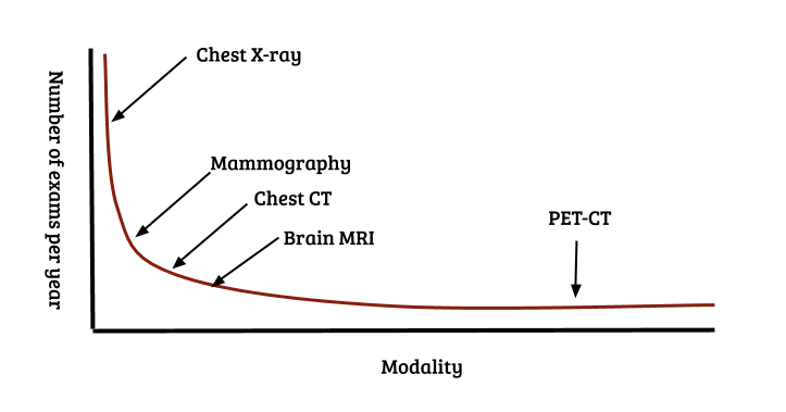
Methods working with less data - few shot learning, meta learning: Long tail samples are a well known problem in real world machine learning applications such as autonomous driving and medical diagnosis. A similar problem exists for modalities and pathologies: the distribution of the number of recorded images per modality also follows a Pareto distribution. Over a billion chest X-rays are recorded annually, approx 100 - 200 million mammograms, but only a couple of million specialized scans such as PET and SPECT. This is illustrated in Figure 7. Collecting large numbers of examples for every individual problem clearly does not scale. Methods such as few shot learning and meta learning [21 - 24] that aim to use data efficiently and learn across tasks, instead of just a single task will likely be crucial in tackling the full spectrum of the long tail of modalities.
Figure 7. The long tail of modalities and diseases. Similar to classes that occur in real-world settings, modalities/classification problems also follow a Pareto distribution. Over a billion chest X-ray images are recorded annually, a couple of hundred million mammograms, but only a couple of million specialized scans for specific diseases [25]. If radiologists have to be replaced completely, this means building AI systems for the detection/classification of every pathology in every modality in the long tail.
3. Methods working with less labels - semi-supervised and active learning
Using experts to perform annotations for all diseases and all modalities also does not scale. Medical data can not simply be annotated by verifying a doctor is not a robot, like Google insists on doing for their search engines. Methods dealing efficiently with sparse annotations such as semi-supervised and active learning will have to be employed. The successful application of silver standard labels in chest X-ray and digital pathology are impressive and could further be explored.
Conclusion
Hinton’s claim that a radiologist’s work will be replaced in the next few years seems far off, but the progress of AI is nevertheless promising. Digital Diagnostics [26] is already deploying a fully autonomous AI system for grading diabetic retinopathy in color fundus images. Several applications such as the detection of skin lesions, breast cancer in mammography and various symptoms of diseases in chest X-ray are becoming more mature and may soon follow suit.
A complete transition from Lodwick’s dream of a computer "aided" diagnosis to the more ambitious "computerized" diagnosis for all diseases in all modalities will likely still be a few decades away. If there is one thing the COVID-19 pandemic taught us, however, is that exponential growth is often underestimated. Computational power, available data and the number of people working on medical AI problems keeps increasing every year (especially in data rich countries such as China and India), speeding up development. On the other hand, progress in machine learning applications is logarithmic: it is easy to go from an AUC of 0.5 to 0.7, but completely covering the long tail, i.e., going from an AUC of 0.95 to 0.99 takes the most effort. The same will likely hold true for the long tail in modalities.
Turing postulated the requirement for solving the imitation game will be mainly about programming. For medical imaging problems, it will be mainly about data. Most image reading problems are simple image in - label out settings that can already be solved using current technology. Beyond that horizon, many new challenges will arise as a radiologists job is about much more than just reading images. Completely replacing radiologists is close to solving artificial general intelligence. Combining imaging modalities, images with lab work, anamnesis and genomic profiles of patients will likely keep us busy for decades to come.
References
[1] Turing, A.M., 2009. Computing machinery and intelligence. In Parsing the Turing Test (pp. 23-65). Springer, Dordrecht.
[2] Lodwick, G.S., 1966. Computer-aided diagnosis in radiology: A research plan. Investigative Radiology, 1(1), pp.72-80.
[4] Armato III, S.G., McLennan, G., Bidaut, L., McNitt‐Gray, M.F., Meyer, C.R., Reeves, A.P., Zhao, B., Aberle, D.R., Henschke, C.I., Hoffman, E.A. and Kazerooni, E.A., 2011. The lung image database consortium (LIDC) and image database resource initiative (IDRI): a completed reference database of lung nodules on CT scans. Medical physics, 38(2), pp.915-931.
[5] Wang, X., Peng, Y., Lu, L., Lu, Z., Bagheri, M. and Summers, R.M., 2017. Chestx-ray8: Hospital-scale chest x-ray database and benchmarks on weakly-supervised classification and localization of common thorax diseases. In Proceedings of the IEEE conference on computer vision and pattern recognition(pp. 2097-2106).
[6] Irvin, J., Rajpurkar, P., Ko, M., Yu, Y., Ciurea-Ilcus, S., Chute, C., Marklund, H., Haghgoo, B., Ball, R., Shpanskaya, K. and Seekins, J., 2019, January. Chexpert: A large chest radiograph dataset with uncertainty labels and expert comparison. In Thirty-Third AAAI Conference on Artificial Intelligence.
[7] Bejnordi, B.E., Veta, M., Van Diest, P.J., Van Ginneken, B., Karssemeijer, N., Litjens, G., Van Der Laak, J.A., Hermsen, M., Manson, Q.F., Balkenhol, M. and Geessink, O., 2017. Diagnostic assessment of deep learning algorithms for detection of lymph node metastases in women with breast cancer. Jama, 318(22), pp.2199-2210.
[8] Tschandl, P., Rosendahl, C. and Kittler, H., 2018. The HAM10000 dataset, a large collection of multi-source dermatoscopic images of common pigmented skin lesions. Scientific data, 5, p.180161.
[9] Halling-Brown, M.D., Warren, L.M., Ward, D., Lewis, E., Mackenzie, A., Wallis, M.G., Wilkinson, L., Given-Wilson, R.M., McAvinchey, R. and Young, K.C., 2020. OPTIMAM Mammography Image Database: a large scale resource of mammography images and clinical data. arXiv preprint arXiv:2004.04742.
[11] Prince, J.L. and Links, J.M., 2006. Medical imaging signals and systems. Upper Saddle River, NJ: Pearson Prentice Hall.
[12] Choi, J.J., Kim, S.H., Kang, B.J., Choi, B.G., Song, B. and Jung, H., 2014. Mammographic artifacts on full-field digital mammography. Journal of digital imaging, 27(2), pp.231-236.
[13] Veeling, B.S., Linmans, J., Winkens, J., Cohen, T. and Welling, M., 2018, September. Rotation equivariant CNNs for digital pathology. In International Conference on Medical image computing and computer-assisted intervention (pp. 210-218). Springer, Cham.
[14] Pinckaers, H., van Ginneken, B. and Litjens, G., 2019. Streaming convolutional neural networks for end-to-end learning with multi-megapixel images. arXiv preprint arXiv:1911.04432.
[15] Mackin, D., Fave, X., Zhang, L., Fried, D., Yang, J., Taylor, B., Rodriguez-Rivera, E., Dodge, C., Jones, A.K. and Court, L., 2015. Measuring CT scanner variability of radiomics features. Investigative radiology, 50(11), p.757.
[16] He, Y., Carass, A., Zuo, L., Dewey, B.E. and Prince, J.L., 2020, October. Self domain adapted network. In International Conference on Medical Image Computing and Computer-Assisted Intervention (pp. 437-446). Springer, Cham.
[17] Ciompi, F., Geessink, O., Bejnordi, B.E., De Souza, G.S., Baidoshvili, A., Litjens, G., Van Ginneken, B., Nagtegaal, I. and Van Der Laak, J., 2017, April. The importance of stain normalization in colorectal tissue classification with convolutional networks. In 2017 IEEE 14th International Symposium on Biomedical Imaging (ISBI 2017) (pp. 160-163). IEEE.
[18] Agarwal, V., Podchiyska, T., Banda, J.M., Goel, V., Leung, T.I., Minty, E.P., Sweeney, T.E., Gyang, E. and Shah, N.H., 2016. Learning statistical models of phenotypes using noisy labeled training data. Journal of the American Medical Informatics Association, 23(6), pp.1166-1173.
[19] Nagendran, M., Chen, Y., Lovejoy, C.A., Gordon, A.C., Komorowski, M., Harvey, H., Topol, E.J., Ioannidis, J.P., Collins, G.S. and Maruthappu, M., 2020. Artificial intelligence versus clinicians: systematic review of design, reporting standards, and claims of deep learning studies. bmj, 368.
[20] Liu, X., Faes, L., Kale, A.U., Wagner, S.K., Fu, D.J., Bruynseels, A., Mahendiran, T., Moraes, G., Shamdas, M., Kern, C. and Ledsam, J.R., 2019. A comparison of deep learning performance against health-care professionals in detecting diseases from medical imaging: a systematic review and meta-analysis. The lancet digital health, 1(6), pp.e271-e297.
[21] Fei-Fei, L., Fergus, R. and Perona, P., 2006. One-shot learning of object categories. IEEE transactions on pattern analysis and machine intelligence, 28(4), pp.594-611.
[22] Ren, M., Triantafillou, E., Ravi, S., Snell, J., Swersky, K., Tenenbaum, J.B., Larochelle, H. and Zemel, R.S., 2018. Meta-learning for semi-supervised few-shot classification. arXiv preprint arXiv:1803.00676.
[23] Finn, C., Abbeel, P. and Levine, S., 2017. Model-agnostic meta-learning for fast adaptation of deep networks. arXiv preprint arXiv:1703.03400.
[24] Lake, B.M., Salakhutdinov, R. and Tenenbaum, J.B., 2019. The Omniglot challenge: a 3-year progress report. Current Opinion in Behavioral Sciences, 29, pp.97-104.
Author Bio Thijs Kooi is VP of radiology research at Lunit, a medical imaging AI startup in Seoul. Before joining Lunit, he was at Merantix and Vara, a breast imaging AI start-up in Berlin. He got a Ph.D. in computer aided diagnosis from Radboud University and a M.Sc. in artificial intelligence from the University of Amsterdam in The Netherlands. His research interest is machine learning applied to medical imaging and diagnosis.
Citation For attribution in academic contexts or books, please cite this work as
Thijs Kooi, "Why skin lesions are peanuts and brain tumors a harder nut", The Gradient, 2020.
Data verified with reports from state and federal health departments. Each chart is timestamped at last update. Data downloads available on most charts or in data centre. Donate to support this work.
Vectorization is when you take some minecraft-style raster image and make a crisp vector picture out of it.
It's especially useful when you want to turn a satellite photo into a map. Or if you want to scan some blueprint and turn it into a CAD model. Or if you want to reissue an old game and you don't want to redraw all the artwork from scratch.
The algorithm I'm going to show you has nothing to do with all these things. It's a basic vectorization technique which, in its original form, has little to none applications in the industry.
On the plus side, it illustrates the approach rather well. It shows how things like bilinear interpolation, gradient descent, and parametric splines work together to solve a real-world problem. At the very least, it makes learning about all these things a little more compelling.
An input image
A raster image is essentially a rectangular table of things. If it's a full-color RGB, then it's a table of color pixels. Color pixels are the triplets of 8-bit integer values where each value represents an amount of red, green, and blue color.
Medical images, such as obtained from computed tomography, are usually the tables of 12-bit or 16-bit integers. It's not a color really since the values come from invisible X-ray radiation, but they are called gray values nevertheless.
Satellite images may have a lot of channels. Apart from the colors of the visible specter they may contain ultra-violet and infra-red luminosity. Channels may be represented by integers or floating point values.
Our image will be a simple gray-scale bitmap.
Technically, we can already turn it into vectors rather easily. Let's just agree on some threshold, and mark the contour of all the pixels that have the values exceeding this threshold.
Well, it's simple, but it's not what we wanted. We want curves, not corners. And for that, we have to make our image less cornery.
Image interpolation
Let's say our image is not a table of values. Let's say we only know the values in the centers of the pixels, and we have to guess the values between them somehow.
This is called interpolation. The simplest case would be the nearest neighbor interpolation, where for every point on an image, the value is the value from the nearest pixel's center. But this simply turns it back into a table.
A little more advanced is the bilinear interpolation. The value is the linear sum of the four neighboring values. It looks like this.
// pixel value with out of bounds checks
function pixel_in(pixels, i, j) {
    if(i >= pixels.length)
        return pixel_in(pixels, pixels.length-1, j);
    if(i < 0)
        return pixel_in(pixels, 0, j);
    if(j >= pixels[0].length)
        return pixel_in(pixels, i, pixels[0].length-1);
    if(j < 0)
        return pixel_in(pixels, i, 0);
    return pixels[i][j];
}

// linear interpolation
function value_in(pixels, x, y) {
    var j = Math.floor(x - 0.5);
    var tj = x - 0.5 - j;
    var i = Math.floor(y - 0.5);
    var ti = y - 0.5 - i;
    return pixel_in(pixels, i, j) * (1 - ti) * (1 - tj)
         + pixel_in(pixels, i, j+1) * (1 - ti) * (tj)
         + pixel_in(pixels, i+1, j+1) * (ti) * (tj)
         + pixel_in(pixels, i+1, j) * (ti) * (1 - tj);
}
If we darken the pixels where the interpolated value meets the threshold, we'll get some kind of a contour.
There are other methods. Plenty of them. But linear interpolation solves the cornery border problem just fine. Although, the border we see is just the borderline of some threshold. It's not a vector representation yet.
Turning an interpolated image into a contour
We can borrow an idea from the simplest possible smooth contouring algorithm. We'll build an initial border from the source pixels, and then we'll use our linearly interpolated image to find the best place to put each contour point so the image value will meet the threshold value.
When you have a distance field, it's easy. A distance field is when for any point in space you can tell how far it lies from the surface you want. It's basically a function from point in space to distance.
You take its gradient, take the difference between the value you have and the threshold value. Since it's the distance field, the value difference is exactly the distance you should move your point for. And the gradient is the exact opposite direction. You just inverse, multiply, add — and you're there.
Unfortunately, we don't have a distance field. We have a continuous image which only resembles one.
But the principle still works. If you traverse against the gradient, you will get closer to the threshold value. And the more the difference, the further you have to go. It's just you wouldn't always get there in one try.
So let's try several times then. Let's make an iterative algorithm out of it.
// gradient
function gradient(pixels, x, y) {
    const eps = 1e-5;
    return [(value_in(pixels, x + eps, y) - value_in(pixels, x, y)) / eps,
            (value_in(pixels, x, y + eps) - value_in(pixels, x, y)) / eps];
}

// how far should you shift the point to meet the isoline
// if value_in were a distance function
function gradient_shift(pixels, threshold, x, y) {
    var g = gradient(pixels, x, y);
    var g_norm = Math.sqrt(g[0]*g[0] + g[1]*g[1]);
    var d = threshold - value_in(pixels, x, y);
    return [g[0] * d / g_norm / g_norm, g[1] * d / g_norm / g_norm];
}

// brings a point closer to the threshold isoline
function fit_point_better(pixels, threshold, point) {
    const ok_error = 1/255;
    if(Math.abs(value_in(pixels, point[0], point[1]) - threshold) < ok_error)
        return point;
    gs = gradient_shift(pixels, threshold, point[0], point[1])
    var new_point = [point[0] + gs[0], point[1] + gs[1]];
    return fit_point_better(pixels, threshold, new_point);
}
We'll move our contour points against the gradient until we're close enough to the threshold
That's good but we can do better. Let's make the contour smooth.
Cubic splines
All we have to do to make the contour smooth is to turn each line segment into a parametric cubic curve.
It's probably sounds more complicated than it is. A parametric cubic curve is just a pair of polynomials. If you have the points and partial derivatives in this points, you can get the coefficients for them from this pair of linear systems:
Px(t1)' = 3axt12 + 2bxt1 + c = dx1/dt
Px(t1) = axt13 + bxt12 + cxt1 + d = x1
Px(t2) = axt23 + bxt22 + cxt2 + d = x2
Px(t2)' = 3axt22 + 2bxt2 + c = dx2/dt
Py(t1)' = 3ayt12 + 2byt1 + c = dy1/dt
Py(t1) = ayt13 + byt12 + cyt1 + d = y1
Py(t2) = ayt23 + byt22 + cyt2 + d = y2
Py(t2)' = 3ayt22 + 2byt2 + c = dy2/dt
The curve itself will then look like this.
Even more, since we get to choose the parameter range, we can make it [0..1]. This greatly simplifies our system and makes it really easy to solve.
Here is the function that makes one array of polynomial coefficients from two pairs of point and tangent values.
The polynomial is then computed in every t with this function.
// polynomial
function polynomial_in_t(A, t){
    var pt = 0.0;
    for(var i = 0; i < A.length; ++i){
        pt += A[i] * Math.pow(x, i);
    }
    return pt;
}
So for every line segment with tangents, we can make a parametric polynomial. There is one problem though. We don't have tangents.
We have the gradient, which is orthogonal to the tangent, but there are two possible tangents in every point. The tangent can be oriented left or right from the gradient.
But this is solvable. Let's just pick the direction we like and keep it consistent.
Let the curves that originally come from horizontally oriented segments always have both tangents that way that dx > 0. And the ones that come from vertically oriented segments, will have dy > 0.
It looks like we have enough parts to assemble an algorithm.
Creating splines from the pixels
Let's split our vectorization into two parts. First, we'll get points and tangents for every line segment from the pixels. Then we'll turn it all into polynomial splines.
The function that does the first part looks like this.
function turn_pixels_into_points_and_tangents(pixels, threshold) {
    var points = [];
    var tangents = [];

    // "horizontal" pieces
    for(var i = 0; i <= pixels.length; i += 1) {
        var old_point = [];
        var old_tangent = [];
        for(var j = 0; j <= pixels[0].length; j += 1) {
            // if right, left, top, and bottom pixels have a sign change,
            // there should be a spline there
            var sign_change_on_the_right  =
                (pixel_in(pixels, i-1, j+0) - threshold) *
                (pixel_in(pixels, i+0, j+0) - threshold) < 0;
            var sign_change_on_the_left   =
                (pixel_in(pixels, i-1, j-1) - threshold) *
                (pixel_in(pixels, i+0, j-1) - threshold) < 0;
            var sign_change_on_the_bottom =
                (pixel_in(pixels, i+0, j-1) - threshold) *
                (pixel_in(pixels, i+0, j+0) - threshold) < 0;
            var sign_change_on_the_top    =
                (pixel_in(pixels, i-1, j-1) - threshold) *
                (pixel_in(pixels, i-1, j+0) - threshold) < 0;
            if(sign_change_on_the_right || sign_change_on_the_left) {
                // fits the point on a threshold isoline
                var point = fit_point_better(pixels, threshold, [j, i]);
                var g = gradient(pixels, point[0], point[1]);

                // we want our tangent to be X-positive for horizontal pieces
                var tangent = g[1] >= 0 ? [g[1], -g[0]] : [-g[1], g[0]];

                // this is an T or X junction, the tangent is ambiguous
                if(sign_change_on_the_left +
                   sign_change_on_the_right +
                   sign_change_on_the_top +
                   sign_change_on_the_bottom > 2)
                    tangent = [0., 0.];

                // store the point+tangent and the previous point+tangent
                // if there is one
                if(sign_change_on_the_left && old_point) {
                    points.push([old_point, point]);
                    tangents.push([old_tangent, tangent]);
                }

                // save the point+tangent for later
                if(sign_change_on_the_right) {
                    old_point = point;
                    old_tangent = tangent;
                }
            }
        }
    }

    // "vertical" pieces
    for(var j = 0; j <= pixels[0].length; j += 1) {
        var old_point = [];
        var old_tangent = [];
        for(var i = 0; i <= pixels.length; i += 1) {
            var sign_change_on_the_right  =
                (pixel_in(pixels, i-1, j+0) - threshold) *
                (pixel_in(pixels, i+0, j+0) - threshold) < 0;
            var sign_change_on_the_left   =
                (pixel_in(pixels, i-1, j-1) - threshold) *
                (pixel_in(pixels, i+0, j-1) - threshold) < 0;
            var sign_change_on_the_bottom =
                (pixel_in(pixels, i+0, j-1) - threshold) *
                (pixel_in(pixels, i+0, j+0) - threshold) < 0;
            var sign_change_on_the_top    =
                (pixel_in(pixels, i-1, j-1) - threshold) *
                (pixel_in(pixels, i-1, j+0) - threshold) < 0;
            if(sign_change_on_the_bottom || sign_change_on_the_top) {
                var point = fit_point_better(pixels, threshold, [j, i]);
                var g = gradient(pixels, point[0], point[1]);
                var tangent = g[0] < 0 ? [g[1], -g[0]] : [-g[1], g[0]];
                if(sign_change_on_the_left +
                   sign_change_on_the_right +
                   sign_change_on_the_top +
                   sign_change_on_the_bottom > 2)
                    tangent = [0., 0.];
                if(sign_change_on_the_top && old_point) {
                    points.push([old_point, point]);
                    tangents.push([old_tangent, tangent]);
                }
                if(sign_change_on_the_bottom) {
                    old_point = point;
                    old_tangent = tangent;
                }
            }
        }
    }
    return [points, tangents];
}
And the one that does the second part — like this.
function turn_points_and_tangents_into_splines(points_and_tangents)
{
    var splines = [];
    var points = points_and_tangents[0];
    var tangents = points_and_tangents[1];
    for(var i = 0; i < points.length; ++i) {
        var Px = spline_for(
            points[i][0][0], tangents[i][0][0],
            points[i][1][0], tangents[i][1][0]);
        var Py = spline_for(
            points[i][0][1], tangents[i][0][1],
            points[i][1][1], tangents[i][1][1]);
        splines.push([Px, Py]);
    }
    return splines
}
This split is not essential for the algorithm, but it makes it possible to edit the model in both image and spline representation.
Import, edit, export
Now, when we have the algorithm, let's see how it works in practice. Let's import a gray-scale image from PGM, turn it into splines, edit them, then export them as SVG.
PGM is a 1-channel ASCII image format. You can make a PGM file in GIMP or any other raster image editor.
When the image is imported, we can either edit the source image pixel-by-pixel or move the splines' points and tangents. Click on a canvas to increase a pixel's luminosity. Click holding the Shift key to reduce it. Please note that in this example, image editing overrides vectors.
When you're happy with the splines, you can export them in SVG. In this example, only the outline is supported. No filling, no coloring.
You don't have to export the polynomials. SVG supports Bézier curves, and they are basically the same as cubic polynomials. Only instead of coefficients, you write down the control points.
The first point is the starting point of the spline. The second is the sum of the first point and one-third of a tangent vector. The third is the subtraction of the finishing point of the spline and the one-third of a second tangent. The fourth is the finishing point of the spline.
The code for the export function, just as all the code mentioned here including the visuals, is available on Github.
Conclusion
The algorithm shows how bilinear interpolation, polynomial approximation, differential analysis, and iterative algorithms work together to solve a practical problem.
I hope this page will not only satisfy one's curiosity but help someone retain inspiration while studying these things. I know from my experience that basic calculus while being not more complicated than the traffic code, is particularly hard to learn because you don't see the application right away. You learn about series, limits, derivatives, integrals, and for what reason? How do you turn this knowledge into something useful?
When I co-founded D2iQ more than seven years ago, only a handful of the world’s leading organizations were beginning to embark on their cloud native journeys. We empowered many of these brands with our DC/OS offerings and support, enabling them to scale deployments in production environments and become truly cloud-driven organizations.
Over the past year and a half our focus has been providing our customers with a path that enables Kubernetes adoption that meets the demanding needs of the enterprise. The result is the D2iQ Kubernetes Platform (DKP) which is not only the leading independent Kubernetes platform and highly rated in the latest Forrester study, but has mostly reached feature parity (and in some cases, superiority) with the DC/OS platform.
Today, nearly every organization is on a cloud native path fueled by Kubernetes. In fact, our recent survey report found that 89% of organizations are running Kubernetes in production or pre-production environments and that 77% of organizations feel that Kubernetes is a central part of their digital transformation strategy. This data aligns with what we’re seeing in the market and with our customers. As cloud native technology matures organizations are looking to Kubernetes to address critical business issues. More and more companies expect enterprise-grade Kubernetes deployments in production and at scale to meet the complex needs of Day 2. Consequently, last quarter was our most successful in company history, led by multiple $1M+ deals for the D2iQ Kubernetes Platform (DKP).
Based on the changing market needs and very clear feedback from our customers, D2iQ is making the decision to focus our resources on the future, that being our DKP portfolio of products. In order to accelerate the delivery of the innovation our customers have become accustomed to from D2iQ, it is necessary for us to align our business to support that objective.
Starting today, we will begin the process to wind down the Mesosphere DC/OS Platform. We will continue to provide support for our current DC/OS customers, of course, but will no longer be investing in new features or capabilities. We are working closely with existing customers to migrate to the D2iQ Kubernetes Platform and provide them with the enhanced innovation and enterprise capabilities available from Kubernetes.
With this shift in product strategy, we have also focused our R&D resources on continued innovation within our DKP platform and resized the company to become more nimble and streamlined.
I feel that this acceleration in strategy is needed to focus our company to meet the exploding demand for our unique Kubernetes solutions, services and expertise. We believe this shift in product strategy best positions us for future success and we look forward to helping the D2iQ ecosystem harness the business value of Kubernetes. We will continue to evolve our operations to meet the needs of our customers, partners, and the overall cloud native market, and believe the decisions made today best position the company for the long-term.
In order to help us execute on our new focus, we have made several important and well-deserved internal promotions. These include: Joe Taborek, who has accepted the expanded role of President of Worldwide Field Operations; Deepak Goel, our new Chief Technology Officer; Darron Makrokanis has expanded his role to SVP, Americas Sales; likewise, Louise Bulman is now VP, International Sales; and finally the promotion of Alexandra Steadman to VP of Global Demand and Field Marketing. Each of them has made significant contributions to our recent performance and will be key members of our team as we continue to help customers achieve success in Day 2 operations.
In conclusion, I want to thank all of our loyal customers, particularly those DC/OS users who were fellow pioneers in the growth of the cloud native landscape from the beginning. I also want to express my sincere gratitude to our employees who strive every day to find a better way for our customers. I’m so excited to go forward with both our employees and our customers to push new boundaries of innovation and usher in the next chapter for our industry focused on a smarter Day 2.
You've probably had one or two thoughts about politics lately.
It's that time of year. The light begins to disappear, both outside your door and inside the eyes of tired, nonsense-peddling politicians.
Perhaps this is what led Microsoft to fully express its own indignation at US politicians' inability to do what more than 130 other countries have already managed -- enact a digital privacy law or two.
Last week, I offered the words of Julie Brill, Microsoft's corporate vice-president for Global Privacy and Regulatory Affairs and chief privacy officer. (Her business card is 12 inches wide.)
She expressed Redmond's frustration that the US is so far behind in doing the right thing. She said: "In contrast to the role our country has traditionally played on global issues, the US is not leading, or even participating in, the discussion over common privacy norms."
Ultimately, however, Brill said the company's research showed people want business to take responsibility, rather than government.
Which some might think humorous, given how tech companies -- Microsoft very much included -- have treated privacy, and tech regulation in general, as the laughable burp of a constantly acquisitive society.
I wondered, though, what other companies really thought about all this.
In an attack of serendipity that I hope didn't come from snooping around my laptop, new research asking those sorts of questions was just published.
Snow Software, a self-described "technology intelligence platform" -- you're nothing if you're not a platform -- talked to 1,000 IT leaders and 3,000 employees from around the world.
I hope Brill and her team at Microsoft are sitting down as they read this. You see, 82% of employees said more regulation was needed. As did 94% of IT leaders. (The other 6% must be doing their jobs from a sandy beach, with a hefty supply of cocktails.)
Yes, Microsoft, more people agree with you more strongly, yet still so little is being done. That won't soothe your innards. It'll drive you madder. Sometimes, having the majority on your side still doesn't make you the winner.
The majority of those surveyed who believed more regulation is necessary pointed to data protection and cybersecurity as the most urgent areas.
In the US, though, IT leaders agreed that the most important area for correction was data protection, but next came data collection. They understand how the mining of our very souls has become entirely uncontrolled.
These US IT leaders placed cybersecurity as third on their list of priorities, followed by universal connectivity and, how bracing that they mentioned this, competition.
I asked Snow to dig deeper into its survey and offer me some unpublished details about its findings. One of the more difficult was that IT leaders said their priorities were adopting new technologies and reducing security risks. Yet the former can cause more of the latter, rather than less. How can you square the two?
Naturally, there was something of a gulf between IT leaders and employees on one issue -- technology that's left unmanaged or unaccounted for.
Far more employees think this is no biggie, whereas IT leaders would like to stand in front of these employees and scream for a very long time. While phrases such as "government fines" and "contractual breaches" emerged from their foamy mouths.
Yet perhaps the most pungent and disspiriting result from this study is that a mere 13% of employees said tech regulations make them feel vulnerable. Last year, the number was 24%.
You might think this good news. You'll think it suggests security has somehow progressed enormously.
I'm not quite as optimistic. I worry employees are now so used to living inside technology that, in truth, they've entirely stopped thinking about the negative consequences of its insecurity. Whatever other answers they might give in surveys.
Why, here's an answer employees gave: A trifling 28% said current tech regulations made them they feel safe. That's only 2 points higher than last year.
Tech regulation isn't easy. Tech companies have been allowed to swallow our lives whole and leave a complex indigestion for us to deal with. Too often, we don't even bother trying because, well, it shouldn't be our responsibility.
These haven't been responsible times. Tech has moved fast and broken things that really shouldn't have been broken.
The pieces on the floor are everyone's. The responsibility for putting them back together lies, as Microsoft now confesses, with the High Humpties of government and business.
I begin to hold my breath.
from Latest Topic for ZDNet in... https://ift.tt/35RNPNJ
TORONTO -- Lisa Carr never thought her work would lead to armed threats, a firebombing, a shooting and a conspiracy to kill her.
The Carr Law office is in a nondescript strip mall in Vaughan, Ont., north of Toronto. It’s closed now, after the litigation lawyer says police told her they could no longer protect her.
She was shuttled to another country where she spent five long months in hiding. Carr has never before told her story, but agreed to meet for an interview as part of a W5 investigation into the shady underbelly of an industry that forced her to give up her business and almost cost her, her life: The tow truck industry.
Over the last number of years, criminal elements have been battling for lucrative control of the major highways around the Toronto area. It has resulted in more than 50 arsons, multiple shootings and at least four murders.
So why is there so much violence over a couple of hundred-dollar tows at the side of the road? Because that one tow can net tens of thousands of dollars.
Here’s how it works: The tow truck driver gets a kickback from an unscrupulous auto body shop, which then submits wildly inflated repair fees to an insurance company.
The insurance industry estimates that fake repair bills tally up to $2 billion a year in Canada. And that’s why Carr was in the crosshairs. She was hired by an insurance company to challenge bogus claims.
Over the course of a number of months, Carr’s law firm was the target of increasingly violent attacks. First a firebombing and then her office was set on fire.
Months later, in broad daylight, a colleague leaving work had a gun put to her head and was told, “Stop suing our friends.” Shortly after that, again in broad daylight, someone opened fire through the front door of the busy office.
Carr says it is incredible no one was struck by the flurry of bullets.
“I looked down the hall and I saw my receptionist on her hands and knees surrounded by glass. And one of the other girls came running at me saying, ‘Shots fired, shots fired. Call 911.’”
While the violence surrounding the tow truck industry has made headlines in the Greater Toronto Area, the story that has never been told is that York Regional Police (YRP) uncovered a plot to kill Carr.
It was such a credible threat that they gave her an hour to pack up her belongings and leave her home. Carr and her husband were then whisked out of the country and spent five months in hiding.
Three separate police services – YRP, Toronto Police Service and Ontario Provincial Police – joined forces to launch Project Platinum to investigate the violence associated with the tow truck industry.
They carried out a series of raids this past spring, which netted dozens of high-powered weapons and led to the arrests of 35 people who face almost 500 charges, including the attempted murder of Carr.
Now back in Canada, Carr says police have told her she is likely no longer in danger, but with one caveat.
“The police said we believe the risk is low. As long as you don't go back to work, as long as you don't restart the firm,” she says.
“So they have effectively ended my career. We lost everything. They won.”
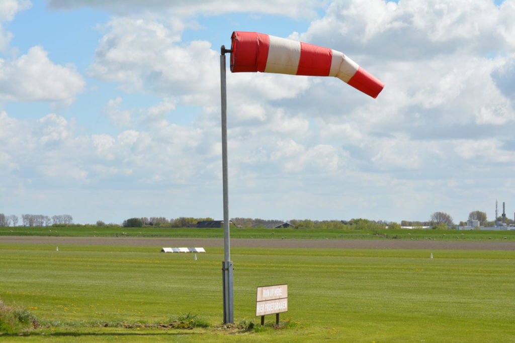
A windsock, as we know it today, is a conically shaped tube made of woven textile which is used to measure both wind direction and speed.
How is a windsock mounted?
They are mounted on a special installation. These usually consist of a metal mast made of aluminum or galvanized steel. The mast is placed on a metal foundation so that it can withstand high wind speeds. A metal basket (or so called swivel frame) is placed on top of the mast, which can rotate 180 degrees horizontally. The windsock is attached to this, so that it can move freely depending on where the wind comes from.
Depending on the application, an installation can be simple or expanded. For example, lighting can be placed on the installation if it’s supposed to be visible at night. The mast can also be made tiltable, so that the bag can be replaced more easily.
What’s the purpose of a windsock?
Windsocks are used in various industries. The goal is to give staff or other attendees a quick indication of where the wind is coming from and how hard the wind is blowing. The most commonly used location next to the runway or helipad at an airport. This allows pilots to quickly estimate the wind direction and speed before take off.
But they’re also used in factories or industrial area’s where hazardous gases or substances can be released. In the event of an emergency, attendees can quickly estimate which way the hazardous substances are being blown, in order to determine the best possible escape route.
What does the color of a windsock mean?
The red / white striped is the most famous version that you’ll often see alongside of the road. Yet many different colors are used internationally, such as orange (striped), green, blue and completely orange. In general, the colors are chosen in such a way that the entire installation is clearly visible in contrast with the background. Almost no blue windbags are used in the maritime world. But at airports where there’s a lot of grass around the runway, green windsocks will hardly ever be used.
But a green windsock is very useful near a nature reserve where a red/white windsock is not always allowed. Near places like that, a green windsock is a perfect solution.
Are windsocks calibrated?
Brand new windsocks are produced according to the guidelines of the ICAO. This means that all current models are calibrated to be fully inflated at wind speeds of 15 knots or more.
What are the windsock speed charts?
The stripes on a windsock are not only chosen to be visible from a great distance. If a stripe is “blown up” by the wind, you can use it to read the current windspeed.
3 knots
6 knots
9 knots
12 knots
15 knots or more
Windsock suppliers
For the most part, the ideal place to buy a windsock or complete installation is from an international specialist. For example, Holland Aviation is an expert in the manufacturing and international delivery of windsocks and installations. This way, you’re always assured of a quality product, produced in accordance with the common rules and regulations. View our selection of windbags to find a suitable windsock for your own needs.
By now, you should be a real windsock expert! Do you still have questions? You can always contact one of our experts. Contact us and we will be happy to help you on your way!
A few years ago we realized that having a package manager for the Ada/SPARK community would be a game changer. Since then, AdaCore has been sponsoring and contributing to the Alire project created by Alejandro Mosteo from the Centro Universitario de la Defensa de Zaragoza. With this blog post I want to introduce Alire and explain why this project is important for the Ada/SPARK community.
There are many different kinds of package managers, Alire is a source-based package manager focused on the Ada/SPARK programming language.
This means that the goal of Alire is to provide an easy way to get, build and use Ada/SPARK projects in source form. It is a tool for developers, as opposed to binary package managers which are providing ready to use applications for end-users. It is comparable to opam for the OCaml ecosystem, or Cargo for Rust.
What are the benefits of Alire for the Ada/SPARK ecosystem? #
In my opinion, the main benefit of a package manager is to improve the collaboration within a community of developers.
This is achieved in multiple ways:
Alire is a central place to look for existing projects. If you are looking for a library to provide a given feature in your project, a quick search on the alire.ada.dev website will tell you if someone from the community already implemented it.
The corollary is that Alire is a central place to contribute projects and make them available to other developers in the community.
Alire provides a common and easy way to integrate projects from the community in your own projects.
Let’s take a simple scenario from personal experience: I am writing an application in Ada, and I want my application to produce PDF reports.
We will look at different steps of this scenario and compare how to achieve them without and with Alire. I will use the alr command line tool from the Alire project.
Before Alire: I will search the web for a project that matches my needs. Search engines are pretty powerful so if there is something out there (on GitHub, SourceForge, GitLab, or elsewhere) I will likely find it. “Ada PDF” doesn’t yield good results, but “Ada PDF library” does the job.
With Alire: A simple search on the alire.ada.dev website gives me a list of Ada/SPARK projects available right now matching the PDF keyword: https://alire.ada.dev/search/?q=pdf Or on the command line:
Before Alire: Once I have found the APDF project (https://apdf.sourceforge.io/) I can either get the source from tarball or checkout the repository. From that I have to understand how to use the source code in my project. Maybe I have to set the GPR_PROJECT_PATH, maybe I have to build and install the library.
With Alire:
$ alr with apdf
The alr with command automatically fetches the latest version of APDF and makes it available in my project.
3rd step: updating APDF when new releases are available #
Before Alire: I have no automated way to know if a new version of APDF is available. I can follow forums and mailing lists in hope of catching the information, but this is not very reliable. If I do get the information that a new version of APDF is available, I have to redo the 2nd step (download tarball, extract, set project path, etc.).
With Alire:
$ alr update
With the alr update command, Alire will let me know if new versions of my dependencies are available and automatically update them for me, if I wish to do so.
4th step: Other developers want to build my project #
Before Alire: I have to document in the README file all the steps to get and set up my dependencies (download tarball, extract, set project path, etc). Anyone interested in compiling my project has to follow all the steps, and do so transitively for all dependencies.
With Alire:
$ alr get my_project
If I contributed my project to the Alire index, anyone can get the project and its dependencies with a simple command. Otherwise, one can checkout the repository and use alr update to fetch the dependencies.
5th step: publishing my project for others to use in their projects #
Before Alire: I have to document how to integrate my project in another project. I can then announce the project on an Ada/SPARK community forum like Reddit r/ada and hope that this or the repository will show up in a Web search when people need my project.
With Alire:
$ alr publish
Alire provides a command to help publishing projects in the Alire index. Once my project is in the index, a dedicated page will be created on the alire.ada.dev website and my project will be available for Alire users. Of course it is still a good idea to announce it in the forums.
As of October 2020, there are 130 projects (“crates” in the Alire vocabulary) available. You can browse through the list on the website: alire.ada.dev/crates.
There is also a network graph view of the Alire ecosystem: here.