June 6, 2020
John Boardley
In a top-ten list of all-time best type designers, Robert Granjon (1513–90) would be up there. In more sober terms, the brilliant typographic scholar Hendrik Vervliet described Granjon as ‘one of the best and most influential type designers of the pre-industrial period of typography’.
Granjon’s work as an itinerant, self-employed type designer, printer-publisher and bookseller, took him to Paris, Lyons, Antwerp, Frankfurt and Rome. He designed and produced some 90 typefaces between about 1543 and 1590 (Vervliet, 2008, p. 321). He didn’t sell cast pieces of metal type but rather he designed the more valuable punches and matrices, that he then sold to customers who could then punch and cast their own fonts.
Civilité
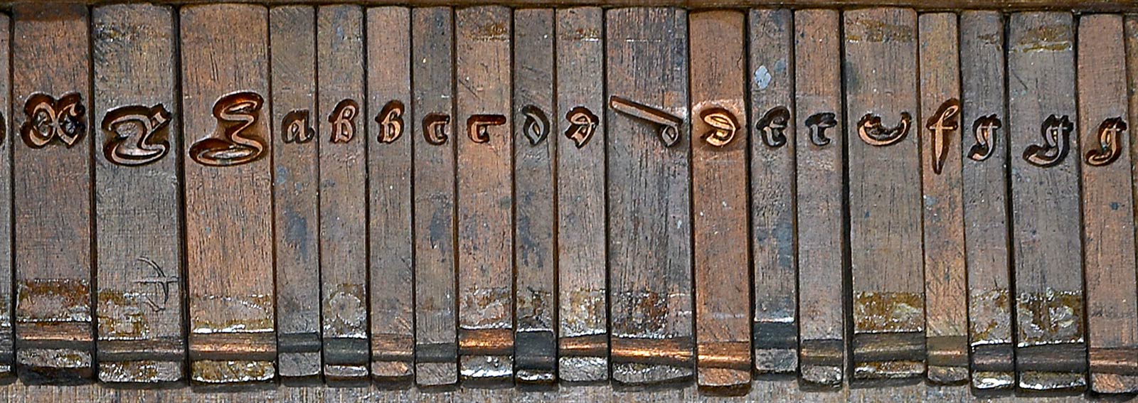
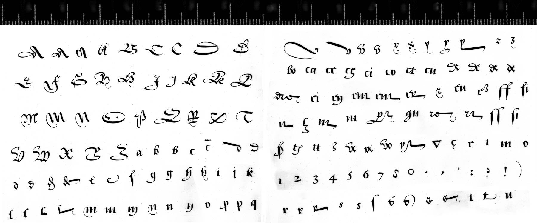
In addition to designing numerous Romans and Italics, Granjon designed and cut Greek, Hebrew, Arabic, Syriac, Cyrillic, and Bastard types, and quite a few fleurons and ornaments. In 1557, he designed an entirely new style of typeface, one modeled closely on Secretary Hand, a popular contemporary form of Gothic cursive handwriting.
For Granjon, his new typeface was not an aesthetic fancy. Sixteenth century Europe was host to intense linguistic and philological debates: about the standardization of language, of grammar and spelling, for example. Looking around, Granjon saw that the Italians had their Roman and Italic (even now named after their place of origin), and the Germans their evolved Gothic, or Schwabacher. Granjon wished for Civilité to be France’s national typeface, something that was instantly recognizable as French, but also practical and familiar enough to be easily readable.
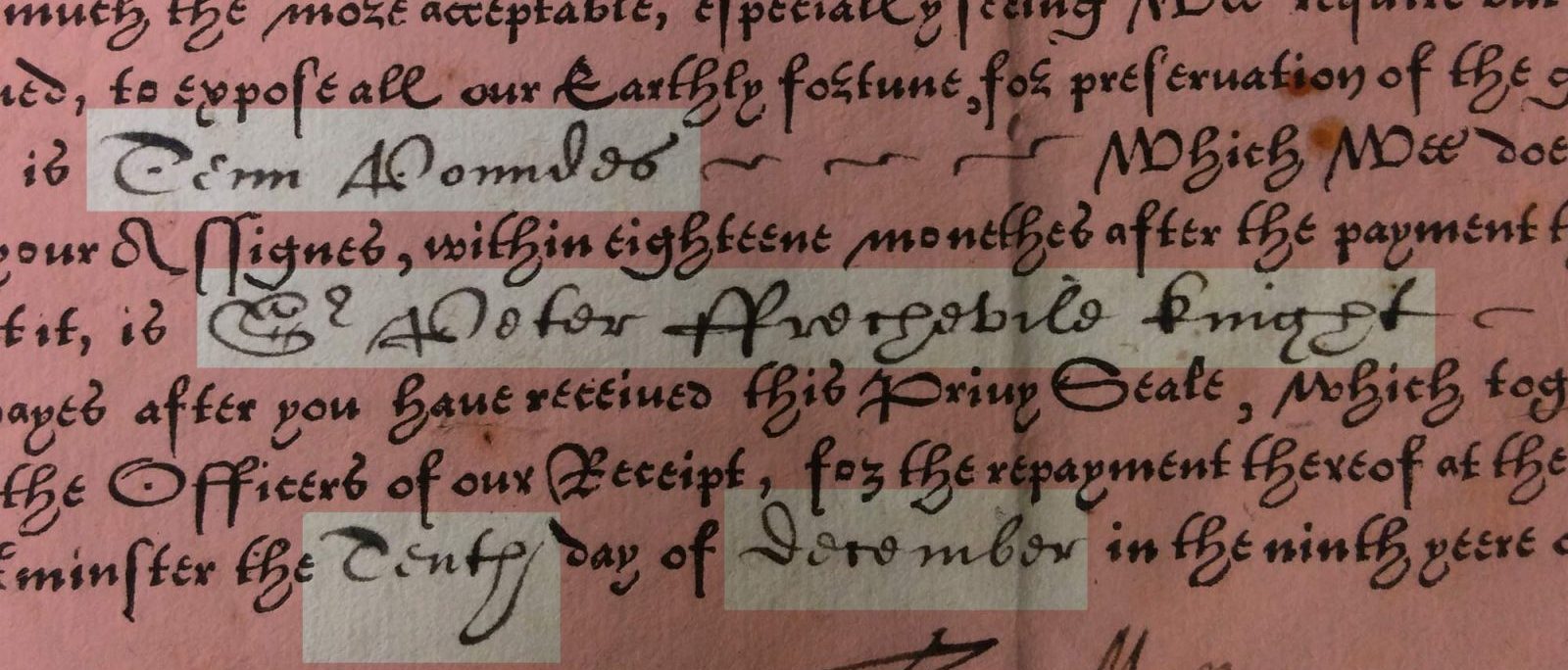
Granjon called his new typeface ‘lettres françaises’. The name Civilité was not used until the eighteenth century, after their early appearance in civilité books, like Erasmus’s La civilité puérile, (‘On Civility in Children’), a young person’s guide to good manners, or etiquette. Interestingly, just to illustrate how Civilité types had come to be associated with such books, I stumbled upon an edition of the same Erasmus book published in 1877 and, although set in Roman, a single line on its title-page is set in Civilité, a late nod to its origins.
Only joking
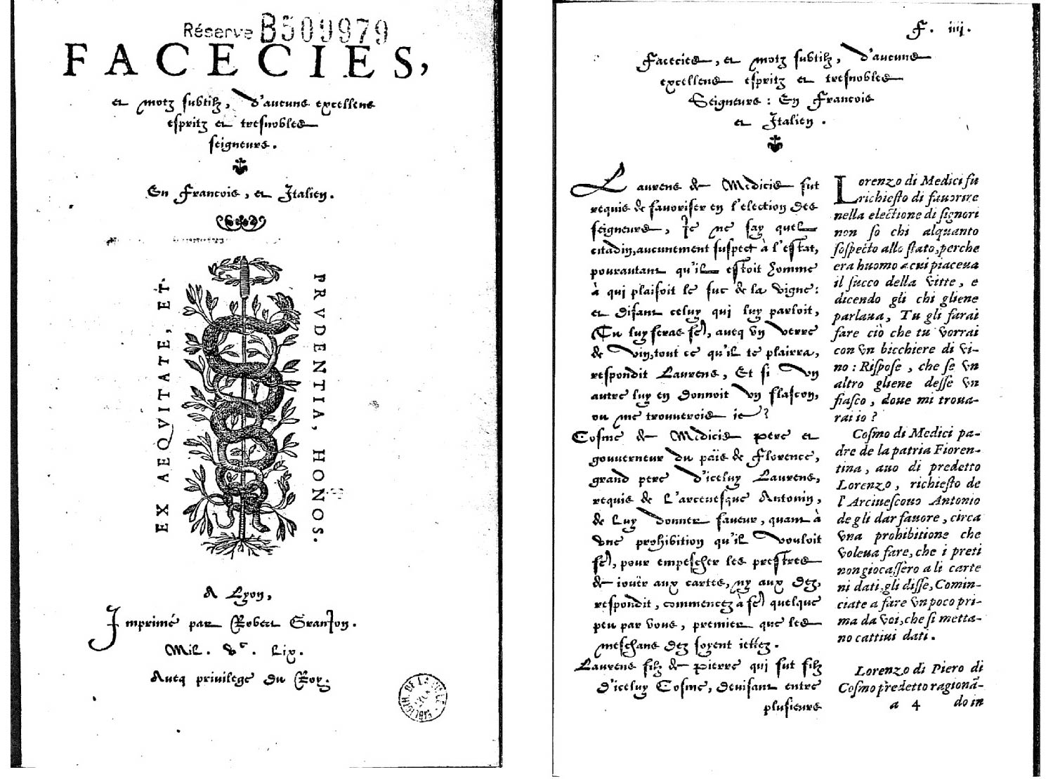
Of the early books set in Civilité types, my favorite is Facecies et motz subtilz, a bilingual, French & Italian, joke-book printed by Granjon in 1559, where his Civilité is used to set the French text, opposite the Italian set in his own Italic type. For two fonts that are roughly equal in (point) size, notice how much wider the Civilité is; a characteristic compounded by its ornate capitals and those distinctive and freakishly wide d, u and v.
Fa-fa-fa-fa-fashion
So why didn’t it catch on? Why aren’t all French books typeset in Civilité? It’s often repeated that it simply has too many sorts (characters), with numerous alternate forms and ligatures, thus making it more expensive and more complex to typeset. Perhaps this contributed to its relative unpopularity but it’s unlikely to have been one of the more significant reasons for its failure. And, although some of the later Civilité types got a little carried away with huge numbers of characters or glyphs, Granjon’s ‘first Civilité had at least 138 sorts, as compared with some 120 usual at the time for Roman or Italic’. (Carter & Vervliet, p. 14)
Another factor to consider in the slow adoption of Civilité is that Granjon, in December 1557, was granted a privilege, a kind of early patent, for his Civilité types, protecting them from copycat or plagiarized designs for a period of ten years. Although that certainly made good financial sense for Granjon, such protections would have stymied its broader adoption. However, Granjon’s Civilité was still copied. As early as 1558, within about a year of Granjon’s Civilité debut, Philippe Danfrié, in Paris, had made his own Civilité (in three sizes!) which he used for a book about court etiquette.
[Granjon] invented and cut these “lettres de civilité”, the ultimate and otherwise vain Gallican reaction to the invasion of “Romans” and “Italics”.
— Vervliet, 2015, p. 191
During the first 50 years of printing, Gothic fonts were used for almost 80% of all fifteenth-century books. But in the subsequent century, Roman and Italic fonts eventually overtook their Gothic or Blackletter counterparts, except in a few Gothic strongholds — notably, in Germany and parts of Northern Europe. Civilité was invented for ideological reasons but failed owing to changing tastes, a mistimed typographical fashion statement, if you like. Civilité was elaborate and Gothic at a time when all-things Gothic were already in decline. ◉
ILT is made possible by the generous sponsorship of Neil Summerour’s Positype, and the support of these fantastic font friends & supporters.
from Hacker News https://ift.tt/2Uj2MmT
No comments:
Post a Comment
Note: Only a member of this blog may post a comment.