 Obligatory Stable Diffusion image
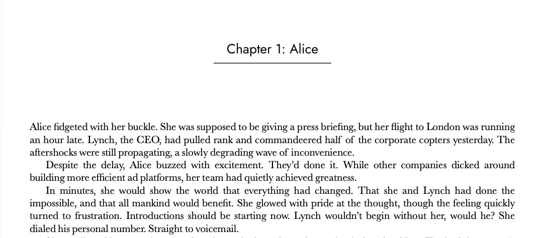
Last year I published my debut technothriller, The Anshar Gambit, as an eBook. Satisfying, yes, but I’ve spent entirely too much of my life peddling bits. I wanted to hold it. Unsurprisingly, in order to get my book printed, I first needed to submit a pixel-perfect PDF of all the pages. And like any self-respecting nerd, I approached the challenge in the most convoluted way possible.
The sane way to do it
As you might expect, laying out a book is a solved problem. The simplest solution is to pay a professional. But I have ample time to learn and limited budget, so I wanted a DIY solution.
Most self-publishers use software explicitly built for this task. Vellum is the gold standard. It is very good and easy to use, and costs just $250. Another contender is Atticus, which is pitched as an all-in-one writing platform for a more affordable $147. These are both good options, and while expensive for software, reasonable for the amount of time they save you. But I am a fool with more time than sense/cents, and I knew I could do it cheaper.
Reedsy offers an online tool that supports generating a basic print layout. And it’s free! That got my attention. I made it as far as uploading my manuscript, but hit a rendering bug displaying Latin Extended-A characters in a code-block. I reported the bug, and a nice CSR told me they’d forward it to their engineering team, who were unlikely to fix it. I decided not to invest more time hacking around their limitations to get a layout I wasn’t thrilled about anyway.
The less sane way to do it
I’m too cheap to hire a professional, but maybe I can use their tools? Adobe InDesign is unsurprisingly a popular choice, but I just hear the word ‘Adobe’ and my hand instinctively reaches back to protect my wallet. In retrospect I might have been able to get away with a one-month subscription for the relative deal of $31.49.
Affinity Publisher makes a well-regarded alternative that people claim is just as powerful. And for $70 you get a real license, none of that subscription BS. I was interested enough to start a free trial, but realized immediately I was in way over my head and had a steep learning curve to climb. If only there was a powerful layout tool I already knew how to use…
The way I did it

I’ve spent a non-trivial amount of my life positioning divs. It is low on my list of tasks I enjoy, but over the years I’ve gotten pretty good at cajoling bits into place. CSS is a hell of a hammer, and the more I thought about it, the more my book started looking like a nail.
That’s right, I decided to lay out a print book using cascading style sheets. You know, like everyone uses on the web. And no one uses in print. Well, almost no one; we’ll get to that later.
I already had my book rendered out as bunch of HTML files from my robust ebook pipeline. Haha, jk, I wrote a few hundred lines of sloppy Python/BeautifulSoup that transforms my FocusWriter-generated odt file into an ePub suitable for distribution. God bless ebookify.py. Anyhow, I was already waist-deep in the HTML swamp, and had something I could slap a stylesheet on.
But CSS isn’t really made for print, right? I mean, sure, like any totally normal person I use @media print to make my HTML resume look better when a recruiter runs off a copy, but laying out a 300+ page novel is a different beast. You’ve got page numbers, persistent headings, special cases for first of a chapter, weird paper-sizing, etc. Can CSS do all this?
Spoiler: Yes. But you have to push it to the bleeding edge.
Getting Started
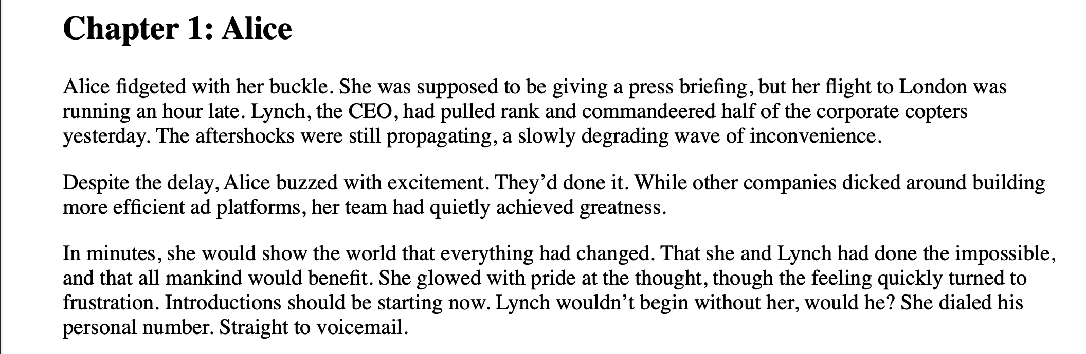
I tweaked ebookify.py to output a single concatenated HTML file containing the markup for all the chapters. My initial goal was to write a stylesheet against this that would make a reasonably good looking book when I hit print in Chrome.
Here’s what I started with:
 LGTM, ship it!
Fonts
CSS is great at sticking fonts on things. As a commercial work though, I needed to pay a little more attention to licensing. I wanted a nice serif font for the body text, and a futuristic sans font for the titles/headers.
Baskerville was an easy pick for the body; it’s a common/modern choice, and the license that comes with my Mac is already good for distribution. I looked up good pairings, saw it next to ‘Futura,’ and fell in love. Then I read Futura’s license.
Licensed (protected) font. This font must not be modified, embedded, or exchanged in any manner without first obtaining permission of the legal owner.
D’oh.
Sure, I could pay the $50, but I’ve already come this far for free – I want to get all the way there. Another trip to professor Google suggested Jost as an alternative to Futura. It’s not as perfect as my first-love, but there’s more to a relationship than just looks. Like licenses (okay, so the metaphor breaks down).
Anyhow, CSS time!
body {
    font-family: "Baskerville";
}

h2 {
    text-align: center;
    font-family: "Jost";
 }
 Better(?)
Basic Layout
It still looks like a web-page, it’s time to apply some print conventions. The chapter headings need some room, and maybe a sweet underline. The body text should be a column, with indented paragraphs. That kind of stuff.
A note on my CSS: Yes, I’m all over the place with my units (Inches! Pixels! Points! Ems!), and there’s no rhyme or reason to the order of my declarations. In my defense: it doesn’t matter. I’m not going to prod with this. No one’s going to be stuck maintaining it. And, god willing, I’ll never have to extend it. But you’re welcome to clean it up for use in your own project.
h2 {
    text-align: center;
    font-family: "Jost";
    margin-top: 1.4in;
    margin-bottom: .9in;
    font-weight: 300;
    display: inline-block;
    /* Pad box to position the "underline" that's rendered using the border */
    padding: 0.1in 0.2in;
    border-bottom: 1px solid;
    line-height: 1em;
    font-size: 15pt;
}

p {
    margin:0;
    text-indent: 1.5em;
    font-size: 12pt;
    line-height: 14.3pt;
    text-align: justify;
    text-justify: inter-word;
    word-spacing: -.7px;
}

p:first-child {
    text-indent: 0;
}

.chapter {
    text-align: left;
}
 Vaguely print-like
Page Numbers
The basic layout is looking okay, but now we’re missing print specific stuff. Page numbers being a big-one, obviously. Dealbreaker for CSS, right?
Wrong!
Check out @page, sucka. CSS knows what pages are! And it can count! And there are special sections on the page margin for sticking things like page numbers. It’s almost like someone was thinking about laying out books with CSS.
Of course, there’s a big difference between “something with a spec” and “something broadly implemented in browsers.” Let’s ask my good friend caniuse
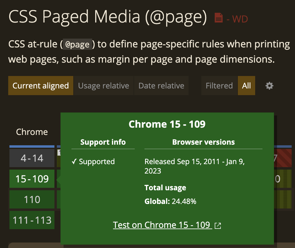 Woohoo! The dark green of full support.
Alright, let’s make some pages and page numbers!
body {
    counter-reset: page_num chap_num;
}

@page {
    margin-top: .7in;
    /* Getting an extra .12 inches padding on the bottom from ?? Whatever, hack! */
    margin-bottom: .58in;
    padding: 0;
    size: 5.5in 8.5in;
    counter-increment: page_num;

    @bottom-center {
        font-family: "Jost";
        font-weight: 300;
        content: counter(page_num);
        font-size: 9pt;
        position: relative;
        margin-top: -.35in;
    }
}
 Umm…
Umm…
It’s the correct size and stuff, but where are my numbers? They’re supported, right? Right? RIGHT??!!?
Oops, there’s a bug. In caniuse, haha. Not Chrome – Chrome has never supported @bottom-center. Ditto goes for Firefox. I cannot use. At least, not all the cool parts.
I took a little solace that Kevin has been feeling my pain for 18 years, but it still stung.
So what now? I’m sunk, right? None of the major browser vendors support the feature I need, and I can’t well have a book without page numbers. But I read through the caniuse bug, and lo:
edgar444 commented on Jul 13, 2018
… [snip some CSS about rendering a header using @top-center]
There is software like weasyprint that did produce the red boxes.
Q: What is a weasyprint?
A: An eldritch invocation for rendering html to pdf that supports a surprising amount of bleeding edge CSS.
I don’t believe in ‘manifesting,’ or whatever. But I’m pretty sure this software didn’t exist until I willed it to. I fired off a brew install weasyprint and crossed my fingers.
One more time with feeling weasing:
 Look at that beautiful page number!
Now we’re off to the races. Let’s marginalia all the things!
One problem though – I want different headers on the left and right pages. Also different left and right margins, since a lot of the paper gets buried in the binding. Surely CSS doesn’t support– aww, you know I’m only messing. CSS DOES ALL.
:root {
    --inside-margin: .75in;
    --outside-margin: .5in;
}

@page :left {
    margin-left: var(--outside-margin);
    margin-right: var(--inside-margin);
    @top-center {
        margin-bottom: -.22in;
        font-family: "Jost";
        font-weight: 300;
        font-size: 9.2pt;
        content: "IAN G. MCDOWELL";
    }
}

@page :right {
    margin-left: var(--inside-margin);
    margin-right: var(--outside-margin);

    @top-center {
        margin-bottom: -.23in;
        font-family: "Jost";
        font-weight: 300;
        font-size: 10pt;
        content: "The Anshar Gambit";
    }
}
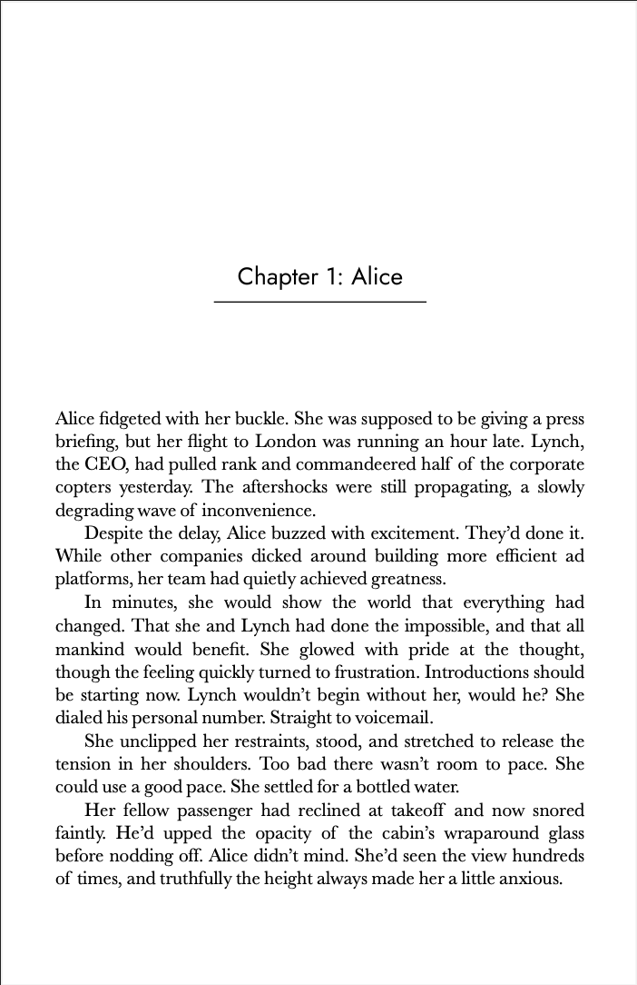
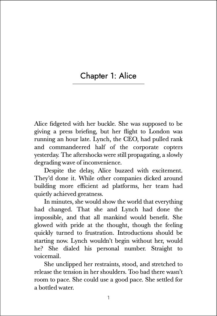
 Headers! This is a book! Wait, what’s that chapter doing there starting mid-page…
More Bookish Things
Anyone that ever word-processed pre-2006 knows that page breaks are a thing. Guess what? CSS breaks pages with the best of them. I’m also going to throw in a sweet custom SVG section break I made.
.chapter {
    break-after: always;
}

.divider {
    text-align: center;
    padding: .2in;
}

.divider img {
    width: 50%;
}
 Tada, chapters start on new pages. Also, look at that sweet mid-chapter break graphic (No, I’m not a designer. Yes, I’m irrationally proud).
But now our header is showing up on the first page of the chapter. That’s not professional. Surely CSS has a way to conditionally hide it?
Actually, no. Not elegantly. At least not that I could find. But I didn’t write CSS for a decade without learning to HACK. We’ll just make our chapter headers exude a giant white box that obliterates everything above them.
h2::before {
    content: '';
    position: absolute;
    /* Need a negative offset as our parent is the non-margin parts of the page. */
    top: -1in;
    left: 0;
    width: 100%;
    height: 2in;
    background-color: white;
}

@page :right {
    ...
    @top-center {
        ...
        z-index: -1;
    }
}

@page :left {
    ...
    @top-center {
        ...
        z-index: -1;
    }
}
 Header be gone!
Conclusion
There you have it: All the formatting of a traditional print book, achieved in the most asinine way possible. I didn’t get CSS to run doom or anything, but I’m still delighted that I made this work using only HTML, CSS, and a little weasy black magic.
It’s even got some advantages; if I change any text, the whole thing automatically reflows. And when I’m ready to send it to the printer, I can dive into the markup to hand-tweak anything that doesn’t look exactly right.
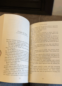
My author copies came in the mail today, and they look like… books! 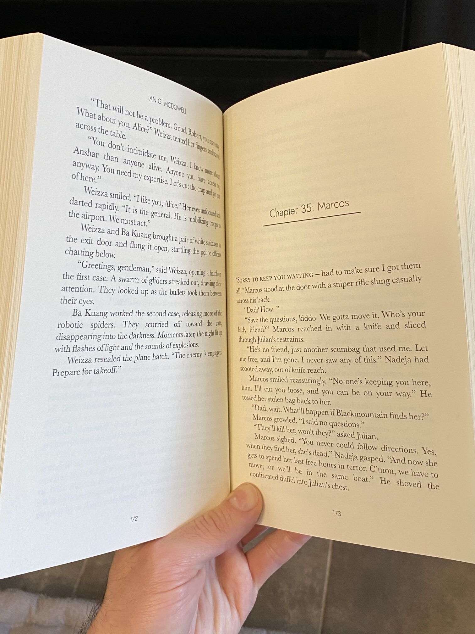 I’m holding HTML!
Total out-of-pocket cost: $0. It’s like Linux: free so long as your time has no value.
 flippity-flip-flip
Would I recommend this approach to a friend? Hell no. Just use Vellum like a normal person. Will I share my stylesheet? I mean, I already kind of did, but if you ask nice I suppose I could give it to you as a file. Hit me up – ian@iangmcdowell.com. I will also listen to your angry CSS rants, though I will not help you fix issues :-)
Anything else?
Pitch time!
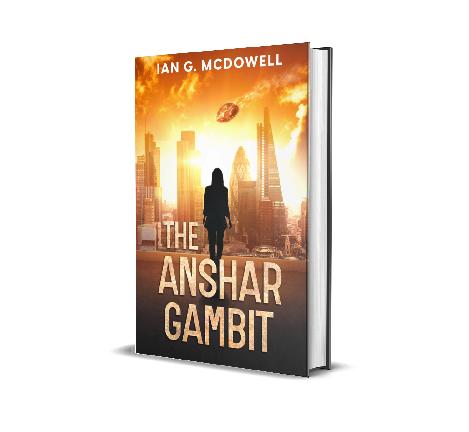
If you like riveting, fast-paced technothrillers with compelling characters, near-future technology, and orbital bombardment, you should check out The Anshar Gambit, available wherever mega-corporation monopolists sell books (read: Amazon). Now in paperback!
Alternatively/additionally, for those of you embracing the frugal spirit of this post, you can sign up for my mailing list to receive a free digital copy of the prequel novella, The Boreas Gap.
from Hacker News https://ift.tt/PcwAmdD
No comments:
Post a Comment
Note: Only a member of this blog may post a comment.