The UX of LEGO Interface Panels
August 2020
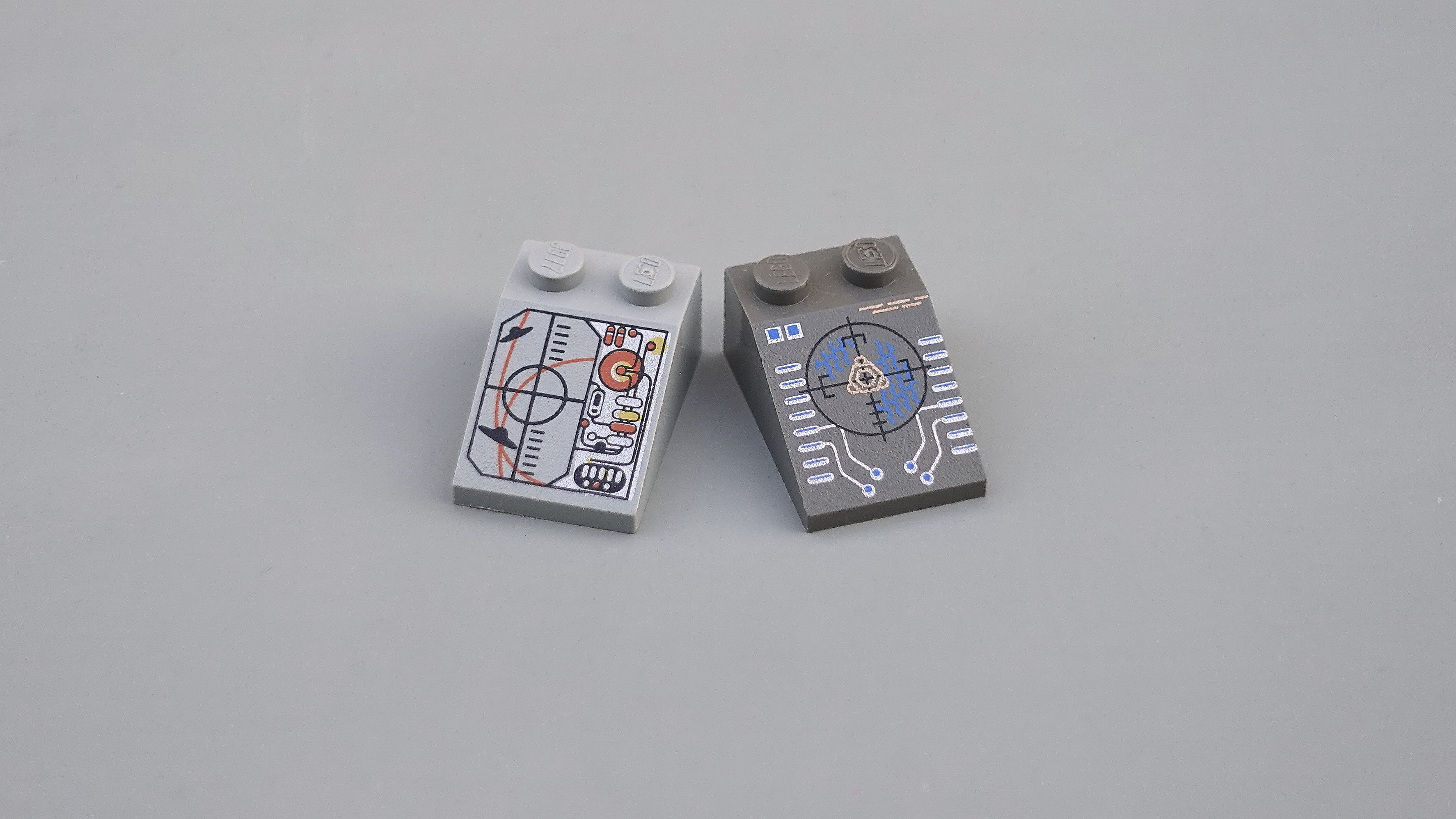
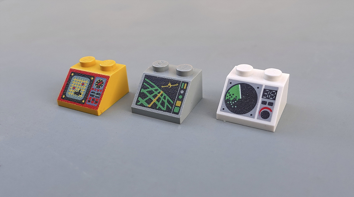
Piloting an ocean exploration ship or Martian research shuttle is serious business. Let's hope the control panel is up to scratch. Two studs wide and angled at 45°, the ubiquitous "2x2 decorated slope" is a LEGO minifigure's interface to the world.
These iconic, low-resolution designs are the perfect tool to learn the basics of physical interface design. Armed with 52 different bricks, let's see what they can teach us about the design, layout and organisation of complex interfaces.
Welcome to the world of LEGO UX design.
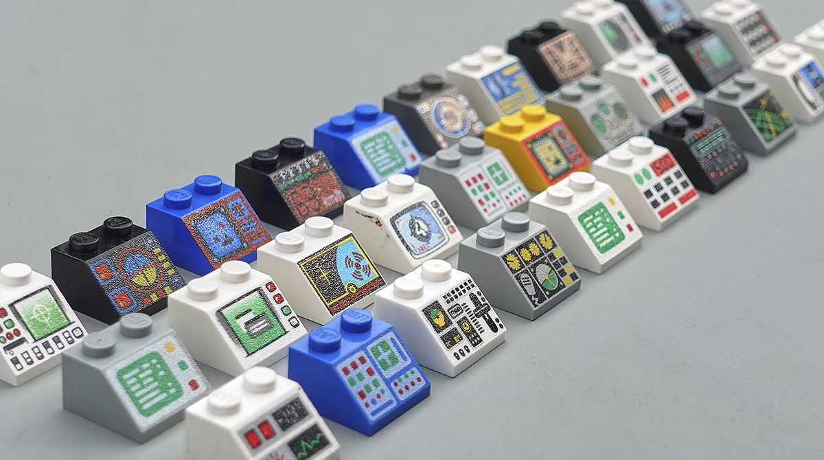
Organised chaos
At a glance, the variety of these designs can be overwhelming, but it's clear that some of these interfaces look far more chaotic than others. Most interfaces in our world contain a blend of digital screens and analog inputs like switches and dials. These LEGO panels are no different.
Plotting the panels across these two axes reveals a few different clusters. Screens with an accompanying row of buttons sit in the top left. A small cluster of very organised switch panels lies to the far right. The centre bottom is occupied by some wild concepts that are hard to understand, even after several glances.

Designing a complex machine interface is a juggling act of many different factors from ergonomics to engineering. But we can break down the problem into two key questions:
- How can we differentiate between the function of different inputs?
- How can we organise the many inputs and outputs so that we understand how they relate to each other?
Let's take a deeper look at tackling these two challenges in LEGO.
Differentiating inputs
What could cause 400 WWII pilots to raise the landing gear on their B-17 bomber just before touchdown? Catastrophic pilot error, or something more fundamental?
It was the psychologist Alphonsis Chapanis who first suggested that the high rate of crash landings might be the fault of poor interface design. The adjacent landing gear and flap control knobs were identically shaped. The pilots never stood a chance.
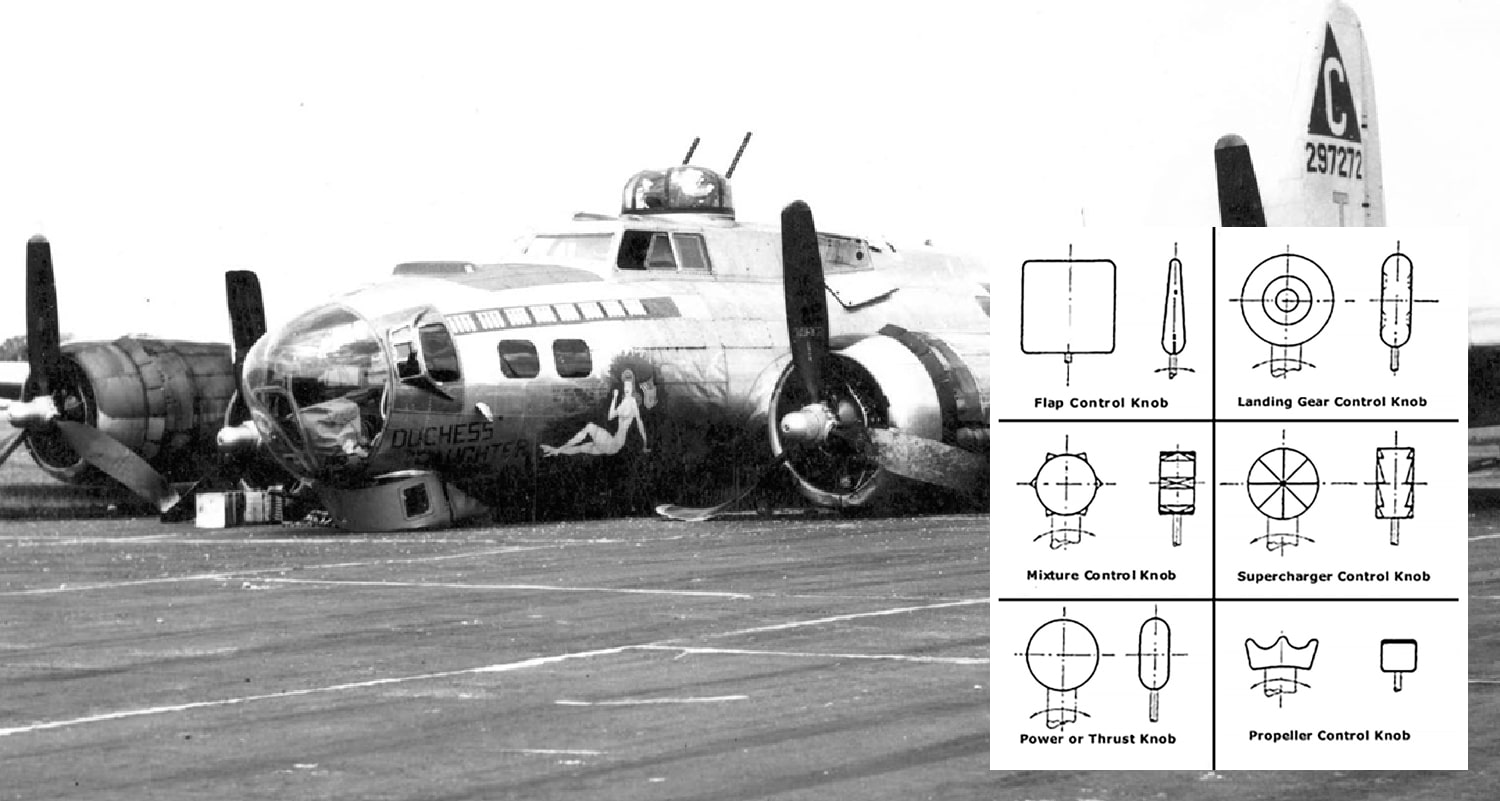
His temporary solution was to glue differently shaped strips of rubber to each switch, enabling blind operation by touch alone. This gave rise to the idea of shape coding and a system of differentiation still being followed in aircraft cockpits today.
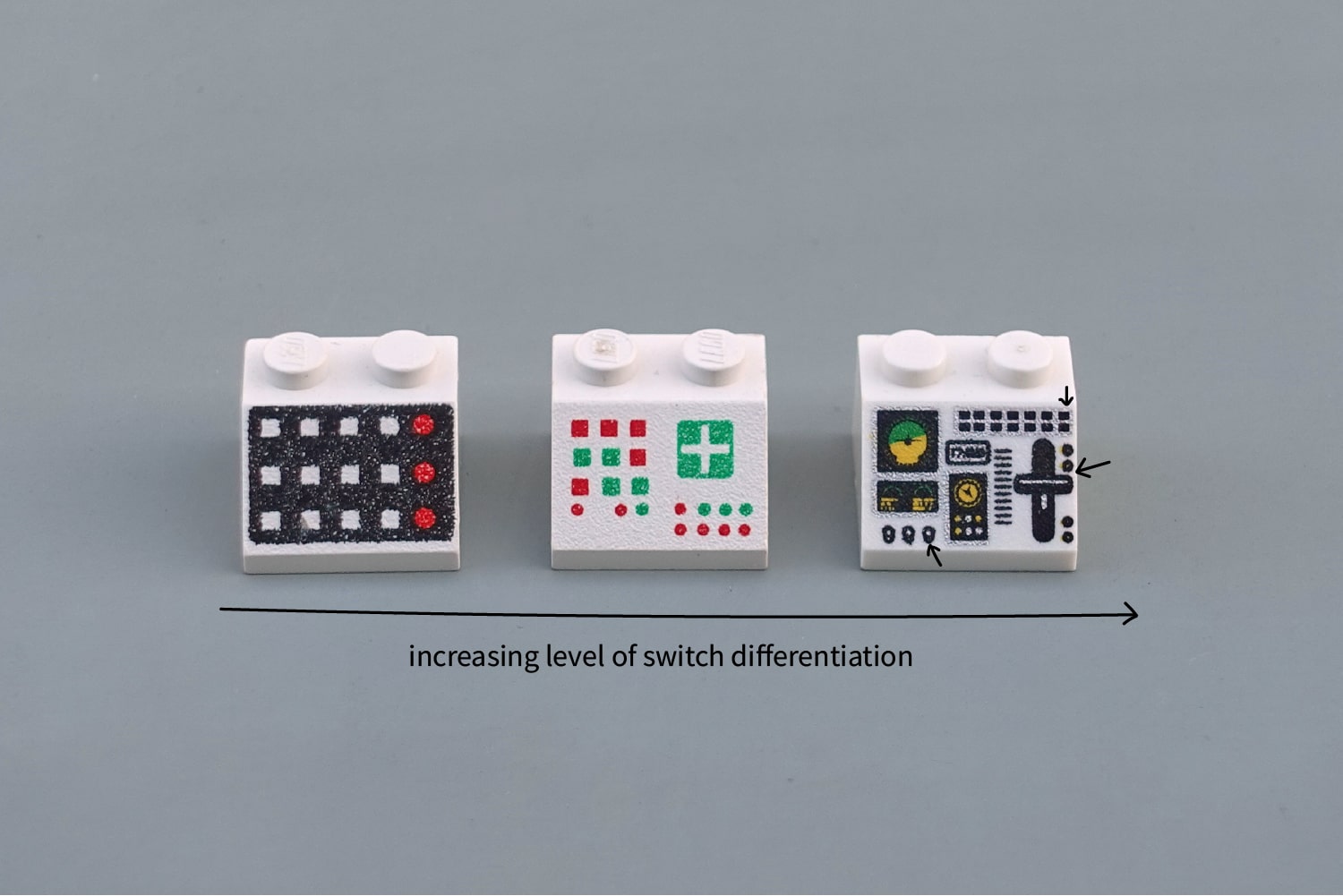
We can compare the three interfaces below to see this in action. Ignore the overall layout, it's the differences between individual switches that matter here. Imagine trying to feel for one of these buttons without looking. The left panel ("Slope 45 2 x 2 with 12 Buttons") would require careful hand-eye co-ordination. The right panel ("Aircraft Multiple Flight Controls") clearly distinguishes between the throttle (large, linear vertical movement), toggle switches (round vertical flick) and the push buttons (square push-in).
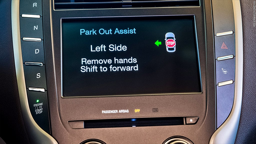
Differentiation like this is a still a very real problem today. In 2015, Ford recalled 13,500 Lincoln SUVs because drivers speeding down the motorway were mistakenly shutting off the engine when they tried to activate sport mode. See if you can spot why:
Shape coding is one approach to differentiation, but there are many others. Colour coding is perhaps the only one to break into our everyday vocabulary, but we can add four more: size, texture, position and operation coding. Together these six are our allies in the design of error-proof interfaces.
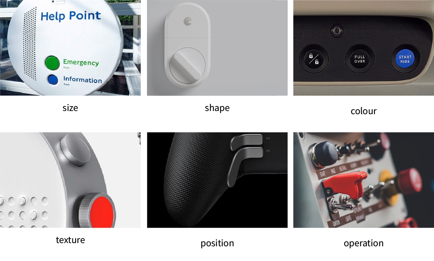
Size, shape and colour-coding are the fundamentals: quick-wins that can fix a lot of interface problems. Texture is also a great differentiator for blind operation, particularly on small dials requiring precise control.
Position-coding is seemingly straightforward but is often under used. Products with a clear default ergonomic position (like binoculars or a gaming console) can exploit the natural position of the hand to differentiate between primary and secondary actions.
Finally, operation-coding ascribes different types of movements (like a twist or vertical slide) to different inputs. This can be immensely powerful when the switch motion reinforces the operation behind it, e.g. a crane lever which raises the crane when the lever is raised.
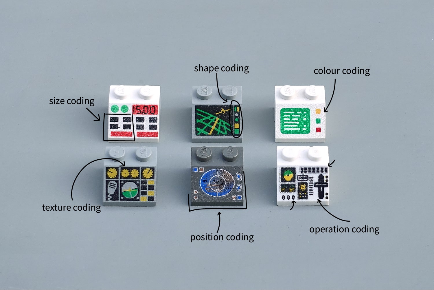
Differentiation is a good first step that will avoid confusion between adjacent switches. But its only with organisation that we can create a clear and accurate mental model of the interface for the user.
Organising inputs
Compare the three panels below. Identical layouts, but the blue one is much clearer than the white. This is the gestalt principles at work, identifying related items with a common region.
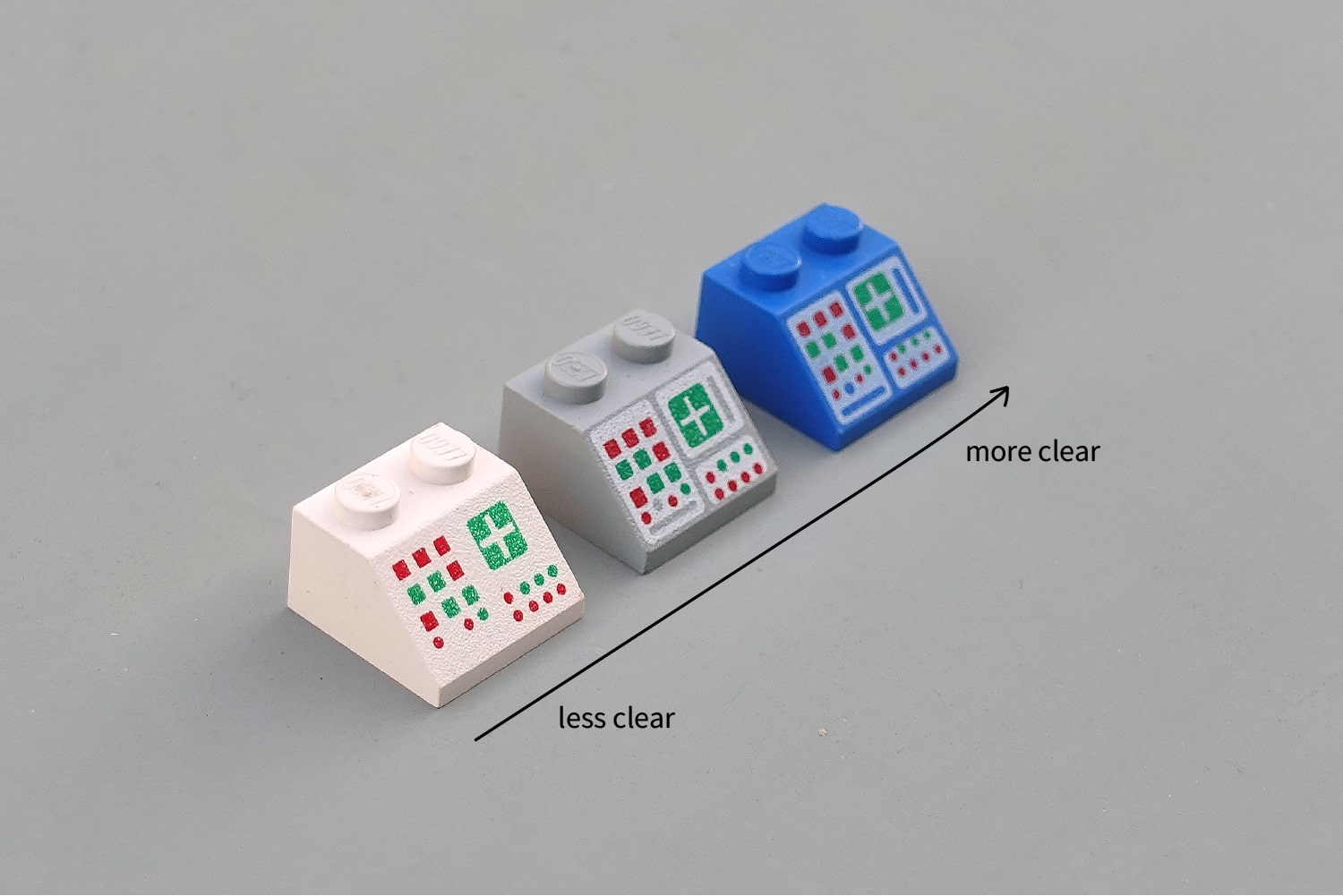
Easy. But how are you going to decide which inputs to cluster together?
I like to use Soviet control panels as a starting point. These beautiful walls of nonsensical dials and levers are brought to life when arranged in a giant factory schematic. It would be hard to find a more literal organisation of the information.

These panels are what I'd called a consolidated interface. Every piece of input and feedback has been moved onto the same panel. This is the approach that Dyson took with their car. Now imagine the opposite, moving each of those lights and switches to the actual location of that valve in the factory. Sounds ludicrous, but these air vents in the Audi TT show that this distributed approach can also be a great win for user experience. I wrote a lot more about these distributed interfaces last year.
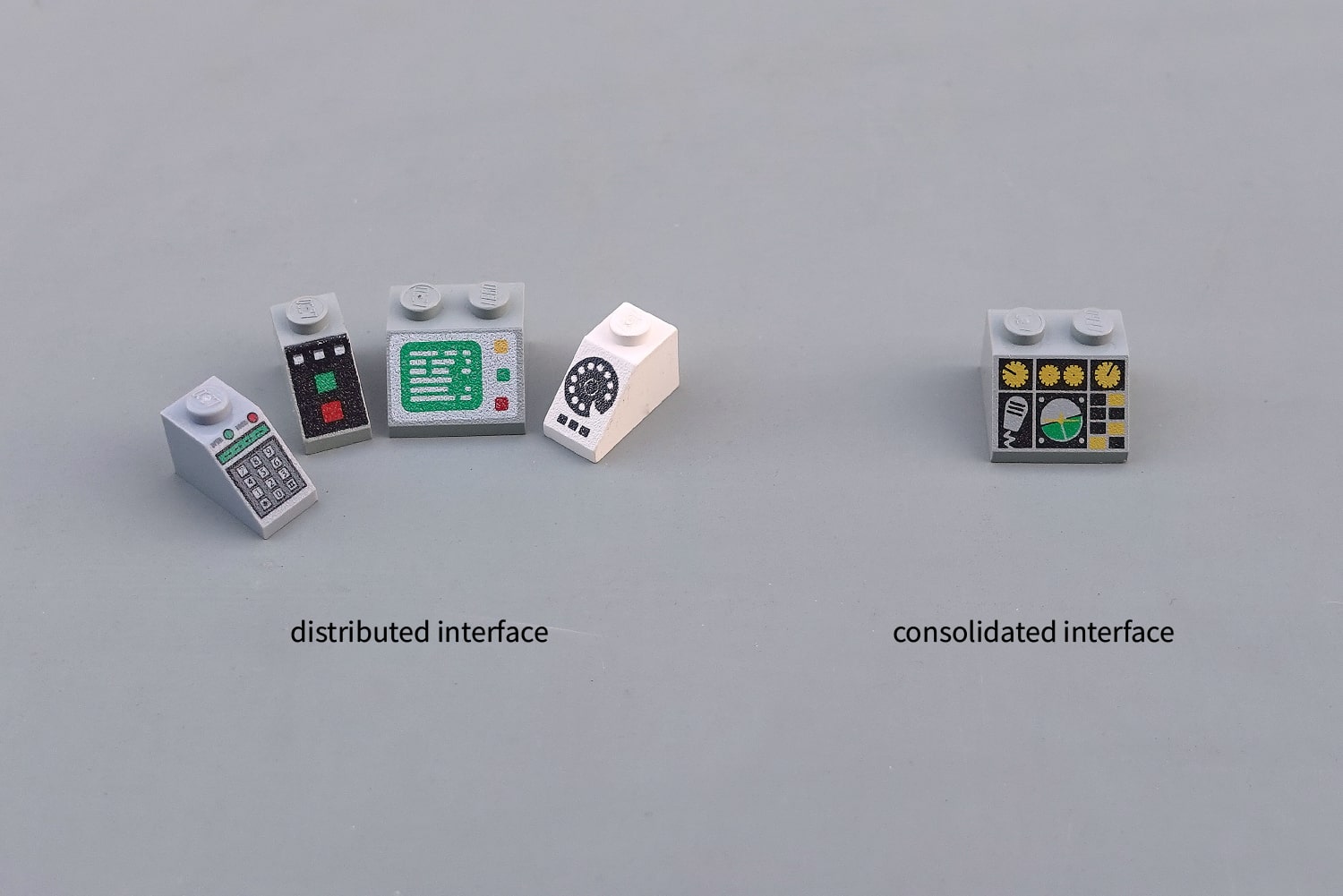
Back to the Soviet factories. Those interface panels were great for answering the question "does this valve let water into tank Б?". But they're very poor for answering "are all water valves closed?" or "where are all the switches I need to prepare for the shift changeover?".
LEGO use the Soviet schematic approach for their fantasy orientated designs, because schematics are superb at providing a mental model of the inner workings of an alien system. However for everyday use, there are some other approaches that work better.
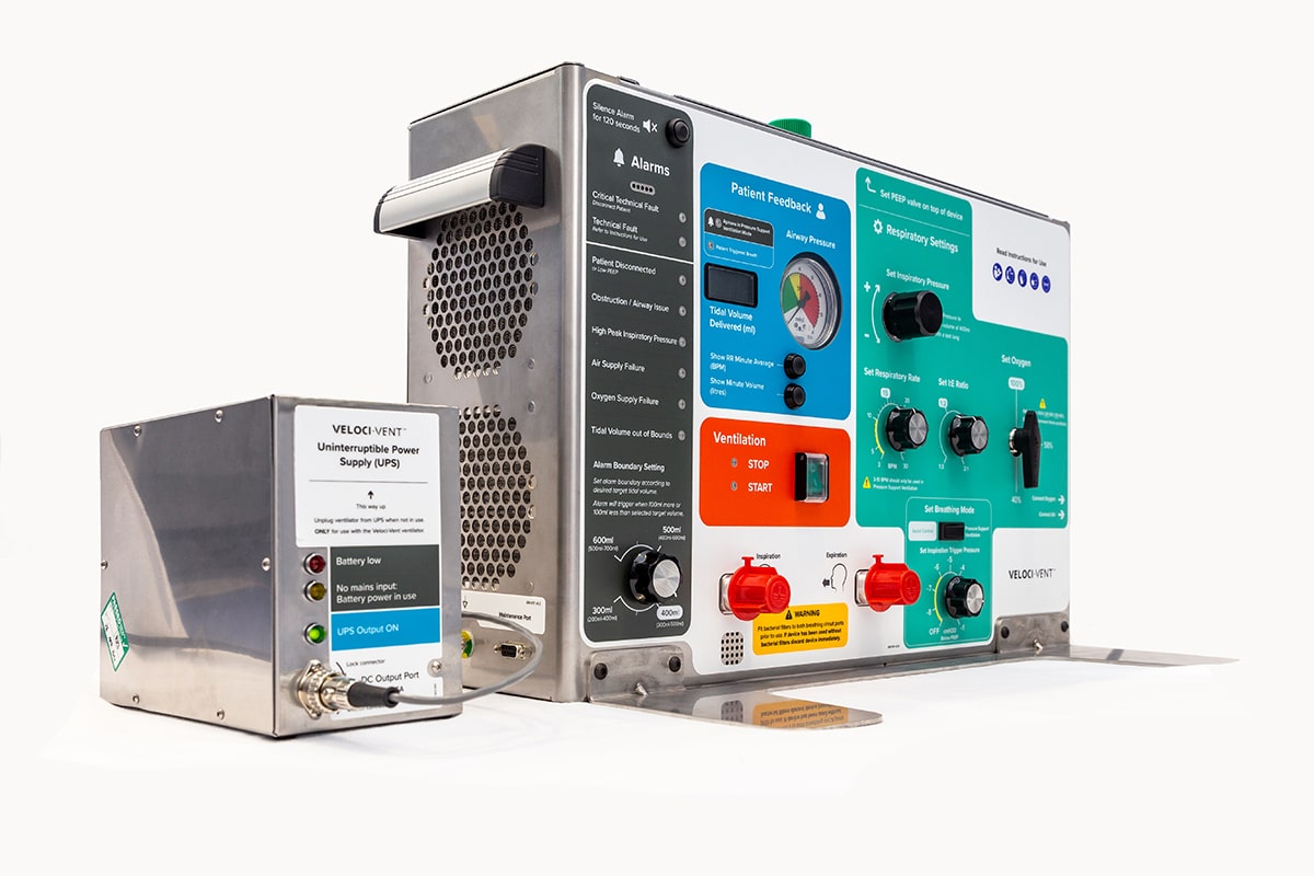
Feature based organisation is the most common, perhaps even the "default" design philosophy. Group together all the inputs and outputs for each product feature. This COVID-19 ventilator from Cambridge Consultants is a wonderful example but we also see this a lot in cars, with a cluster of switches for the airflow control and all of the lights on one control stick.
Organising by operation means putting all the switches that function in a certain way in the same place. I've no idea what all the valves in the picture below do, but I bet they don't all open things that relate to each other. Anytime you see a row of switches that look and function the same, but control disparate parts of the system, you've come across organisation by operation.

Today most interfaces are effectively fly-by-wire, but historically the levers that you pulled in, say, a tractor cabin would literally move the hydraulic pistons beneath the seat to a new position. Routing all these different electrical, mechanical and hydraulic systems efficiently can severely compromise your interface clustering, leading to organisation by technology.
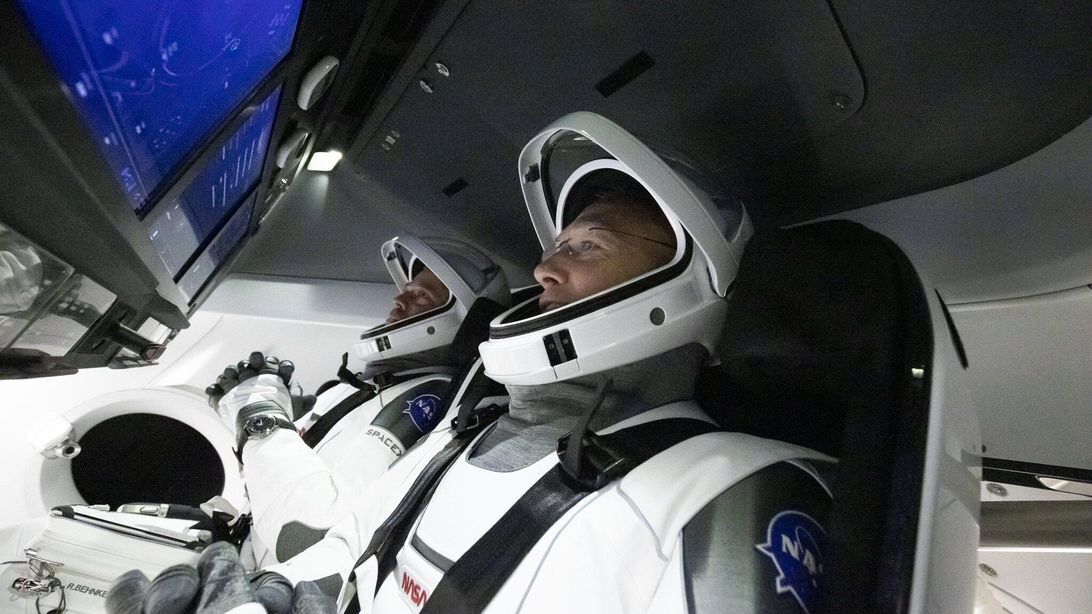
The modern equivalent of this is surprisingly common. Any touchscreen with buttons by the side exhibits this technology-based split. In a future world, SpaceX might embed these physical controls right inside the screen next to the information they affect, but for now they sit awkwardly by the side as if nothing is wrong.
In LEGO we find the feature based organisation in the "Monitor with -19° pattern". Two clear clusters, perhaps one for temperature control and another for vital signs monitoring. In the second panel below, I don't know what all those switches do, but they seem to be clustered based on their operation, not because of what they will operate.
There are many LEGO panels with a technology split like the SpaceX Dragon capsule, but I like to imagine that this early 90s police control unit was forced to divide the audio and video playback because the newer tape reel technology was incompatible with the older analog phone line system. This is organisation by technology in action.
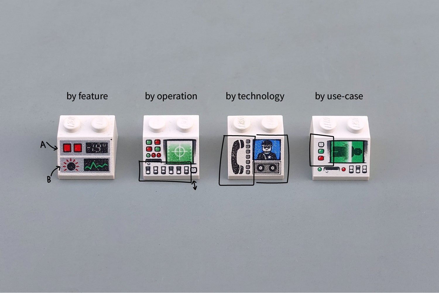
All of our approaches so far: organisation by features, operation or technology, have been grounded in properties of the system, not of the user. Organisation by use-case is the antidote to this, a clustering based on the daily routines and tasks of the user.
Imagine arriving for work each day at the LEGO body scanner factory. Grouping the switches by task (prepare machine, load body, process scan...) would mean splitting up the radiation and scanner buttons into many different regions. More complex for the computer, but more streamlined for the operator. As the designer, only you and your users will be the judge of what works best.
But George, which is the best interface?
I often say there's no such thing as the best interface, but there are plenty of examples of the worst interface.
However I do have three favourites. Beautiful, visual layouts with clearly differentiated inputs and simple, clean organisation. I'd be proud to sit behind the console of any of them.
from Hacker News https://ift.tt/3fC7IyQ
No comments:
Post a Comment
Note: Only a member of this blog may post a comment.