One of the Government Digital Service’s (GDS) priorities for the next 5 years is making sure that GOV.UK remains reliable, accurate and continues to meet user needs.
That’s why we’re always looking to improve the navigation on GOV.UK.
GOV.UK is a big site. It’s made up of more than half a million pages, and in 2021 has averaged 17.8 million users a week. This scale of the site, and the huge range of user needs, means ensuring people can find what they’re looking for is one of the most important things we do.
This isn’t a new or unique challenge for GOV.UK. All large websites constantly need to look at the findability of their content to reflect new technologies and their users’ habits.
There are lots of different strands to our work in this area; recently we’ve improved how GOV.UK information appears in search engine results, trained an algorithm to provide useful related links and made the mobile experience of the site better.
As part of this work on findability, we’ve been looking at how we can improve browsing on GOV.UK. By ‘browsing’ we mean when a user clicks through GOV.UK using menus, topic pages and links.
This is a blog post about why we focused on this, what we learned, and how we’re going to make it easier for users to find what they need from government.
Our discovery
At the start of last year before the coronavirus (COVID-19) pandemic, a small team on GOV.UK ran a discovery to understand how the site’s navigation might be improved.
We decided to look in-depth at this area because the way most users browse the site has remained largely unchanged since 2014. Our main navigation elements - our homepage, topic pages and menu bar - have only had minor iterations in this time.
What we learned
Our first step was to validate whether browse navigation was the right area for us to be focusing. We found that while most users start from a search engine, around 15% use topic pages to navigate.
Looking closely at these browse journeys we found a number of specific problems to address.
1. A confusing information architecture
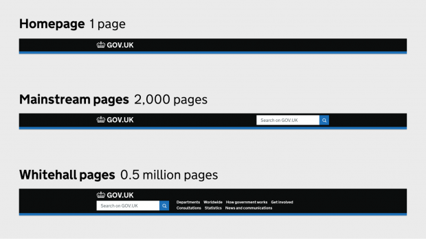
We have 3 different kinds of topic page on GOV.UK. These are pages designed to list the information and services the government provides in a particular area.
This triple-system, which has substantial duplication, causes confusion for users who can easily find themselves in the wrong part of the site for their needs.
It also makes things difficult for publishers, the civil servants who write the content on GOV.UK. They currently need to tag their content to multiple topics, and to multiple topic systems, without a clear indication of how this tagging affects where their content will appear.
2. We need to improve how our navigation works on smaller screens
The devices used to browse GOV.UK have changed a lot since 2014, with most of our traffic now coming from smartphones. Our work on coronavirus navigation exemplified the value of a mobile-first approach to design, and we know there’s potential to improve GOV.UK’s mobile experience sitewide.
3. Navigation feels overwhelming for some, limited for others
In our user research sessions some people told us they felt lost on GOV.UK, overwhelmed by the volume of content and number of options available to them. Equally, users looking for specialist content struggled to find this using GOV.UK’s primary navigation system.
What happened next
The discovery work wrapped up in February 2020, and then the team pivoted to help with the coronavirus response. This meant we could apply some of this early thinking to gov.uk/coronavirus, which was designed to be mobile-first, and used expanding sections and carefully curated content lists to avoid overwhelming users.
One year later, with the GOV.UK team growing, we’re excited to have sitewide navigation on the roadmap again, applying the lessons we learned during the pandemic.
We’ve now been able to move into the Alpha phase of this work, building prototypes to test out ideas for how to solve these problems.
Ideas we’re testing
We’ve still got more research to do, but wanted to share some of the ideas we’re working on that are looking promising.
1. A consistent sitewide menu bar
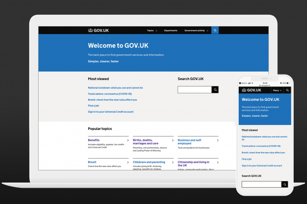
GOV.UK today
 Our prototype
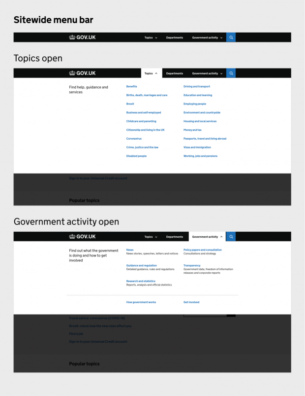
Currently GOV.UK has 3 different menu bars depending on what kind of page you are on. In our prototype we’re testing a simpler but more versatile ‘megamenu’ pattern that would provide consistent navigation on every page of the site. This would provide clear routes to browse by topic, department or content type.
2. A unified topic system
We’re in the early stages of thinking about how we might bring together mainstream topics, specialist topics and the taxonomy into a single tagging system. We’re keen to provide a system that’s easier for users to navigate, and for publishers to tag to.
There are no plans to change the ownership of these topics, but our research findings suggest that aligning and de-duplicating these systems will provide a better experience for users.
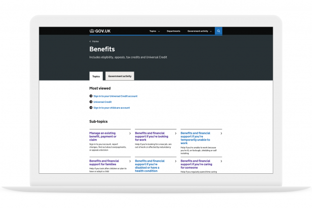
3. An improved topic template
Drawing on the insights from the coronavirus and Brexit landing pages, we’ve redesigned GOV.UK’s topic page template, the underlying page design for every topic on the site
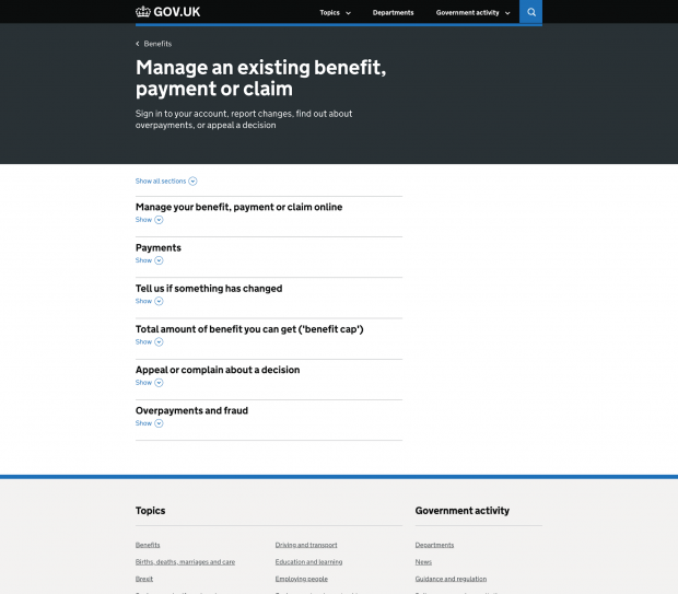
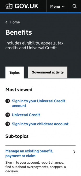
The new template groups sub-topics into a grid, and the categories below into expanding sections called accordions. The aim here is to provide simple, clear navigational paths without overwhelming users with options.
Topic page
Sub-topic page
 Another new idea we’ve been exploring is providing 2 tabs on each topic page.
The first tab labelled ‘Topics’ provides a curated view of content to help users get to guidance and services quickly and without distraction. The second tab (shown below) enables users, for the first time, to find things like the policy documents and statistics relating to that same topic.
Our hypothesis is that the simple curated view will provide speed and simplicity for most user journeys, while the second tab will provide routes to greater depth for those who need it.
Government activity tab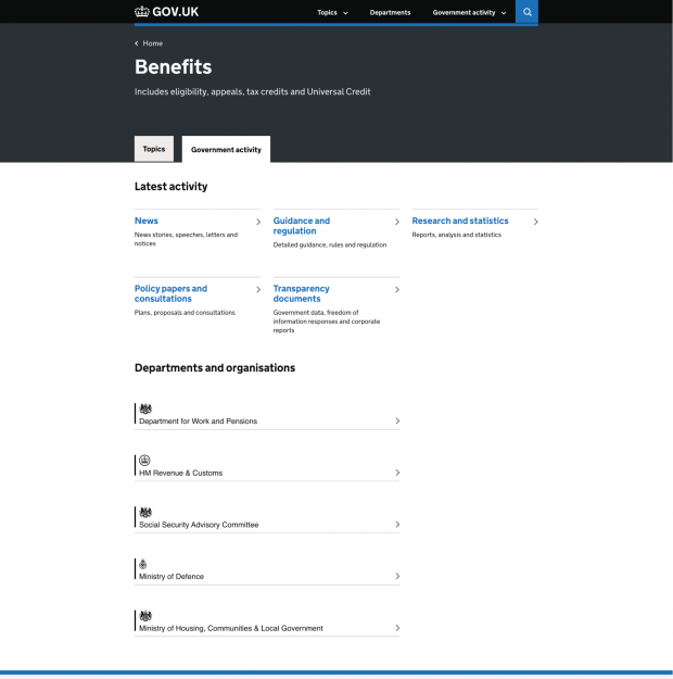
4. Mobile-optimised components
We’ve been working closely with the GOV.UK Design System team to test new designs for a number of GOV.UK components including topic links and accordions. With mobile and tablet users in mind, these new designs significantly increase the size of the tappable area around links, making interactions easier and more accessible.
Our next steps
This work is currently in alpha phase, which means we’re evolving it rapidly based on findings from multiple rounds of research.
Once we’re comfortable that this system of new elements is accessible and working well for users, we’ll move into beta phase. This would involve an incremental rollout of these new elements across the site. We’re likely to do this using A/B tests to assess whether the improvements we’re seeing in research are replicated at site-scale, building in time to iterate as we go.
We know any information architecture changes we make could impact the way that departments curate and tag content. We’re committed to working closely with departmental content teams should any changes be needed, and ensuring these don’t add to their workload. For this reason, any changes we make need to represent a simplification of the content tagging and topic curation process, as well as an improvement to user experience.
from Hacker News https://ift.tt/33OTNyd
No comments:
Post a Comment
Note: Only a member of this blog may post a comment.