Lesser Known Coding Fonts
17 Oct 2019In the past few months, I’ve become interested—fascinated even—by programming fonts. As programmers we look at text all day: code, logs, command outputs, monitoring tools, etc. If we’re going to be looking at text all day, we might as well make it easy and pleasant for our eyes to read that text.
One great place to see the fonts used by other people is at /r/unixporn. I have not conducted a thorough survey, but from my observations it seems that, currently, the most popular font for the ricers of /r/unixporn is Hack. As we might expect, many use the built-in system fonts: DejaVu Sans Mono and Ubuntu Mono for Linux; Monaco, Menlo, and SF Mono on macOS. High-quality open source fonts are also very well represented: Fira Code, Inconsolata, Iosevka, Noto, Roboto Mono, and Source Code Pro.
In this post, I want to show five fonts that I don’t see as often on /r/unixporn, but which I believe deserve to be better known. (Edit: ironically enough, this post cannot be posted on /r/unixporn, because they don’t accept content that isn’t screenshots, photos, or videos.)
APL385 Unicode
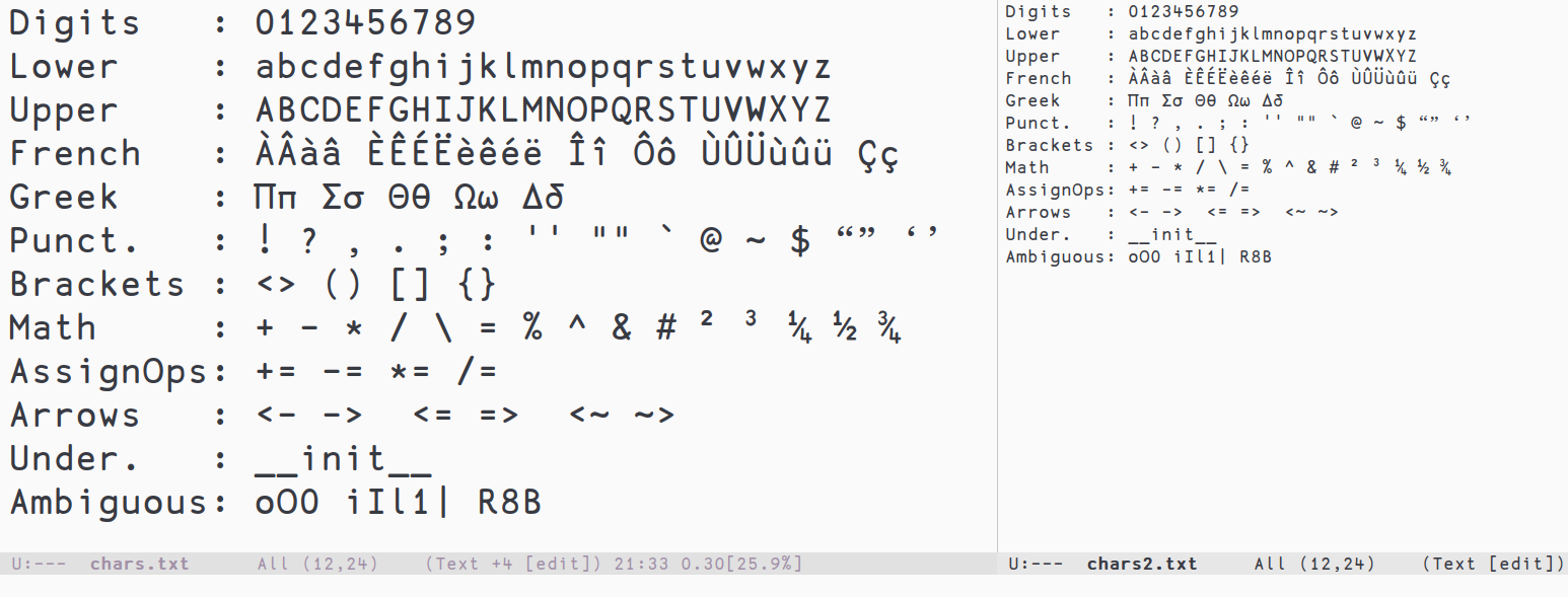
The first font I want to suggest is APL385 Unicode. APL is a programming language where operations are denoted with operators. In order to make APL code more readable, APL385 has generous spacing between lines and between characters. The terminators (the end of strokes) are rounded which gives the font a fun, whimsical look.
(Click on the image to zoom)
As a programming font, the majority of characters are easy to distinguish, however the lack of slashed or dotted zero can cause confusion with the uppercase Oh. APL385 does not support Powerline glyphs, and there isn’t a patched version like there exists for other fonts.
One thing to note, at least on Linux: at smaller font sizes, the hinting is very bad and the font looks very jaggy. Not recommended if you like very small font sizes.
| Homepage | http://apl385.com/fonts/ |
|---|---|
| License | Public domain |
| Glyph count | 769 |
| Weights | Regular |
| Italics? | No |
| Ligatures? | No |
| Customizable? | No |
Go Mono
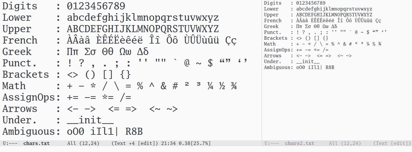
Go Mono is one of the typeface in the Go type family. These fonts were created by the professional firm Bigelow & Holmes, and released under the BSD license. Go Mono is the only serif font in this list. (Serifs are the little “legs” at the end of some strokes.)
(Click on the image to zoom)
Like most programming fonts, all the characters are easy to distinguish, though I will point out the lack of spacing between consecutive underscores; this can be annoying to people who code in languages like Python where the double-underscore is used quite often. Go Mono is easy to read at very small sizes: even with my aging eyes, it’s not difficult for me to make out words at 8 points (although I recommend using a larger font size!) Like the majority of coding fonts, Go Mono comes in two weights, regular and bold, and it has an italic version.
As the name suggests, Go Mono is monospaced; the proportional typeface of the family, Go, is actually serviceable as a coding font. Typically, proportional fonts such as Times or Helvetica suck as coding fonts, but Go makes all characters distinguishable. If you want to try something different, you may want to try coding with a proportional font.
Sudo
Sudo is the work of one programmer, Jens Kutílek, who decided to create his own coding font in 2009 and is still actively developing it.
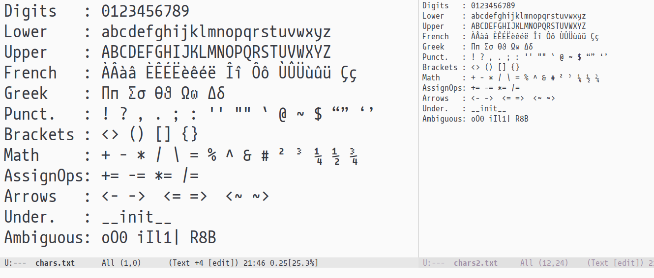
(Click on the image to zoom)
Sudo is a narrow font, so if you like having two or three side-by-side splits in your text editor, Sudo is a good choice. All the characters in Sudo are easy to distinguish, and there is a gap between consecutive underscores. One characteristic of Sudo is the height of digits: they are a bit shorter than capital letters; this helps to further disambiguate, say, the digit one and the letter el.
Sudo has a variable font download option, i.e., a single font file that contains the regular, bold, and italic glyphs. This reduces network transfers if you want to use Sudo on your website.
One thing you’ll note about Sudo is that some characters (e.g., the superscript 3 or the lowercase theta) are very pixelated. This is due to the way the font designer works: he creates a pixel version first, then he draws the curves. The pixelated characters are the characters he hasn’t yet gotten around to drawing.
Monoid
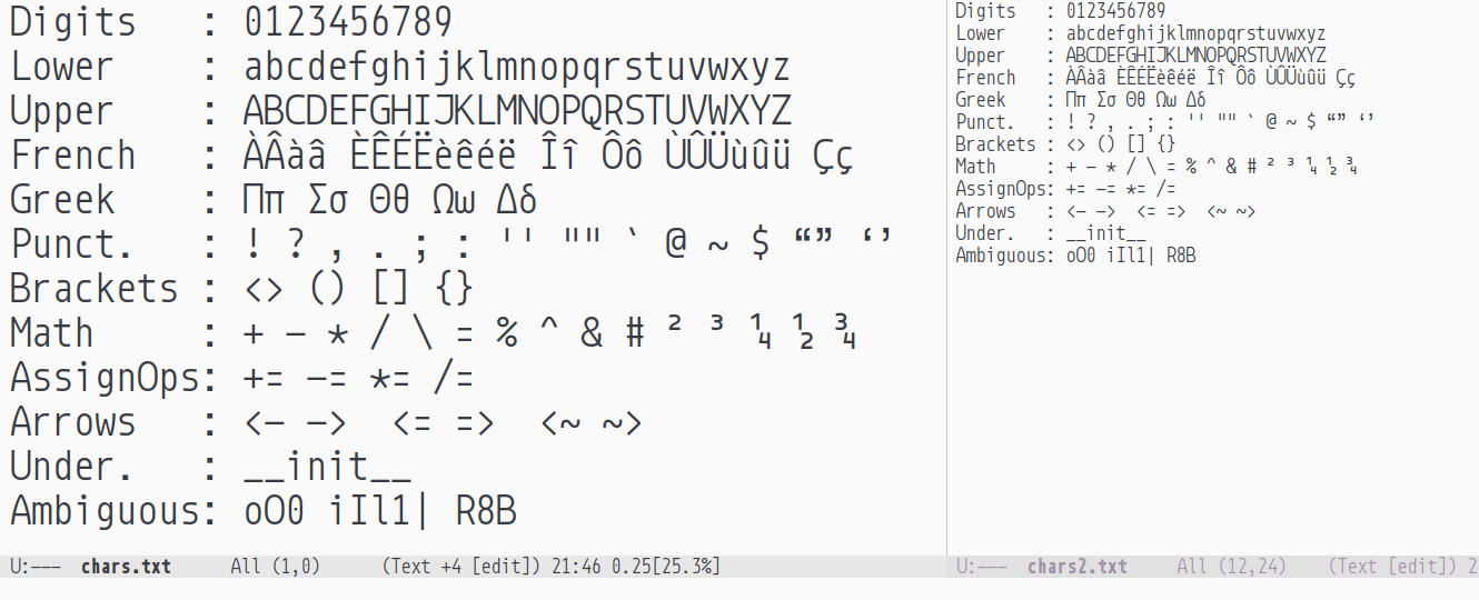
Like Sudo, Monoid is another coding font that was developed by a programmer, Andreas Larsen. Monoid’s number one goal is extreme readability, especially at smaller font sizes and its look reminds of bit-mapped fonts.
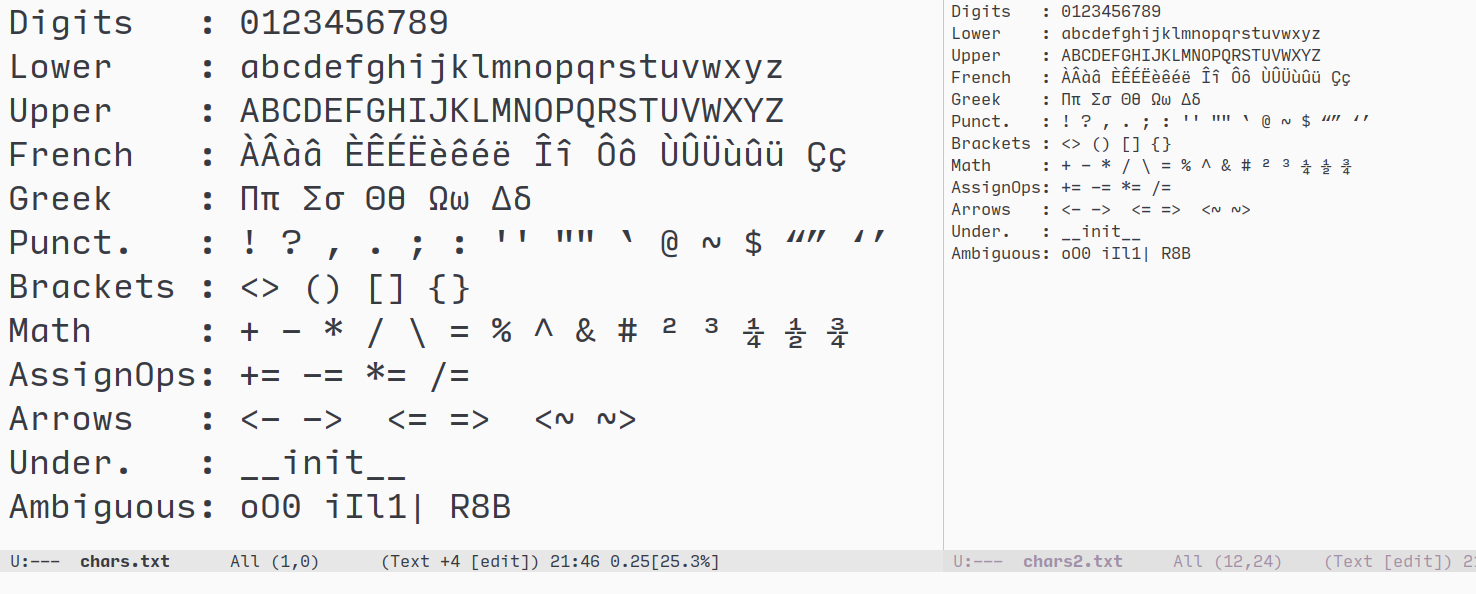
(Click on the image to zoom. Note: this is my own customized version of Monoid. The characters 01l$ might look different for you.)
All the characters in Monoid are easy to distinguish. While researching Monoid, I learned that they made an effort to distinguish the Cyrillic letter Ze (З) and the number three (3) by giving three a flat-top. The characters 01l$ can be customized before download; you can also adjust the line spacing and the tracking—the spacing between characters. Monoid is the only font in this list to feature programming ligatures, and these can be turned off if you don’t like them.
The creator of Monoid gave a talk about the language; the audio quality is not great, but you can learn a lot from this presentation.
| Homepage | https://larsenwork.com/monoid/ |
|---|---|
| License | MIT + OFL |
| Glyph count | 618 |
| Weights | Regular, Bold |
| Italics? | Yes |
| Ligatures? | Yes (optional) |
| Customizable? | Yes |
Input Mono
The last language in our list is Input Mono, a font for programmers by professional font designer Jonathan David Ross. Unlike the other fonts in this list, Input Mono is not open source: it is free for private use, but if you wish to use it on your website or in a print publication, you must purchase a license.
(Click on the image to zoom. Note: this is my own customized version of Input; the characters 0agil{*} might look different for you.)
All the characters in Input are easy to distinguish and it comes with Powerline support out of the box. At the download screen, you can customize Input: you can choose your shape of choice for the characters 0agil{*} and you can increase or decrease the line spacing.
Input Mono is part of a massive font family. In addition to the monospaced variant, there is a sans-serif proportional variant and a serif proportional variant. Though they aren’t monospaced, they are designed with programmers in mind. Then, each of the three variants comes in three widths: regular, narrow, and condensed. If you’d like for Input to be as slim as Sudo, it can. Finally, each font has seven weights and an associated italic. Put it all together, and Input has 126 different fonts for you to choose from.
Input Mono has been my daily driver for many months, and I only have good things to say about it. If you want to hear more about Input, you can watch Jonathan David Ross’s presentation, Cracking the Code.
| Homepage | https://input.fontbureau.com/ |
|---|---|
| License | Free for personal use |
| Glyph count | 921 |
| Weights | Thin, Extra Light, Light, Regular, Medium, Bold, Black |
| Italics? | Yes |
| Ligatures? | No |
| Customizable? | Yes |
from Hacker News https://ift.tt/2P1lTjK
No comments:
Post a Comment
Note: Only a member of this blog may post a comment.