Just take a drive on a day with poor visibility and even if you yourself have normal vision, it will immediately become apparent what can happen to texts posted at the roadside under these conditions. The lovingly carved wooden sign for the rural hotel may indeed be highly stylish and well-intentioned, but if the wrong text form is used, it will become illegible in rain and darkness. If unfavourable reading conditions are simulated, the causes of the various problems very soon become clear.
The characters in texts need to be formed with adequately open internal structures if they are to be clearly recognisable even in poor reading conditions.
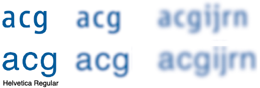
This example shows how the letters of the Helvetica lose their form in adverse reading conditions, whereas the letters of the font illustrated above, which clearly exhibit more open inner forms, are still easy to recognise.
This effect is even more marked in the case of numerals. Not only does their outline become blurred, but individual numerals can be readily confused with each other, and the consequences of this can be serious.

But it is not just poor reading conditions that make it difficult to recognise individual characters. The design of some typefaces means that it is almost impossible to distinguish between characters that are similar in appearance, such lowercase “l” and uppercase “I” or figure “0” and uppercase “O”.

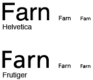
And a final example will suffice to show that the design of a typeface determines to what extent it is possible to differentiate between characters. When some typefaces are used in smaller point sizes, the letter sequence “r” followed by “n” can visually merge and appear to be an “m”. If better spacing and forms are used, this kind of mix-up will not arise.
While DIN 1450 meets the recommendations on designing a font to avoid the problems illustrated above, it comes up with clear recommendations in other sectors, where it is important that reading is barrier-free. Here letter proportions, stroke widths, font size and distances are specified. In this way DIN 1450 distinguishes three areas of application:
| 1. | Reading text is described as a long, continuous running text. |
| 2. | Consultation texts are sections amplifying a reading text, such as marginalia or captions. |
| 3. | Signalling text, as the name implies, comes into use on signage. |
Depending on the x-height, DIN 1450 describes minimum and maximum widths of body and hair line and also gives concrete recommendations for the letter proportions. In addition, minimum sizes for text, the distances for letters and words, margins, even the surface character are specified.
But don’t worry. All this may seem at present to be baffling, potentially problematic and highly theoretical, but in practice you will find it undemanding to conform to the requirements of the standard. As a typographer, you will of course be responsible for text design and line spacing, but you will be able to obtain the necessary typefaces directly from Monotype. Fonts, which are identified by the affix 1450, have been adapted or extended particularly with the recommendations in mind – we have made quite sure of that. Not only stroke widths, letter proportions, but also the form of the characters satisfies the recommendations. The creation of readily legible texts has never been this easy.
from Hacker News https://ift.tt/Q6TlrpR
No comments:
Post a Comment
Note: Only a member of this blog may post a comment.