Kyle Simpson has a talk titled “FOUC, and the Death of Progressive Enhancement” wherein he suggests the idea of building websites in layers of fidelity instead of layers of technology.

He argues that building websites is not about clinging to an ideal like the separation of concerns: markup separate from styles separate from scripts. Instead, it’s about the humans — about building technology solutions that can defer to user preferences. What we humans want and need varies from one moment to the next, from one human to the next, and we need technology that accommodates that.
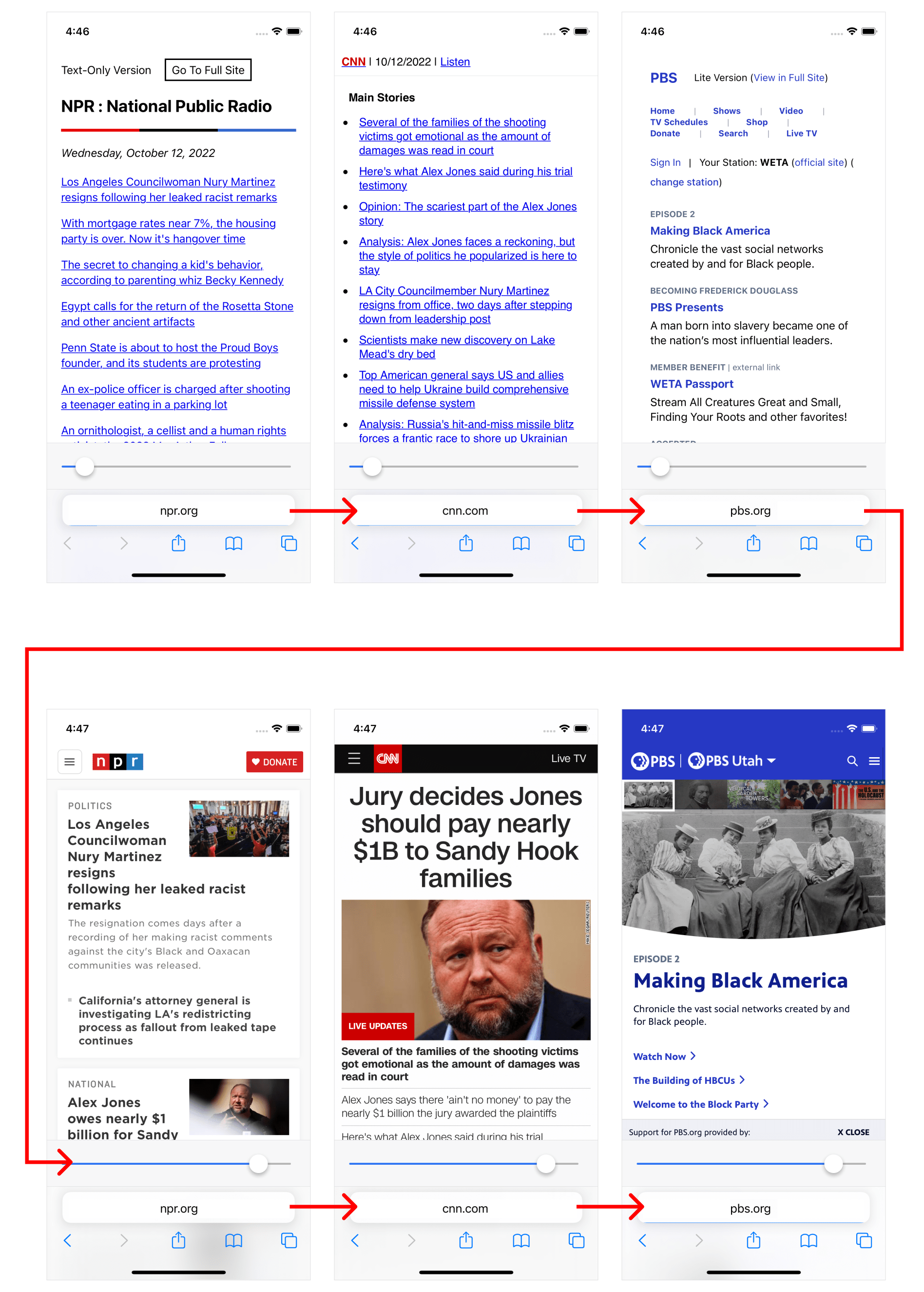
As a simple example, many news sites offer separate, trimmed-down versions of their sites:
These are great because they recognize the one-size-fits-all approach to providing a website doesn’t cater to the vast needs and preferences of users.
Not only do demographics vary wildly, but within and across demographics needs are always changing and contextual to attributes of a user’s current state like environment, device, or capability. For example, NPR notes the purpose (one of many, I’m sure) of their text-only website:
We have a text-only version of our website for anyone who needs to stay up-to-date on Hurricane Florence news and keep their battery and data usage to a minimum
Somebody visiting text.npr.org to preserve battery and decrease bandwidth because they’re in a Hurricane disaster zone probably needs a lite version for every website they visit, not just NPR.
What Kyle suggests is a world where you don’t need remember separate domains based on the experience you want. Rather, you visit the same domains you always visit, but with the ability to express a preference for the fidelity of experience you want/need in any given moment.
Kyle gives an example of how this could work: a browser-level control to indicate the “fidelity” of the experience you want, e.g. how much bandwidth, CPU, and battery are required to load and interact with the page (note the slider at the top where the URL bar is).

In other words, rather than going to text.npr.org when you want a lean experience, you always go to npr.org but you set your “fidelity preference” to “low”. In theory, this sends a header to NPR indicating you want a “low fidelity” version of the website, e.g. text-only.
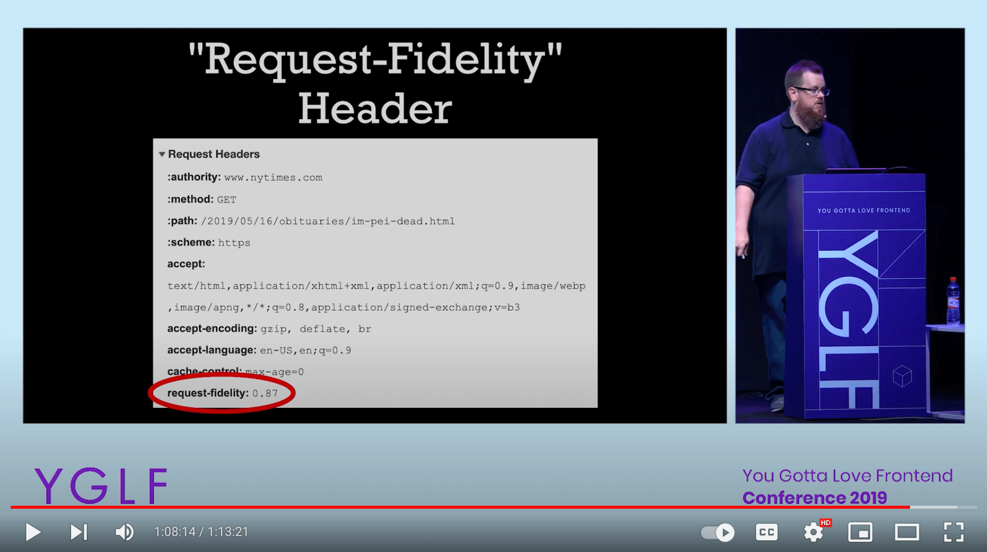
From there, it’s up to the site owners to figure out how that user preference maps to an available version of the site. Kyle illustrates this with an example routing configuration.
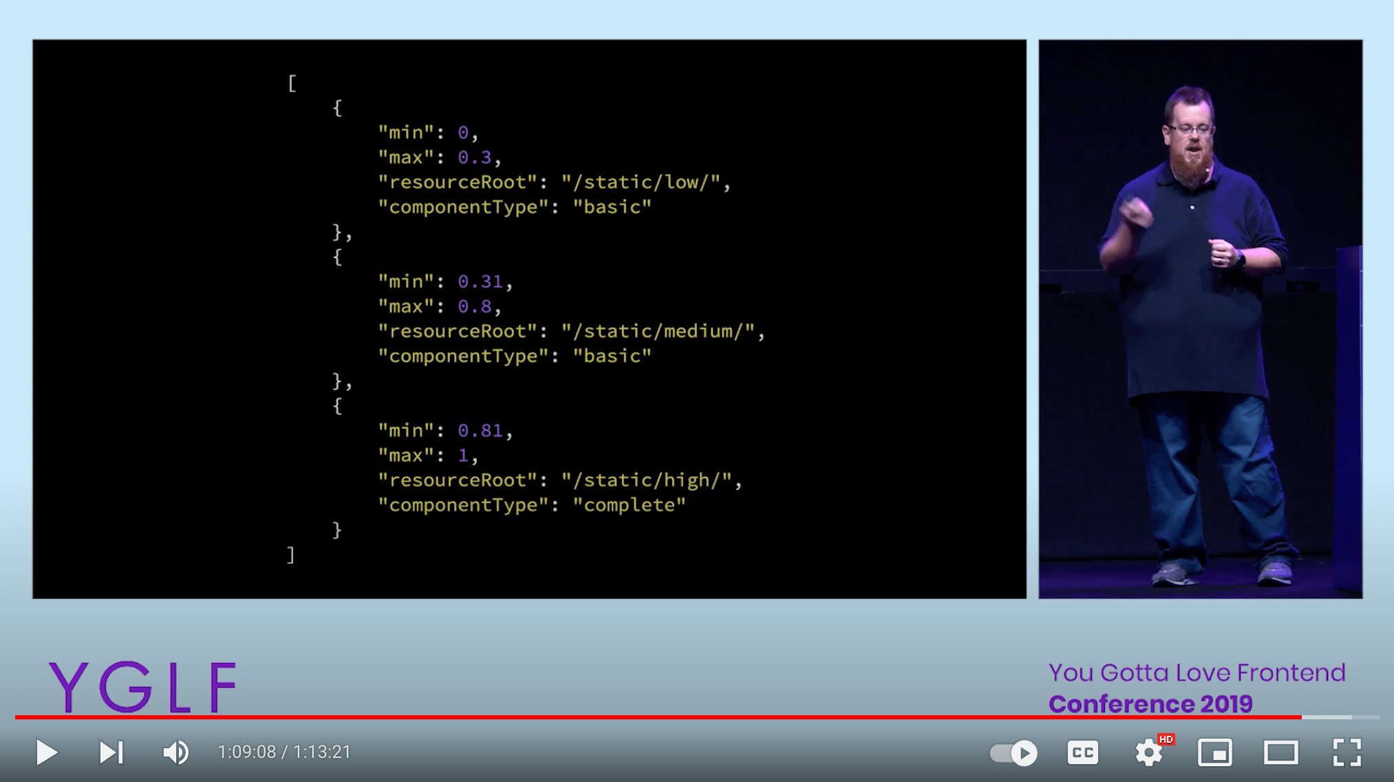
Granted, there would have to be some kind of rough consensus about what this spectrum of fidelity means. For example, “0” means HTML only: no styles or scripts (inline or external) or even inline images. From there, you build up.
A site may intentionally provide a fidelity that, on the generalized scale may only be a “0.4” but is the highest fidelity offered. That’s a good thing, it means their site will be fast by default, even if the user’s preferred setting across sites is “0.8”.
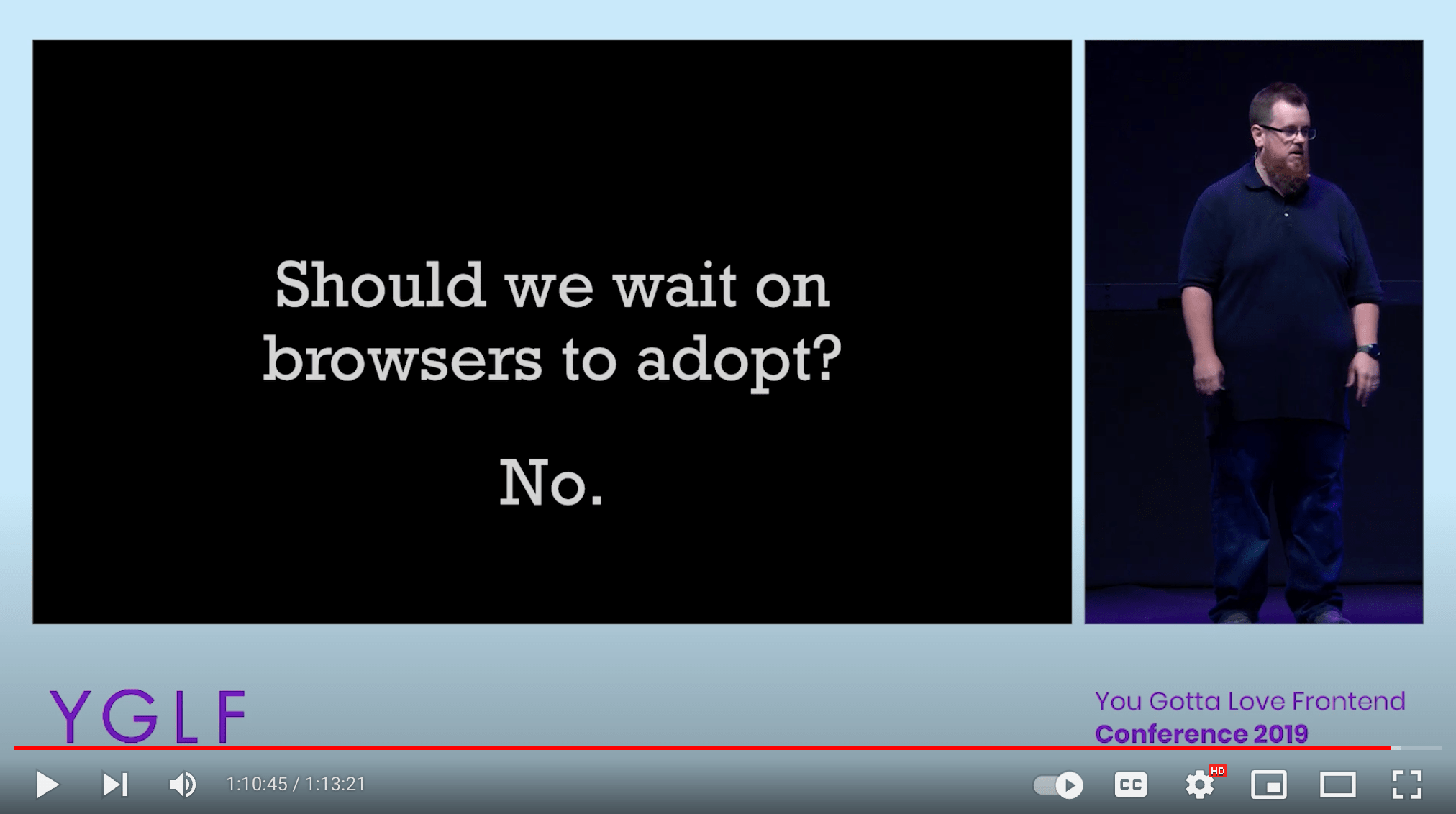
The thing is, we don’t have to wait for browsers to adopt this. As Kyle suggests, we can start now.
Granted, a browser-level feature would be the ideal here, as it would allow a persistent experience of fidelity across sites. Imagine going from CNN to NPR to PBS and maintaining a (roughly) similar experience of fidelity across websites!
A Quick Aside on CSS
Experiencing various appearances of a website — i.e. keep the same markup but only change the stylesheet — is cool, like CSS Zen Garden.
But that’s not what I’m trying to get at here. I’m not talking about varying styles based on user preference. I’m talking about varying experiences based on user preference. The styles change, but so too does the HTML and the JavaScript.
While I love the idea of a media feature like @prefers-reduced-data, the fact is: if someone really wants a leaner experience of your website, you need to know that at request time. That’s a preference that, in my opinion, transcends CSS. A preference for reduced data means less resources, including HTML, CSS, and JavaScript. How do you control a preference for reduced data in CSS alone?
For example, one end of fidelity is 0. To me, this is pure HTML with no embedded or inlined resource dependencies. No styles. No JavaScript. Not even an <img> tag. We’re talking the most lean experience you can provide. If you opened the console, you’d only see one request: the .html file.
How would you handle <img> then? Hyperlink it! Instead of:
<img src="elephant.jpg" alt="An image of an elephant." />
You do:
<a href="elephant.jpg">[An image of an elephant.]</a>
You can’t do that with @prefers-reduced-data. That’s why the idea of fidelity as a preference in a request header seems crucial. Not just customizeable themes, but customizeable experiences.
My Implementation
Given all the above, I wanted to try this out as a site-level preference on my blog. I implemented it as three separate preferences: Default, Minimal, and Text-Only.
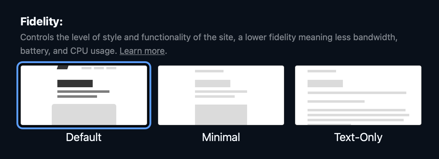
The controls for this fidelity preference vary, based on which version of the site you’re looking at.
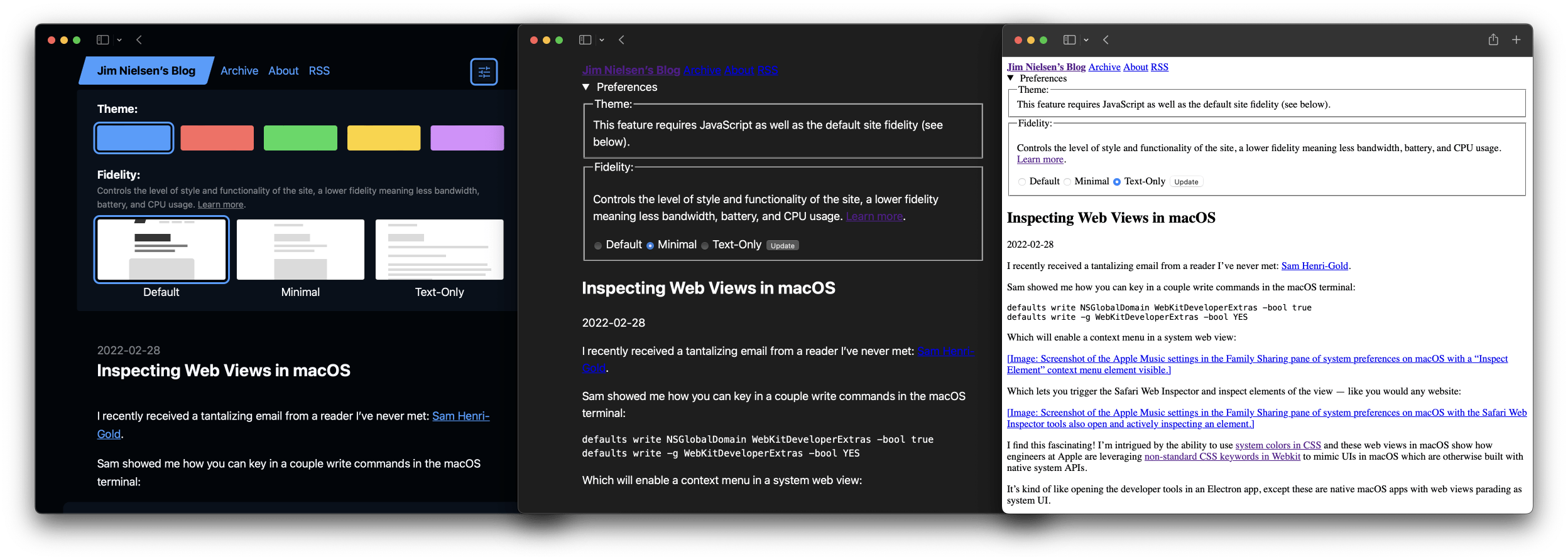
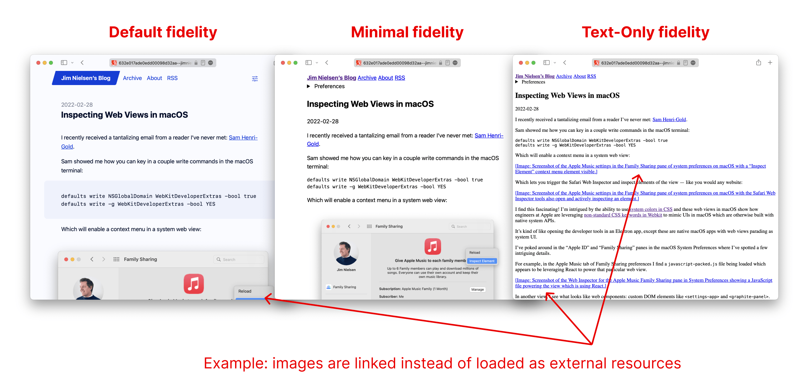
“Default” is the experience you get if you have no preference set (how the web works today). “Minimal” is set around the core experience of reading the site: no JavaScript and just a few basic styles. Text-only is my theoretical “fidelity 0”: no styles, no JavaScript, no inline images, as small a site as can be.
Because I wanted this feature to work without JavaScript — that is, after all, part of the essence of the feature — it works by setting a cookie which persists across requests. Choosing a preference sets a cookie and the server knows which version of the site to serve based on the presence of a given cookie (a browser-level request header in the future would be nice, something that’s present upon every client request).
Technical Details
In my case, I am using Netlify and a static site generator to serve my blog, so I wanted to try accomplishing this feature with those constraints.
In essence, it works by having three versions of my site. The first version (the “Default” version) is in the root folder while the other two versions are nested in named folders. Example:
.
├── index.html
├── _fidelity/
     ├── low/
     │    └── index.html
     └── med/
          └── index.html
Using Netlify’s redirects, I route requests to the appropriate version of the site based on the presence of a cookie.
[[redirects]]
  from = "/*"
  to = "/_fidelity/low/:splat"
  status = 200
  force = true
  conditions = { Cookie = ["fidelity-low"] }

[[redirects]]
  from = "/*"
  to = "/_fidelity/med/:splat"
  status = 200
  force = true
  conditions = { Cookie = ["fidelity-med"] }
This is a little convoluted, but again, working within the constraints I have I think it works. (Fortunately, my site is pretty basic.)
As for the different “fidelities” of the site, I accomplished this using a form of backwards progressive enhancement: I generate the “Default” version of my site and then strip features out in stages to lower the fidelity. (Thank goodness I built my blog in a progressively-enhanced way, or I could not have done this without breaking the site!)
For example, to generate the “Minimal” version of the site, I take the “Default” version, strip out tags like <script>, <style>, <link rel=stylesheet>, etc., and inject a separate “basic” stylesheet (~25 lines of CSS, inspired by Robin Rendle and Frank Chimero).
To generate the “Text-Only” version, I take the “Minimal” version, strip out the remaining styles, and swap out inline images for inline links.
This leaves me with three experiences of my site, which I would summarize as:
- Default: All the bells and whistles (yet still lean and mean). Custom theme selection, styled motifs, and any extras — including JavaScript.
- Minimal: Basic enhancements to the core reading experience, including inline images and a base stylesheet for improved layout, but otherwise nothing else (no JavaScript).
- Text-Only: Leanest experience possible. No styles, interactivity, or inline images. Saves bandwidth, CPU, and battery.
I’m using Metalsmith as my static site generator, so you can peak at the code if you want. The above approach results in a slower build that I would prefer as I accomplish generating each version of the site by creating each page as a JSDOM document and using .querySelector to strip stuff out.
In the future, I’ll probably generate the site by running my templating pass three distinct times with a configuration value like fidelity=(low|med|default) and, based on the presence of that value, render things appropriately. Example:
<head>
  ${fidelity === 'default' &&
    `<link
      rel=stylesheet
      href=/styles/default.css
    />`
  }
  ${fidelity === 'med' &&
    `<link
      rel=stylesheet
      href=/styles/basic.css
    />`
  }
  <!-- No styles if fidelity === 'low' -->
</head>
Admittedly, this would be simpler if I was using a server to generate pages at request time. Perhaps I’ll go that direction someday – in the meantime, I’m working with what I’ve got in static file hosting.
There’s a lot more I could write about this, but maybe I’ll split those out into different posts. If you decide to try this out on your site, hit me up with a link!
from Hacker News https://ift.tt/MVUDmN7
No comments:
Post a Comment
Note: Only a member of this blog may post a comment.