Why am I here?
If you were brought here from a link given to you, the person who gave you the link probably thinks your code displays Japanese wrong. In short, from a native Japanese eye, yѳur ҭєxҭ lѳѳks κιnd ѳf lικє ҭЋιs. This page will give you a brief description of the glyph appearance problems that often arise with implementations of Asian text display, why it happens, why it’s a big deal, and how to fix it.
OK, what’s wrong?
Kanji, also known as Hanzi, Hanja or just Han Characters, is a set of logographic characters that originated in China but are also used in Japan, Korea, Taiwan, etc. It consists of several thousand characters, each having their own glyph (glyph is a typographical term which refers to the appearance of a character, as opposed to the meaning.)
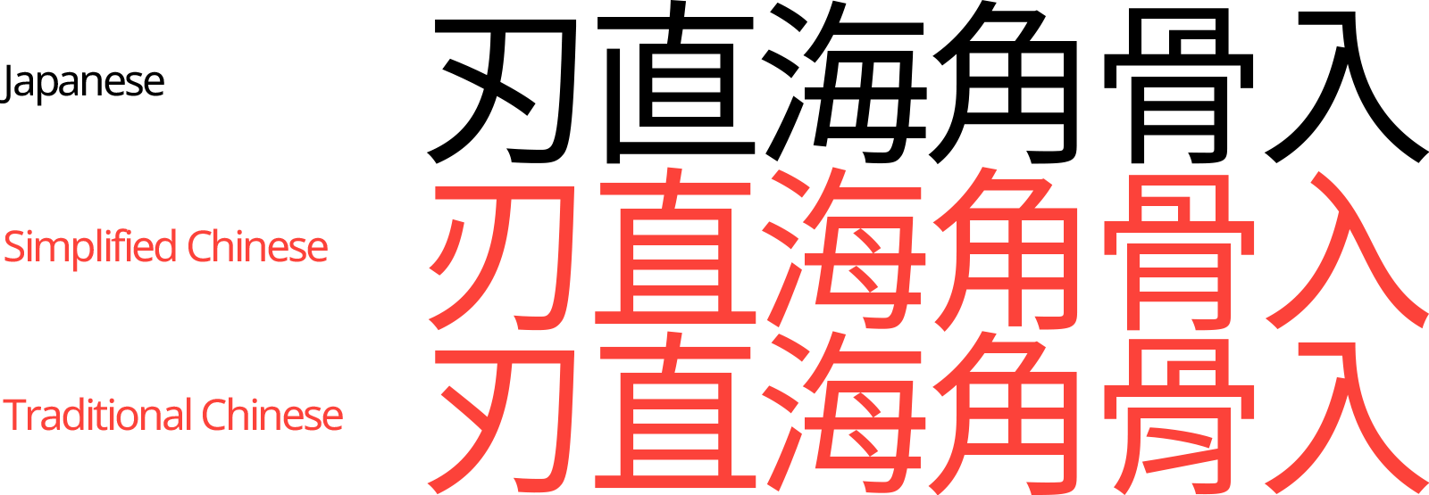
The Kanji glyph sets used in Chinese, Japanese, and Korean—commonly abbreviated to CJK—each look mostly similar to each other, but have large numbers of characters that must look distinctly different. For instance, here are the Japanese, Simplified Chinese, and Traditional Chinese glyph variants of the character that represents knife edge:
| Language | Glyph |
|---|---|
| Japanese | 刃 |
| Simplified Chinese | 刃 |
| Traditional Chinese | 刃 |
Therefore, if text in Japanese is displayed using a Kanji glyph set meant for other languages, it will look to a native Japanese reader as ugly, non-native, and plain bizarre due to the unfamiliar glyphs showing up in the text. This is most likely what’s happening with your program.
Why does this happen?
Back when Unicode was being designed, a decision called Han Unification was made to create a single unified set of all the Chinese (Simplified/Traditional), Japanese, and Korean Kanji characters. This involved giving equivalent code points to characters that were deemed equivalent across languages, which allowed the size of the character set to be kept small.
However, this also meant that characters which differ in appearance across languages, such as 刃 and 刃 and 刃, were given identical code points! It is up to the program displaying the text to render them using a font that can display the correct glyph set. Which, if the developer is not aware of it, tends to fail.
In many cases, the default fallback behavior in an ambiguous situation is to choose the Simplified Chinese glyph set. Therefore, Japanese text tends to be incorrectly displayed using Chinese glyphs.
Is it that much of a big deal?
As the app is not exactly unreadable in this state, it may be tempting to consider this issue minor and give it low priority. However, this issue is much more than the difference between, say, the lowercase A with the overhang (a) or without (α). Like the example at the beginning of this article, if the equivalent symptom was happening with English text, ιҭ wѳuld bє lѳѳkιng sѳmєҭЋιng lικє ҭЋιs.
Much like how the previous sentence immediately jumps out at you as appearing weird and wrong, Japanese text written in incorrect glyph sets will stand out similarly to any native speaker of Japanese, and will give off a connotation that whoever developed this app does not care about this (often large) subset of the global user population. I hope you agree in that this apathy is not the message you want to be sending.
How can I check if it’s happening or not?
Here are some characters that are known to have different glyph appearances between different languages.
刃直海角骨入
Try copy-pasting them into your code, see the rendered results, and compare them with below. If the glyphs don’t exactly look like the Japanese result sample below, your code is displaying Japanese wrong.

How can I fix it?
In a nutshell, the way to fix it is to make your code and font be aware that it’s displaying Japanese when it is doing so.
Web development
On the web, browser rendering engines are usually smart enough to choose the correct fonts from generic font family declarations like font-family: sans-serif. However, it may choose a wrong font if the lang or xml:lang property of your DOM elements are specified to a value that’s not ja. Make sure that when you switch the output language of your pages to Japanese, the lang property also changes to ja.
Also, if explicitly specifying fonts in CSS, be sure to specify a font that is designed for the language. The following font-family statement covers most standard Japanese fonts preinstalled in macOS, iOS, Android, and Windows:
[TBD; will insert CSS statement later]
Game development (Unity, Unreal, etc.)
Games often store and display fonts using a system that generates font texture atlases from a font file, such as Unity’s TextMesh Pro.
If you are using such a system, make sure you are generating separate font atlases for each CJK language, and that each of the source fonts used to generate them are specifically designed for that language. Google’s Noto project provides great open-licensed fonts specifically designed for Japanese, Simplified Chinese, Traditional Chinese, Korean, etc.
Any other things to be careful of?
A few other things. I broke them off to a separate page.
Do similar problems occur with other languages? / Why aren’t there steps to fix it in [insert environment here]?
The author is a Japanese native who only speaks English/Japanese, and made this site out of a personal peeve. I don’t have much insight on other languages, sorry. If you can offer assistance in problems that happen with other languages/environments, or find any mistakes, please drop me a line.
More Resources
Author
Kenji Iguchi
from Hacker News https://ift.tt/3Gu8JUw
No comments:
Post a Comment
Note: Only a member of this blog may post a comment.