For a long time, I’ve been curious about something. It is a truth I’ve seen casually dropped in textbooks, package documentation, and tweets: random effects and penalized smoothing splines are the same thing. It sounds so profound and enlightened. What does it mean? How are they the same? What deep statistical gnosis was I missing out on?
I have spent months, off and on, trying to understand this equivalence. I can’t give you the full mathematical treatment, but I have the gist of it and I can point you to the equations. In this post, I will try to highlight the connections between the two.
Here are the main takeaways:
- Mixed effects models use partial pooling to strike a balance between a grand mean (complete pooling) and individual means (no pooling).
- Smoothing splines work by penalizing model coefficients to reduce the model degrees of freedom.
- You can use the computational machinery of one framework to estimate the other.
Mixed model review
Let’s review what these things means. Mixed effects models, apparently the main focus of this blog over the years, are used to estimate “random” or “varying” effects. Here is the classic equation set up:
\[\mathbf{y} = \mathbf{X\beta} + \mathbf{Zb} + \mathbf{\epsilon} \\ \mathbf{b} \sim \textsf{Normal}(0, \sigma_b) \\ \mathbf{\epsilon} \sim \textsf{Normal}(0, \sigma_y) \\ \mathbf{X}: \textrm{fixed effects model matrix} \\ \mathbf{Z}: \textrm{random effects model matrix} \\ \sigma_b, \sigma_y : \textrm{variance components} \\ \sigma_b : \textrm{where the magic happens} \\\]The magic here is the σb, as it ties all of the individual effects in b under a common distribution. If σb were replaced with a fixed number like 10, then all of the effects in b would be independent and unaware of each other: There would be no pooling of information between the groups.
Consider the radon dataset example from Gelman and Hill (2007). Radon measurements were taken in Minnesota counties. We would like to estimate the average radon measurement for each county. We have a repeated measures situation, and some counties have more observations than others. We use a Bayesian mixed effects model with brms to estimate a population distribution of county estimates, and the county-level estimates are randomly varying effects. They are drawn from a random distribution, the scale of which we estimate from the data.
library(tidyverse)
theme_set(theme_grey(base_size = 14))
library(brms)
radon <- rstanarm::radon

b_radon <- brm(
  log_radon ~ 1 + (1 | county),
  radon,
  family = gaussian,
  file = "radon"
)
b_radon
#>  Family: gaussian
#>   Links: mu = identity; sigma = identity
#> Formula: log_radon ~ 1 + (1 | county)
#>    Data: radon (Number of observations: 919)
#> Samples: 4 chains, each with iter = 2000; warmup = 1000; thin = 1;
#>          total post-warmup samples = 4000
#>
#> Group-Level Effects:
#> ~county (Number of levels: 85)
#>               Estimate Est.Error l-95% CI u-95% CI Rhat Bulk_ESS Tail_ESS
#> sd(Intercept)     0.30      0.05     0.22     0.40 1.00     1782     2894
#>
#> Population-Level Effects:
#>           Estimate Est.Error l-95% CI u-95% CI Rhat Bulk_ESS Tail_ESS
#> Intercept     1.35      0.05     1.26     1.45 1.00     2749     3198
#>
#> Family Specific Parameters:
#>       Estimate Est.Error l-95% CI u-95% CI Rhat Bulk_ESS Tail_ESS
#> sigma     0.77      0.02     0.73     0.80 1.00     7374     3105
#>
#> Samples were drawn using sampling(NUTS). For each parameter, Bulk_ESS
#> and Tail_ESS are effective sample size measures, and Rhat is the potential
#> scale reduction factor on split chains (at convergence, Rhat = 1).
Here sd(Intercept) corresponds to σb.
We can plot the observed county means alongside the model estimated ones. First, I do some wrangling so that the difference between observed means and estimated means are computed for use later on.
radon_aug <- radon %>%
  # add ns and means
  group_by(county) %>%
  mutate(
    observed_mean = mean(log_radon),
    county_n = n()
  ) %>%
  ungroup() %>%
  # add fitted values
  tidybayes::add_fitted_draws(b_radon) %>%
  mutate(
    observed_minus_model = observed_mean - .value
  ) %>%
  # summarize fitted values
  ggdist::median_qi(.value, observed_minus_model)

radon_aug$type <- "mixed model estimates"
radon$type <- "observed means"

ggplot(radon_aug) +
  aes(x = fct_infreq(county), y = log_radon) +
  stat_summary(
    aes(color = type, shape = type),
    data = radon,
    fun = mean,
    geom = "point"
  ) +
  geom_point(
    aes(y = .value, color = type, shape = type)
  ) +
  # want to include 0 in the figure
  geom_blank(aes(y = 0)) +
  labs(
    x = "county (in decreasing order by sample size)",
    y = "log(radon)"
  ) +
  geom_hline(yintercept = fixef(b_radon)[1]) +
  scale_color_manual(values = c("blue", "grey40")) +
  labs(color = NULL, shape = NULL) +
  theme(
    axis.text.x = element_blank(),
    axis.ticks.x = element_blank(),
    panel.grid.major.x = element_blank(),
    panel.grid.minor.x = element_blank(),
    legend.title = element_blank(),
    legend.position = "top",
    legend.direction = "horizontal",
    legend.justification = "left",
  )
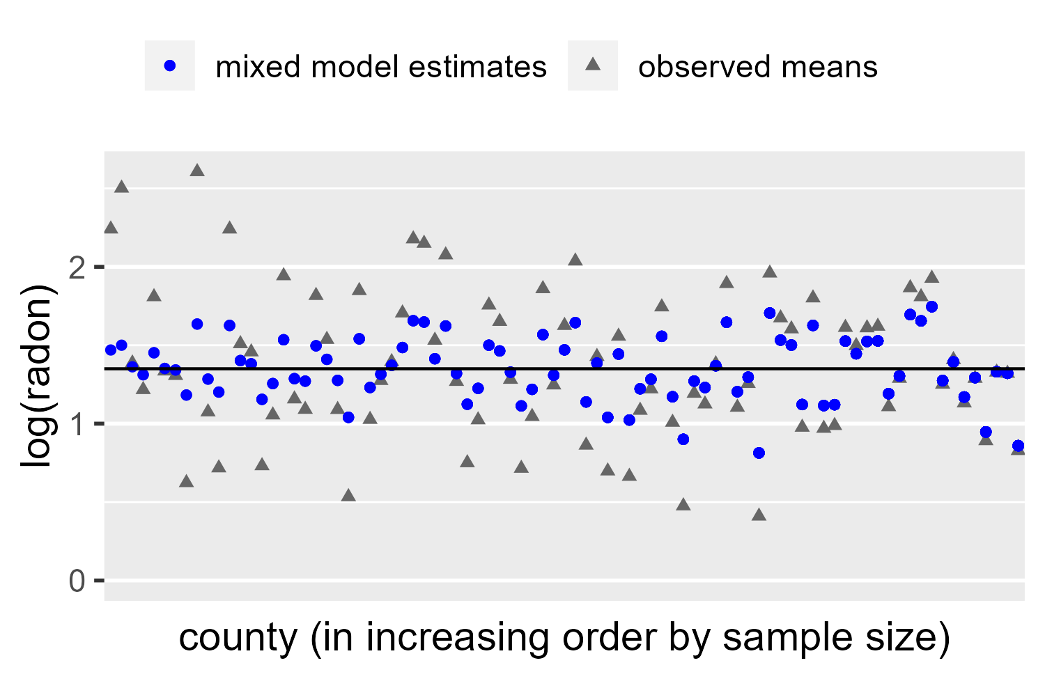
We see a classic example of partial pooling. For counties with many observations, the estimate mean is hardly adjusted. For counties with less data, the estimate is pulled towards the population mean (Intercept in the summary above).
The following plot shows difference between the observed means and the estimated means, subtracting the grey triangles from the blue squares in the plot above.
radon_aug %>%
  ungroup() %>%
  distinct(county, county_n, observed_minus_model) %>%
  ggplot() +
    aes(x = county_n, y = observed_minus_model) +
    geom_point(alpha = .5) +
    labs(
      x = "Number of observations in county",
      y = "Observed mean - estimated mean"
    )
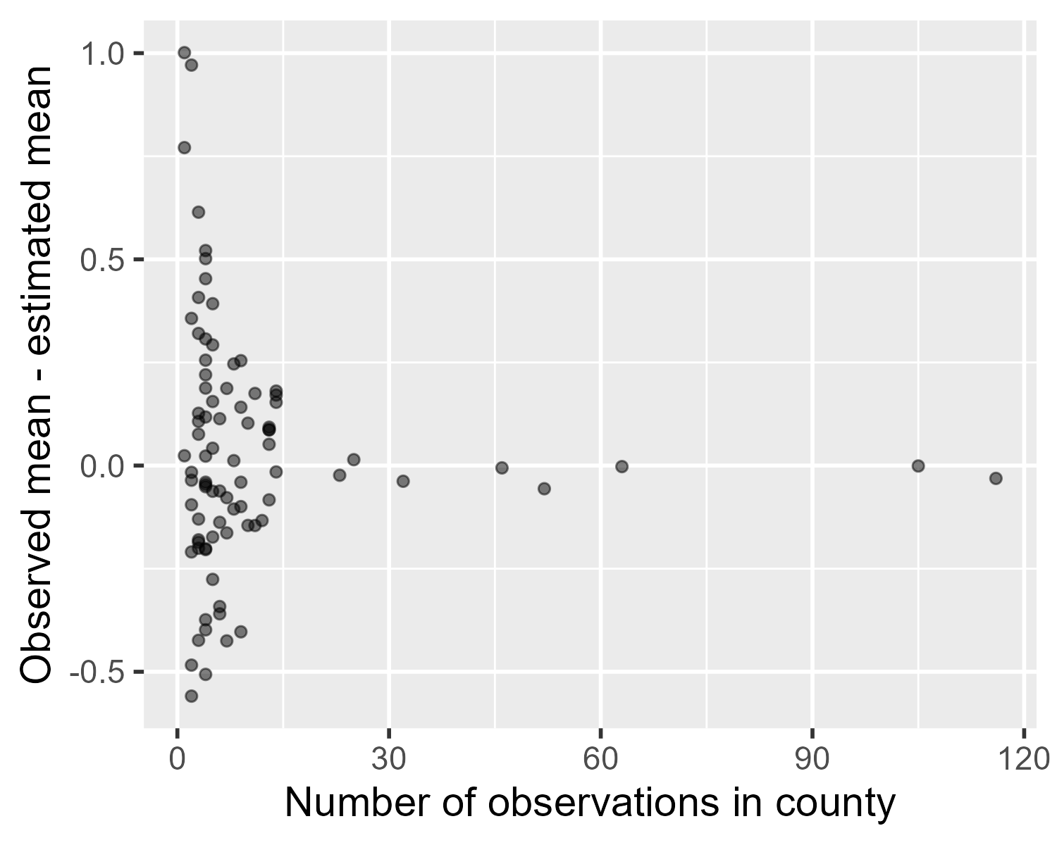
The contention behind the smooths = random effects claim is that what we just did is a case of smoothing. These random effects are, in a way, smoothed fixed effects.
But what’s smoothing?
Now let’s walk through a generalized additive model in mgcv to demonstrate a penalized smoothing spline. That was a mouth full, but basically additive models are like the smoothing expansion pack for the standard linear model. We’re still doing regression, but we have some new syntax and our models can do nonlinear relationships more easily now.
I will walk through a basic example of how a spline’s basis functions are weighted to approximate a nonlinear trend, but this is not going to be a full tutorial. Other people have made video introductions to additive models or the mgcv package. I first learned them from a tutorial for linguists and then from the mgcv textbook, but there are other resources online.
We use the mcycle dataset which gives the head acceleration in a simulated motorcycle accident. We are going to fit a model, plot the smooth from it, and then we are going to work through what the model did.
library(mgcv)

mcycle <- MASS::mcycle %>%
  tibble::rowid_to_column()

# Fit the model
gam_20 <- gam(
  accel ~ 1 + s(times, bs = "cr", k = 20),
  data = mcycle,
  method = "REML"
)

mcycle$.fitted <- fitted(gam_20)

ggplot(mcycle) +
  aes(x = times, y = accel) +
  geom_point(alpha = .5) +
  geom_line(aes(y = .fitted), color = "blue") +
  labs(x = "time after impact [ms]", y = "acceleration [g]")
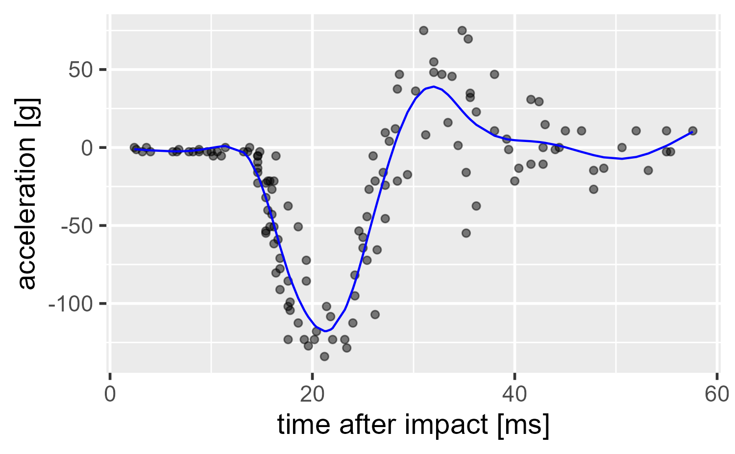
So what happened here? We will cover it visually.
Splines are the sums of weighted wiggles
Let’s look at the regression formula.
formula(gam_20)
#> accel ~ 1 + s(times, bs = "cr", k = 20)
We told gam() to estimate accel using an intercept term and a smooth term on the time predictor (s(times, ...)). Specifically, we created our smooth using a cubic regression spline basis (bs = "cr") with k = 20 - 1 curves. Our model is estimating a function by adding up smaller components called basis functions, and the space that defines those components is the basis. These basis functions are weighted and summed together to produce a smooth trend called a spline. The name splines is inspired by drafting splines which are flexible strips of wood that can be weighted and anchored in place to make a nice curve.
To reiterate, conceptually, we are decomposing the times predictor into a bunch of individual wiggly lines (basis functions), and these are weighted and summed together to approximate some nonlinear function. My post on orthogonal polynomials illustrates the same principle but with polynomial basis functions. Richard McElreath provides a friendly 30-minute introduction splines in a Bayesian model in his Statistical Rethinking course. One line I appreciate from his description is that with splines, we replace a predictor variable, like times, with a set of “synthetic” predictor variables.

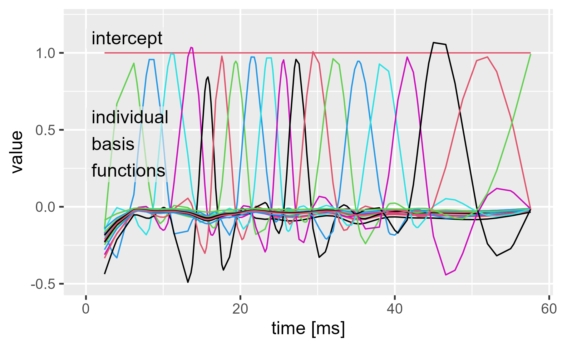
An easy way to pull the wiggles is to use the model matrix. We have 20 columns for the intercept and 19 basis functions.
model.matrix(gam_20) %>%
  tibble::trunc_mat(width = 72)
#> # Description: dbl[,20] [133 x 20]
#>    `(Intercept)` `s(times).1` `s(times).2` `s(times).3` `s(times).4`
#>            <dbl>        <dbl>        <dbl>        <dbl>        <dbl>
#>  1             1      -0.143       -0.165      -0.154       -0.311
#>  2             1      -0.0317      -0.193      -0.133       -0.293
#>  3             1       0.292       -0.270      -0.0716      -0.242
#>  4             1       0.492       -0.309      -0.0357      -0.208
#>  5             1       0.669       -0.332      -0.00603     -0.175
#>  6             1       0.933        0.0792     -0.0455      -0.0280
#>  7             1       0.808        0.278      -0.0969      -0.0106
#>  8             1       0.730        0.383      -0.122       -0.00387
#>  9             1       0.286        0.851      -0.182        0.00169
#> 10             1       0.123        0.957      -0.143       -0.0130
#> # ... with 123 more rows, and 15 more variables: `s(times).5` <dbl>,
#> #   `s(times).6` <dbl>, `s(times).7` <dbl>, `s(times).8` <dbl>,
#> #   `s(times).9` <dbl>, `s(times).10` <dbl>, `s(times).11` <dbl>,
#> #   `s(times).12` <dbl>, `s(times).13` <dbl>, `s(times).14` <dbl>,
#> #   `s(times).15` <dbl>, `s(times).16` <dbl>, `s(times).17` <dbl>,
#> #   `s(times).18` <dbl>, `s(times).19` <dbl>
To visualize the matrix, I am using a helper function from my personal R package for plotting matrices in ggplot2. What we see is times on the x axis and one line for the intercept and for each of the basis functions.
# Helper function to plot the lines of a matrix
ggmatplot <- tjmisc::ggmatplot

# Helper function to label on a theme_grey() plot
annotate_grey <- tjmisc::annotate_label_grey

ggmatplot(cbind(mcycle$times, model.matrix(gam_20)), x_axis_column = 1) +
  annotate_grey("intercept", 0, 1.02, size = 5) +
  annotate_grey("individual\nbasis\nfunctions", 0, .16, size = 5) +
  expand_limits(y = 1.2)  +
  labs(x = "time [ms]", title = NULL)
Now we can weight these by multiplying by the model coefficients. Here we use the diag(coef()) trick to prevent the weighted predictors from being summed together.
weighted_coefs <- model.matrix(gam_20) %*% diag(coef(gam_20))

ggmatplot(cbind(mcycle$times, weighted_coefs), x_axis_column = 1) +
  annotate_grey("weighted intercept", 35, -40, size = 5) +
  annotate_grey("weighted basis functions", 0, 26, size = 5) +
  labs(x = "time [ms]", title = NULL)
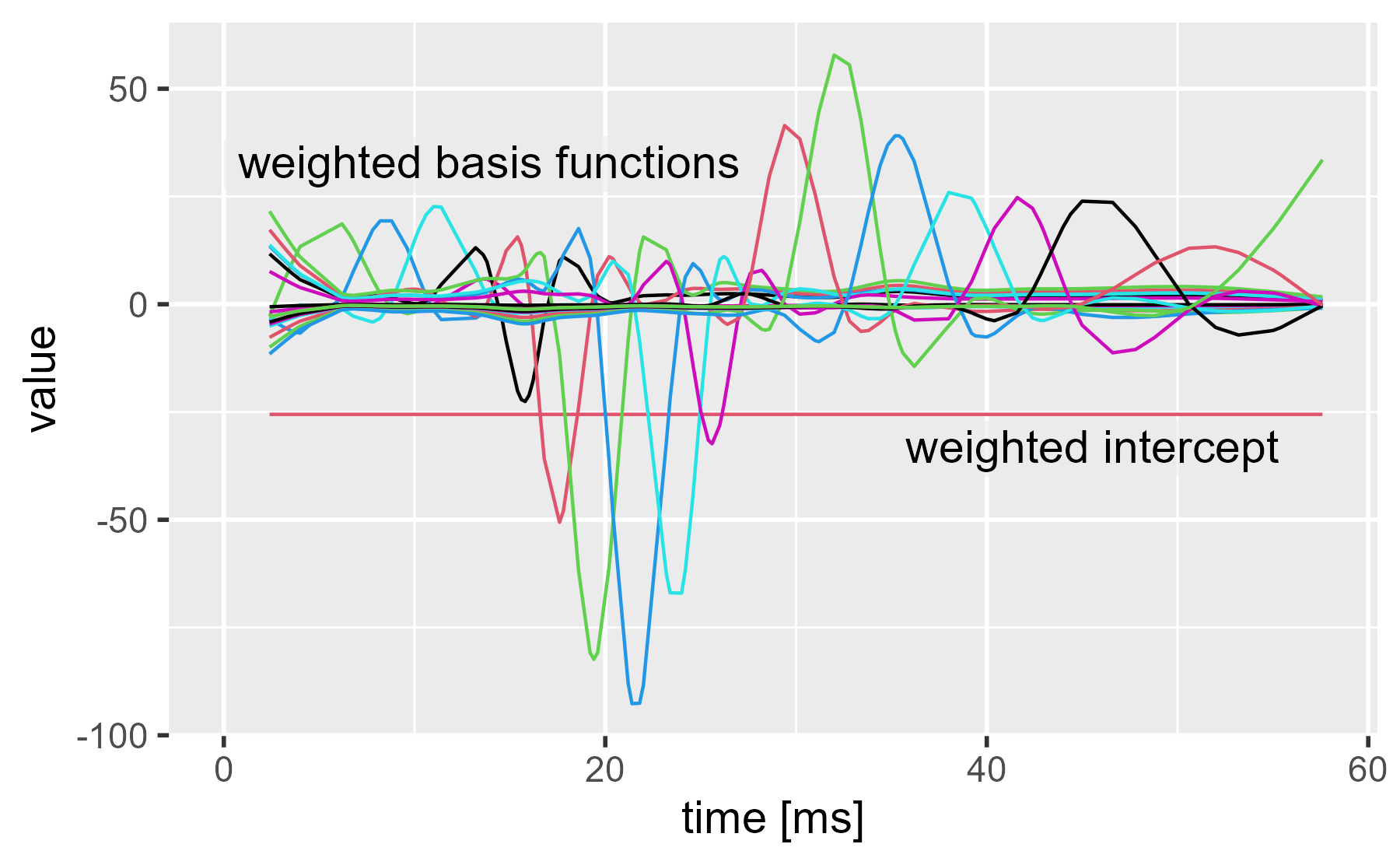
We can see the two main inflections points in the dataset now. The basis functions around 20 ms and 30 ms become very active in order to push the spline away from 0 at those times.
If we sum the lines together, we get the regression line (the intercept plus the smoothing spline).
ggmatplot(
  cbind(mcycle$times, weighted_coefs),
  x_axis_column = 1,
  n_colors = 1
) +
  stat_summary(
    aes(group = 1),
    color = "maroon",
    fun = sum,
    geom = "line",
    size = 1.5
  ) +
  annotate_grey("sum", 10, -70, size = 5, color = "maroon") +
  labs(x = "time [ms]", title = NULL)
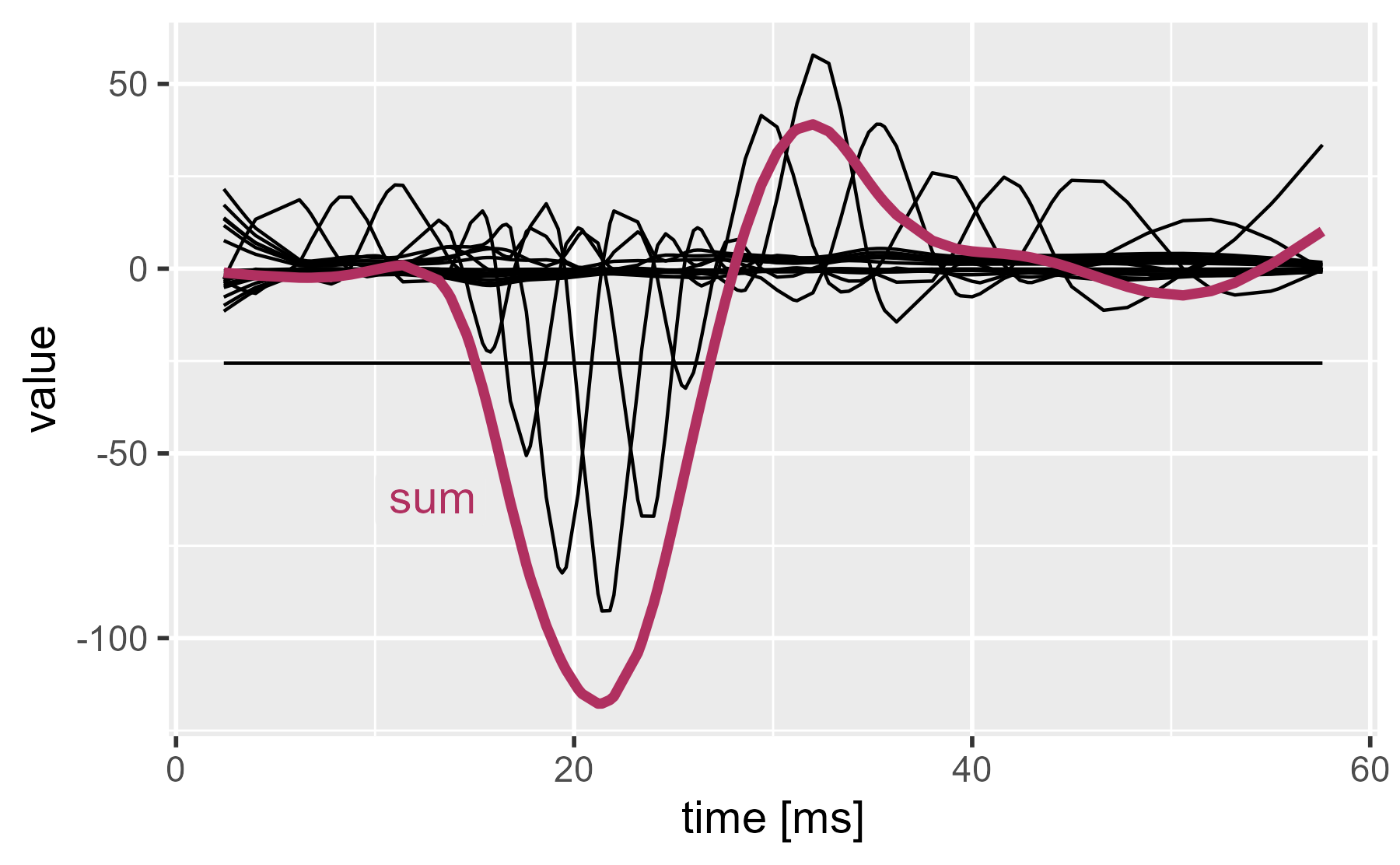
Our plots so far demonstrate regression with basis functions, but smoothing splines go one step further: They penalize wiggliness to prevent overfitting. The idea is as follows: For the above demonstration, we chose a 20-dimension spline basis (19 curves because 1 is removed for identifiability, apparently). But where did that number 20 come from? Thin air. What if we specified a dimension of 50? That’s 50 predictors (1 intercept and 49 basis functions). Isn’t it really easy to overfit the data with this approach?
Well, let’s look at a 50-dimension version.
gam_50 <- gam(
  accel ~ s(times, bs = "cr", k = 50),
  data = mcycle,
  method = "REML"
)

mcycle$.fitted50 <- fitted.values(gam_50)

ggplot(mcycle) +
  aes(x = times, y = accel) +
  geom_point(alpha = .5) +
  geom_line(aes(y = .fitted, color = "20"), size = 1) +
  geom_line(aes(y = .fitted50, color = "50"), size = 1) +
  labs(
    x = "time after impact [ms]",
    y = "acceleration [g]",
    color = "Dimension"
  )
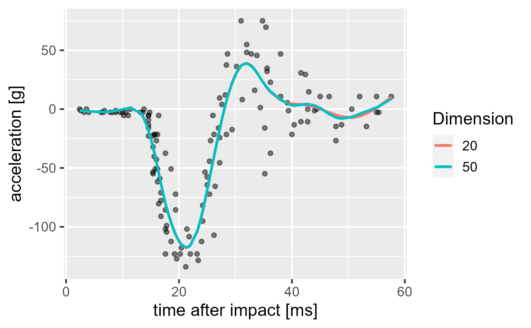
Huh, they hardly look any different. There is no overfitting. What’s going on? I already said it. Wiggliness is being penalized.
Fit versus smoothness
Behind the scenes, the model is trying to balance two competing goals. On the one hand we want to maximize the fit to the data. In linear regression, this goal amounts to minimizing the sum of squared errors. On the other hand, we want to minimize wiggliness (overfitting). In penalized smoothing splines, this is done by first specifying a penalty matrix that defines wiggliness for that spline basis. These two features are pitted against each other in the following equation:
\[\begin{align*} \mathbf{\hat{β}} &= \operatorname{arg min}_\mathbf{β}\ \|\mathbf{y} − \mathbf{Xβ}\|^2 + \lambda\mathbf{β}^\intercal\mathbf{Sβ} \\ &\ \text{(want }\mathbf{\hat{β}} \text{ that minimizes fitting error and wiggliness)}\\ \|\mathbf{y} − \mathbf{Xβ}\|^2 &: \text{sum of squared errors (minimize error to improve fit)} \\ \lambda\beta^\intercal\mathbf{Sβ} &: \text{wiggliness penalty} \\ \mathbf{Xβ} &: \text{spline basis times weights} \\ \mathbf{S} &: \text{penalty matrix (defines wiggliness for the spline)} \\ \lambda &: \text{smoothness parameter (increase to make penalty stronger)} \\ \end{align*}\]Don’t worry about the exact mathematics here: Just appreciate that error is now paired with wiggliness, and wiggliness is controlled by a penalty matrix S and a smoothness parameter λ. And yes, wiggliness is the technical term. I based the equations from Simon Wood’s slides, which use the phrase “fit-wiggliness tradeoff”.
For our purposes, we won’t worry too much about the penalty matrix. I’ll briefly describe it. For this model, wiggliness is defined by using the second derivative of the estimated spline. The first derivative measures the slope/steepness of the curve along x, and the second derivatives measures how much the slope/steepness changes with x. Thus, wiggliness is the change in slope, and the penalty matrix provides penalties for each of the model coefficients related to this wiggliness. The excellent gratia will plot the penalty matrix as a heat map. x and y represent model coefficients (weights for the basis functions), so along the main diagonal we see a penalty applied to each coefficient. In the two off-diagonals, we see neighboring basis functions have their weights jointly unpenalized or penalized.
gam_20 %>%
  gratia::penalty() %>%
  gratia::draw()
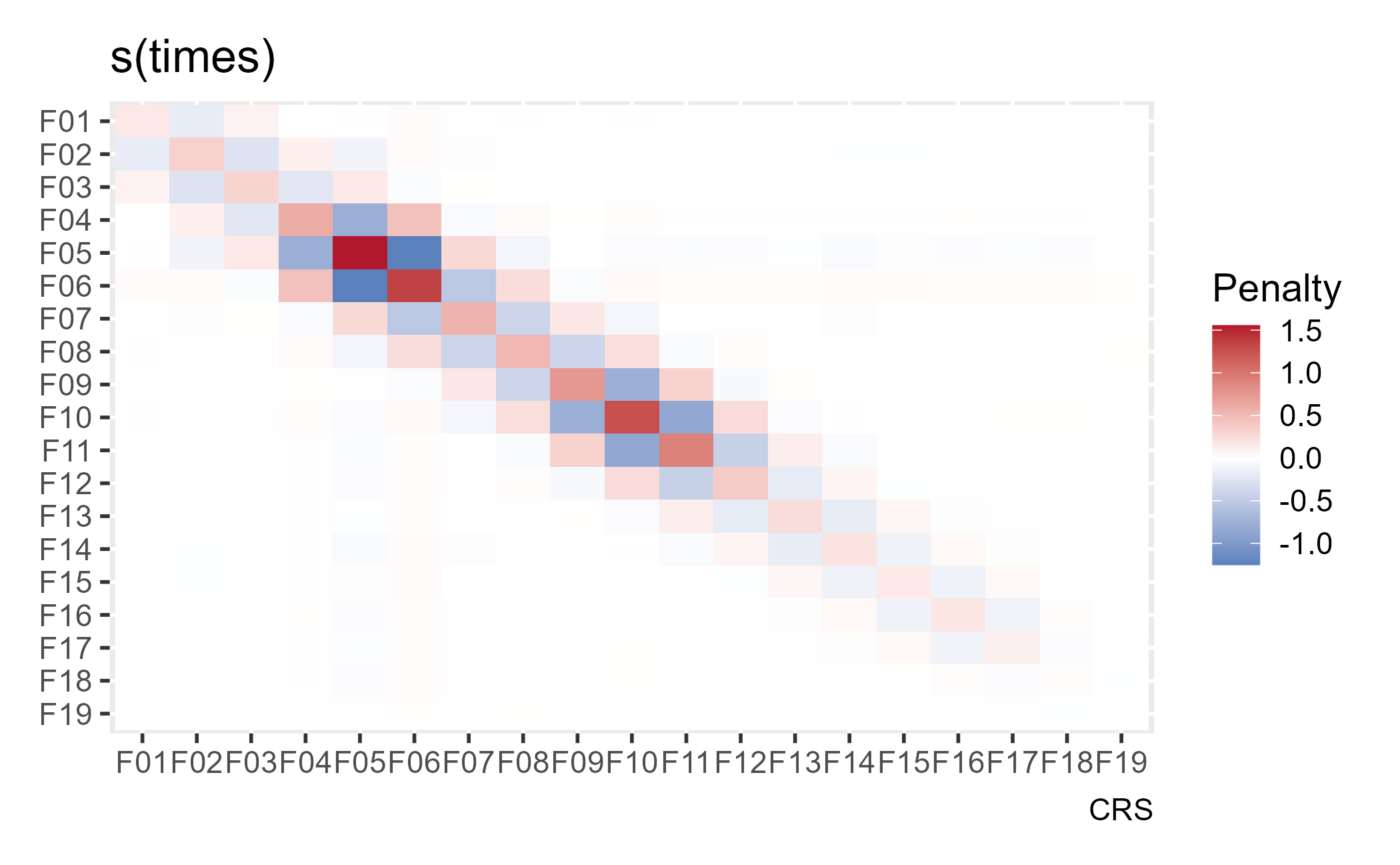
The stiffest penalties are meted out to the 5th and 6th basis functions, I think because these two basis functions cover the most rows in the dataset, but I’m not 100% confident in that explanation.
To see the overfitting in action, we can disable the smoothing penalty in the above spline-comparison plot by used fixed (fx = TRUE) regression splines. Now, the model’s main goal is to minimize the error, and the 50-dimension spline basis gives the model many, many degrees of freedom.
gam_20_fx <- gam(
  accel ~ s(times, bs = "cr", k = 20, fx = TRUE),
  data = mcycle,
  method = "REML"
)

gam_50_fx <- gam(
  accel ~ s(times, bs = "cr", k = 50, fx = TRUE),
  data = mcycle,
  method = "REML"
)

mcycle$.fitted20_fx <- fitted.values(gam_20_fx)
mcycle$.fitted50_fx <- fitted.values(gam_50_fx)

ggplot(mcycle) +
  aes(x = times, y = accel) +
  geom_point(alpha = .5) +
  geom_line(aes(y = .fitted20_fx, color = "20"), size = 1) +
  geom_line(aes(y = .fitted50_fx, color = "50"), size = 1) +
  labs(
    x = "time after impact [ms]",
    y = "acceleration [g]",
    color = "Dimension"
  )
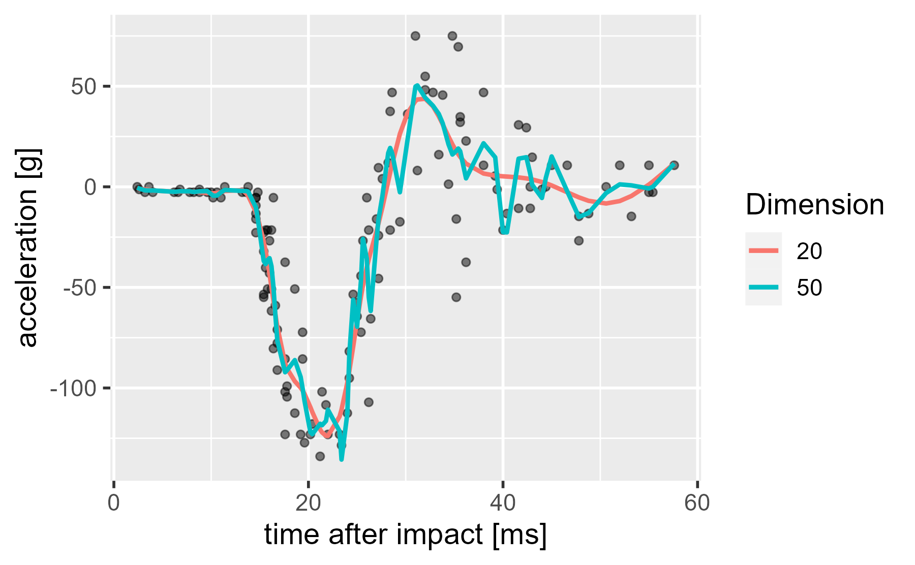
Thus, when we disable the penalty, the 50-dimension splines is free to wiggle all over the place.
How much smoothing happened: Effective degrees of freedom
The smoothing parameter, λ, is a hyperparameter. It controls the spline coefficients (basis function weights), and it is estimated from the data. We can set the λ manually and crank it up way, way up. In this case, the model tries to find the least wiggly curve that decreases modeling error: A straight line.
gam_20_sp <- gam(
  accel ~ s(times, bs = "cr", k = 20, sp = 10000000),
  data = mcycle,
  method = "REML"
)

mcycle$.fitted20_sp <- fitted.values(gam_20_sp)

ggplot(mcycle) +
  aes(x = times, y = accel) +
  geom_point(alpha = .5) +
  geom_line(aes(y = .fitted, color = "estimated"), size = 1) +
  geom_line(aes(y = .fitted20_fx, color = "no smoothing"), size = 1) +
  geom_line(aes(y = .fitted20_sp, color = "10,000,000"), size = 1) +
  labs(
    x = "time after impact [ms]",
    y = "acceleration [g]",
    color = "lambda"
  )
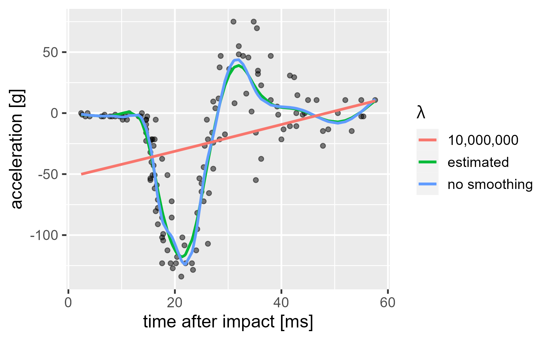
We need some way to talk about how much smoothing took place. On the one hand, we might treat each basis function as an independent predictor that uses up a full degree of freedom in fitting the curve. On the other hand, we might penalize the basis function weights so much that they produce a straight line, and thus, the batch of predictors effectively acts just like a single predictor variable would. That is, they are effectively estimating a curve that has just 1-degree-of-freedom’s worth of action in it. And indeed this is how mgcv describes the smoothness of the models: It reports the effective (or estimated) degrees of freedom (EDFs) behind each smooth.
If we look at the model summary, we see that our 20-dimension basis smooth has an EDF of 11.78 (see edf under Approximate significance of smooth terms).
summary(gam_20)
#>
#> Family: gaussian
#> Link function: identity
#>
#> Formula:
#> accel ~ 1 + s(times, bs = "cr", k = 20)
#>
#> Parametric coefficients:
#>             Estimate Std. Error t value Pr(>|t|)
#> (Intercept)  -25.546      1.956  -13.06   <2e-16 ***
#> ---
#> Signif. codes:  0 '***' 0.001 '**' 0.01 '*' 0.05 '.' 0.1 ' ' 1
#>
#> Approximate significance of smooth terms:
#>            edf Ref.df     F p-value
#> s(times) 11.78  13.97 33.93  <2e-16 ***
#> ---
#> Signif. codes:  0 '***' 0.001 '**' 0.01 '*' 0.05 '.' 0.1 ' ' 1
#>
#> R-sq.(adj) =  0.782   Deviance explained = 80.1%
#> -REML = 616.01  Scale est. = 509.01    n = 133
Similarly, our 50-dimension basis smooth has only 12.81 effective degrees of freedom, but the unpenalized version uses all 49 of its basis function curves and uses 49 degrees of freedom.
gam_50
#>
#> Family: gaussian
#> Link function: identity
#>
#> Formula:
#> accel ~ s(times, bs = "cr", k = 50)
#>
#> Estimated degrees of freedom:
#> 12.8  total = 13.81
#>
#> REML score: 616.068

gam_50_fx
#>
#> Family: gaussian
#> Link function: identity
#>
#> Formula:
#> accel ~ s(times, bs = "cr", k = 50, fx = TRUE)
#>
#> Estimated degrees of freedom:
#> 49  total = 50
#>
#> REML score: 403.4616
The big trick: Turn λ into a random effect variance in a mixed model
Okay, so far, here’s what we have:
- A spline decomposes a predictor into a number of wiggly basis functions.
- A penalized spline adds a penalty term to the model to reduce wiggliness.
- This penalty shrinks model coefficients so that they use a smaller number of degrees of freedom used by the model.
- The amount of smoothing is controlled by a hyperparameter λ.
We saw another hyperparameter earlier on in this post whose job was to pull individual parameter estimates closer to 0: σb. Both of these hyperparameters are estimated from the data and perform shrinkage on a batch of related coefficients (random effects or basis function weights).
So, here’s the big thing… If you do a bunch of linear algebra (as in slide 7 here or the Appendix in Wood, 2004), you can express the smooth as a mixed model:
\[\begin{align*} \mathbf{y} &= \mathbf{X}\mathbf{\beta} + \mathbf{Zb} + \mathbf{\epsilon} \\ \mathbf{b} &\sim \textsf{Normal}(0, \sigma/\lambda) \\ \mathbf{\epsilon} &\sim \textsf{Normal}(0,\sigma) \\ \mathbf{X}, \mathbf{Z} &: \textrm{matrices from transforming spline and penalty matrices} \\ \mathbf{X} &: \textrm{unpenalized (fixed) effect model matrix} \\ \mathbf{Z} &: \textrm{penalized (random) effects model matrix} \\ \lambda &: \textrm{smoothness parameter} \\ \sigma &: \textrm{residual variance component} \\ \end{align*}\]And right there, on the second line, we see the mixed effects magic again: σ/λ = σb: Model coefficients are related under a common distribution so that they can share information with each other. We can smuggle penalized smooths into the mixed effects framework.
So… you can turn splines into mixed models?
Yes. What this means is that we can use nlme or lme4 to estimate a smooth as a mixed effects model. mgcv provides this feature in its aptly named smooth2random() function. Let’s walk through what happens to our spline basis along the way.
First, let’s set up our cubic regression spline basis, manually outside of a regression formula.
basis_cr <- smoothCon(
  s(times, k = 20, bs = "cr"),
  data = mcycle,
  absorb.cons = TRUE
)

p1 <- ggmatplot(basis_cr[[1]]["X"][[1]]) +
  labs(title = "original spline basis")

p2 <- gratia::penalty(basis_cr[[1]]) %>%
  gratia::draw() +
  theme(
    panel.background = element_blank(),
    axis.text.x = element_text(angle = 90, vjust = .5)
  ) +
  guides(fill = FALSE) +
  labs(title = "penalty matrix")

# for combining plots together
library(patchwork)

p1 + p2
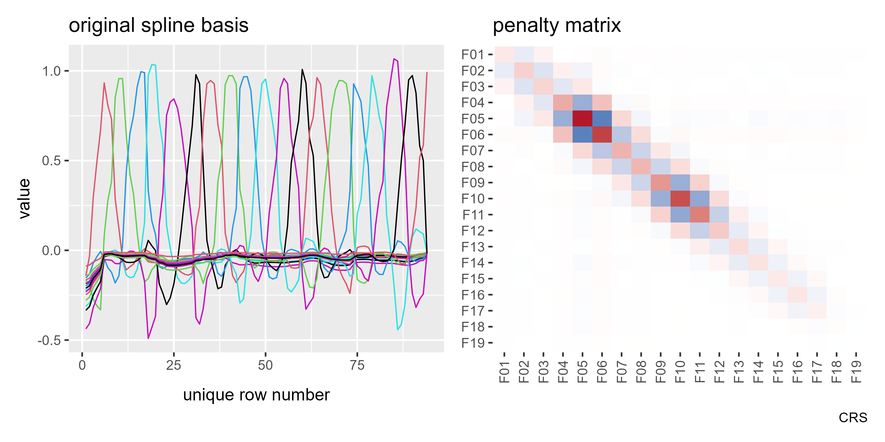
But we are going to reparameterize model so that the penalty matrix is just a diagonal of 1s using diagonal.penalty = TRUE. Now, our basis is no longer a row of pointy curves.
# Construct a smoothing basis outside of a model
basis_cr_diag <- smoothCon(
  s(times, k = 20, bs = "cr"),
  data = mcycle,
  absorb.cons = TRUE,
  diagonal.penalty = TRUE
)

p1b <- ggmatplot(basis_cr_diag[[1]]["X"][[1]]) +
  labs(title = "natural parameterization")

p2b <- gratia::penalty(basis_cr_diag[[1]]) %>%
  gratia::draw() +
  theme(
    panel.background = element_blank(),
    axis.text.x = element_text(angle = 90, vjust = .5)
  ) +
  guides(fill = FALSE) +
  labs(title = "penalty matrix")

p1b + p2b
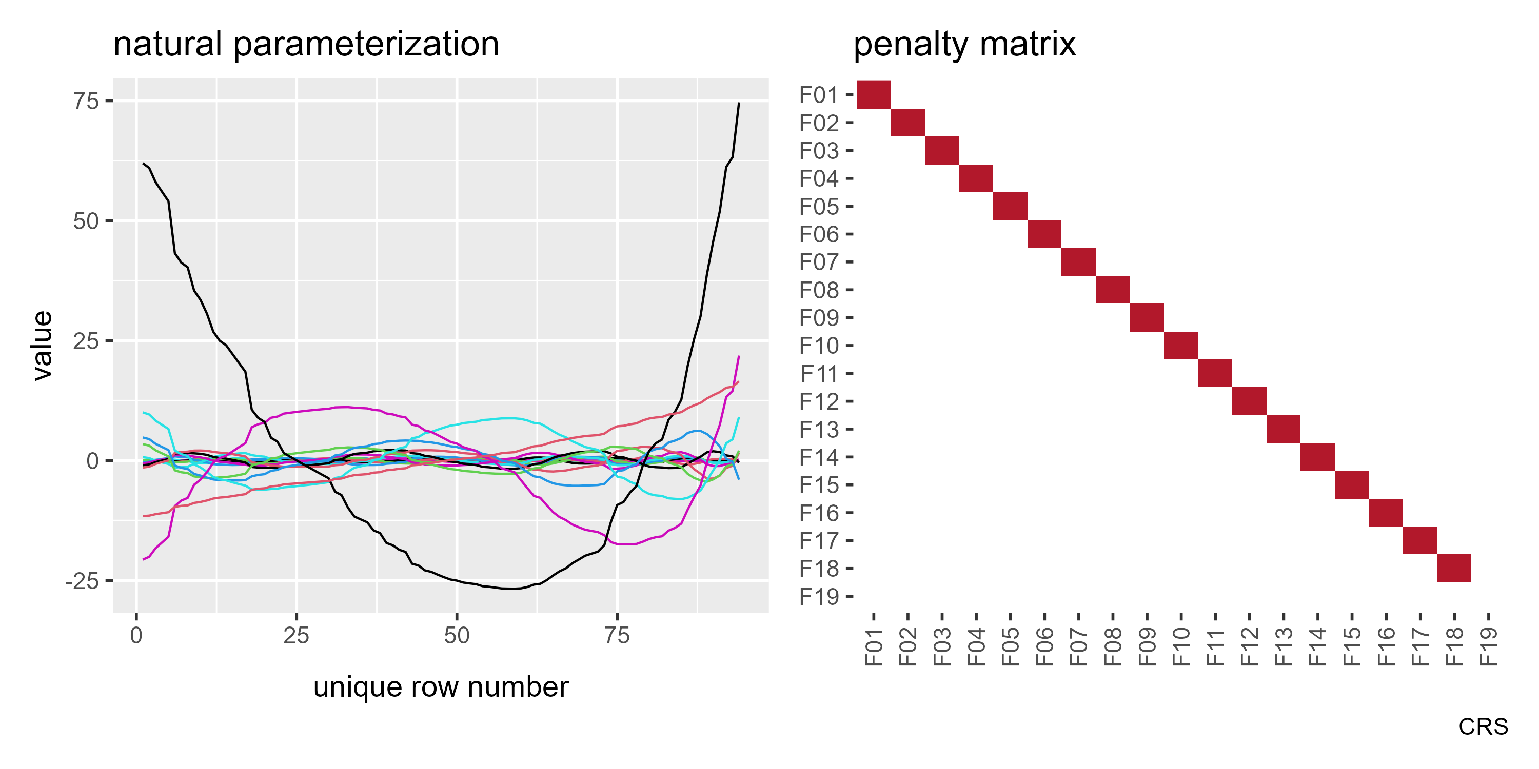
If my reading of Wood’s textbook is correct, this is the “natural” parameterization of a single-variable smoothing spline. (The source code for smoothCon() in mgcv also calls an internal function called nat.param() so I think I am the right track here.)
Take a look at F19 x F19 in the above plot. It snuck past me at first, but this basis function is not penalized. In a mixed effect model, an unpenalized parameter is a fixed effect. Thus, when smooth2random() creates a one-column fixed effects matrix and stores the remaining curves in a random effects matrix, we find that the unpenalized column is the fixed effects column.
re <- smooth2random(basis_cr_diag[[1]], "", type = 2)

# Confirm that the fixed effect column and the
# unpenalized column are the same
unpenalized_column <- basis_cr_diag[[1]]["X"][[1]][, 19, drop = FALSE]
all(unpenalized_column == re$Xf)
#> [1] TRUE

p1c <- ggmatplot(re$Xf) +
  labs(title = "fixed effects matrix") +
  expand_limits(y = c(-30, 80))

p2c <- ggmatplot(re$rand$Xr) +
  labs(title = "random effects matrix") +
  expand_limits(y = c(-30, 80))

p1c + p2c
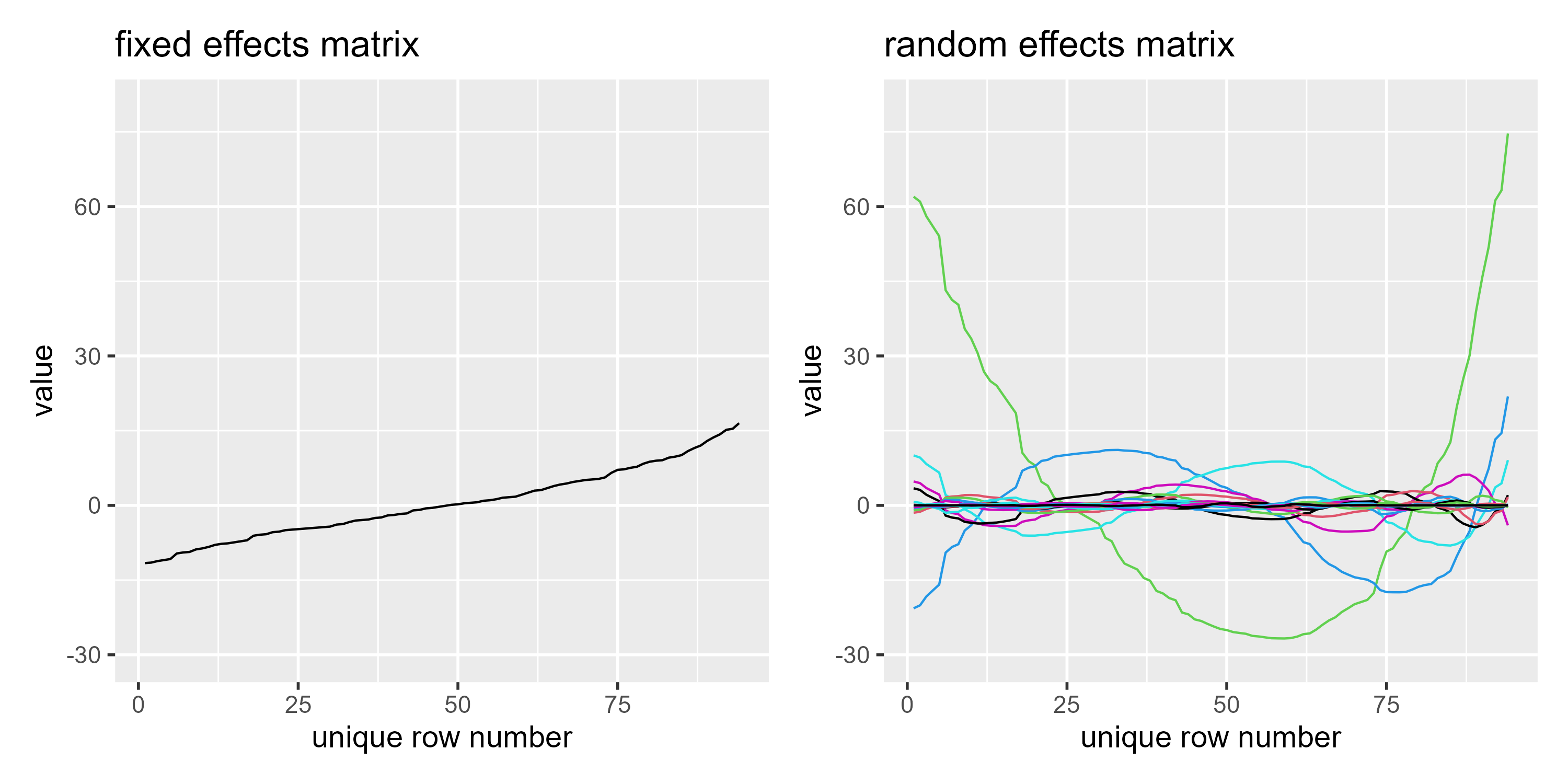
I still don’t understand the transformation (that takes place from the original basis matrix) very well myself, and I probably won’t be converting smoothing bases into mixed effects model matrices and fitting them with lme4 anytime soon. gamm4 fits its smooths with lme4, but by the looks of it, it’s not simply a matter of calling of lmer(). Still, this mixed model reparameterization is useful to know about because of the following fact.
This point seems obscure, but it is what brms uses!
What happens when we fit a smooth in brms? We are fitting a mixed effects model.
b_gam_20 <- brm(
  accel ~ s(times, bs = "cr", k = 20),
  data = mcycle,
  family = gaussian,
  file = "b-gam-20"
)
summary(b_gam_20)
#>  Family: gaussian
#>   Links: mu = identity; sigma = identity
#> Formula: accel ~ s(times, bs = "cr", k = 20)
#>    Data: mcycle (Number of observations: 133)
#> Samples: 4 chains, each with iter = 2000; warmup = 1000; thin = 1;
#>          total post-warmup samples = 4000
#>
#> Smooth Terms:
#>               Estimate Est.Error l-95% CI u-95% CI Rhat Bulk_ESS Tail_ESS
#> sds(stimes_1)     5.00      1.14     3.21     7.66 1.00     1095     1579
#>
#> Population-Level Effects:
#>           Estimate Est.Error l-95% CI u-95% CI Rhat Bulk_ESS Tail_ESS
#> Intercept   -25.50      2.02   -29.39   -21.45 1.00     5454     2867
#> stimes_1      1.65      0.34     0.98     2.30 1.00     5156     3033
#>
#> Family Specific Parameters:
#>       Estimate Est.Error l-95% CI u-95% CI Rhat Bulk_ESS Tail_ESS
#> sigma    22.77      1.45    20.20    25.81 1.00     4851     3277
#>
#> Samples were drawn using sampling(NUTS). For each parameter, Bulk_ESS
#> and Tail_ESS are effective sample size measures, and Rhat is the potential
#> scale reduction factor on split chains (at convergence, Rhat = 1).
You see sds(times_1)? That’s the variance of smooth weights. You see stimes_1? That the single fixed effects term (re$Xf) in the code above. I’m pretty sure about this because I learned smooth2random() from studying the brms source code.
Indeed, if we look at the actual Stan code used to fit the model, we see a mixed effects model. I suggest you only skim this code.
b_gam_20$model
#> // generated with brms 2.14.4
#> functions {
#> }
#> data {
#>   int<lower=1> N;  // total number of observations
#>   vector[N] Y;  // response variable
#>   // data for splines
#>   int Ks;  // number of linear effects
#>   matrix[N, Ks] Xs;  // design matrix for the linear effects
#>   // data for spline s(times,bs="cr",k=20)
#>   int nb_1;  // number of bases
#>   int knots_1[nb_1];  // number of knots
#>   // basis function matrices
#>   matrix[N, knots_1[1]] Zs_1_1;
#>   int prior_only;  // should the likelihood be ignored?
#> }
#> transformed data {
#> }
#> parameters {
#>   real Intercept;  // temporary intercept for centered predictors
#>   vector[Ks] bs;  // spline coefficients
#>   // parameters for spline s(times,bs="cr",k=20)
#>   // standarized spline coefficients
#>   vector[knots_1[1]] zs_1_1;
#>   real<lower=0> sds_1_1;  // standard deviations of spline coefficients
#>   real<lower=0> sigma;  // residual SD
#> }
#> transformed parameters {
#>   // actual spline coefficients
#>   vector[knots_1[1]] s_1_1;
#>   // compute actual spline coefficients
#>   s_1_1 = sds_1_1 * zs_1_1;
#> }
#> model {
#>   // likelihood including all constants
#>   if (!prior_only) {
#>     // initialize linear predictor term
#>     vector[N] mu = Intercept + rep_vector(0.0, N) + Xs * bs + Zs_1_1 * s_1_1;
#>     target += normal_lpdf(Y | mu, sigma);
#>   }
#>   // priors including all constants
#>   target += student_t_lpdf(Intercept | 3, -13.3, 35.6);
#>   target += student_t_lpdf(sds_1_1 | 3, 0, 35.6)
#>     - 1 * student_t_lccdf(0 | 3, 0, 35.6);
#>   target += std_normal_lpdf(zs_1_1);
#>   target += student_t_lpdf(sigma | 3, 0, 35.6)
#>     - 1 * student_t_lccdf(0 | 3, 0, 35.6);
#> }
#> generated quantities {
#>   // actual population-level intercept
#>   real b_Intercept = Intercept;
#> }
Okay, that’s a lot. But let me highlight and translate the key part of it.
\[\begin{align*} \mathbf{S} &: \texttt{s_1_1} & \texttt{// actual spline coefficients}\\ \mathbf{\sigma} &: \texttt{sds_1_1} & \texttt{// standard deviations of spline coefficients}\\ \mathbf{Z} &: \texttt{zs_1_1} & \texttt{// standarized spline coefficients}\\ \mathbf{S} &= \sigma \cdot \mathbf{Z} & \texttt{s_1_1 = sds_1_1 * zs_1_1}; \\ \mathbf{Z} &\sim \textsf{Normal}(0, 1) & \texttt{target += std_normal_lpdf(zs_1_1);}\\ \mathbf{\sigma} &\sim \textsf{StudentT}(3, 0, 35.6) & \texttt{target += student_t_lpdf(sds_1_1 | 3, 0, 35.6) ...}\\ \end{align*}\]The spline coefficients start as z scores, drawn from normal distribution with mean 0 and a standard deviation of 1. They are then scaled by σ, a scaling factor. This scaling factor acts as the hyperparameter that is learned from the data. This formulation of a mixed model is call the noncentered parameterization. It’s one of those topics you eventually run into in the Stanverse. Richard McElreath does a friendly tour of it as a matter of algebra. For a deeper dive, Michael Betancourt covers the topic in the context of debugging degenerate posteriors.
We can see completely analogous code in the Bayesian radon model above. I’ll just show the relevant part:
b_radon$model
#> ...
#> parameters {
#>   ...
#>   vector<lower=0>[M_1] sd_1;  // group-level standard deviations
#>   vector[N_1] z_1[M_1];  // standardized group-level effects
#> }
#> transformed parameters {
#>   vector[N_1] r_1_1;  // actual group-level effects
#>   r_1_1 = (sd_1[1] * (z_1[1]));
#> }
#> model {
#>   ...
#>   target += student_t_lpdf(sd_1 | 3, 0, 2.5)
#>     - 1 * student_t_lccdf(0 | 3, 0, 2.5);
#>   target += std_normal_lpdf(z_1[1]);
#> }
Simple random effects are category smoothers
One consequence of this relationship is that you can walk this relation backwards: You can fit a simple random effects using a basis matrix and penalty matrix. Indeed, mgcv provides a random effects ("re") smoother basis so we can estimate our mixed model from above using a smooth.
gam_radon <- gam(
  log_radon ~ 1 + s(county, bs = "re"),
  data = radon,
  method = "REML"
)
In this case, the basis matrix is just a single indicator variable for county.
ggmatplot(model.matrix(gam_radon)[, -1])
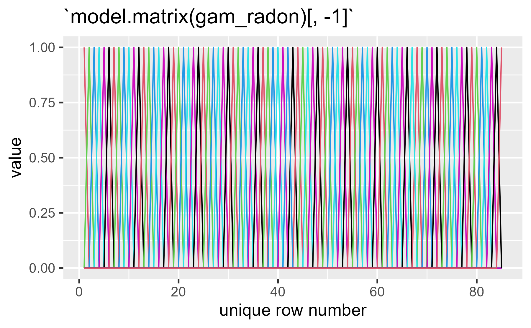
(Yikes, that one stings the eyes!)
The penalty matrix is a diagonal as each county effect is equally penalized.
gam_radon %>%
  gratia::penalty() %>%
  gratia::draw() +
  theme(axis.text = element_blank())
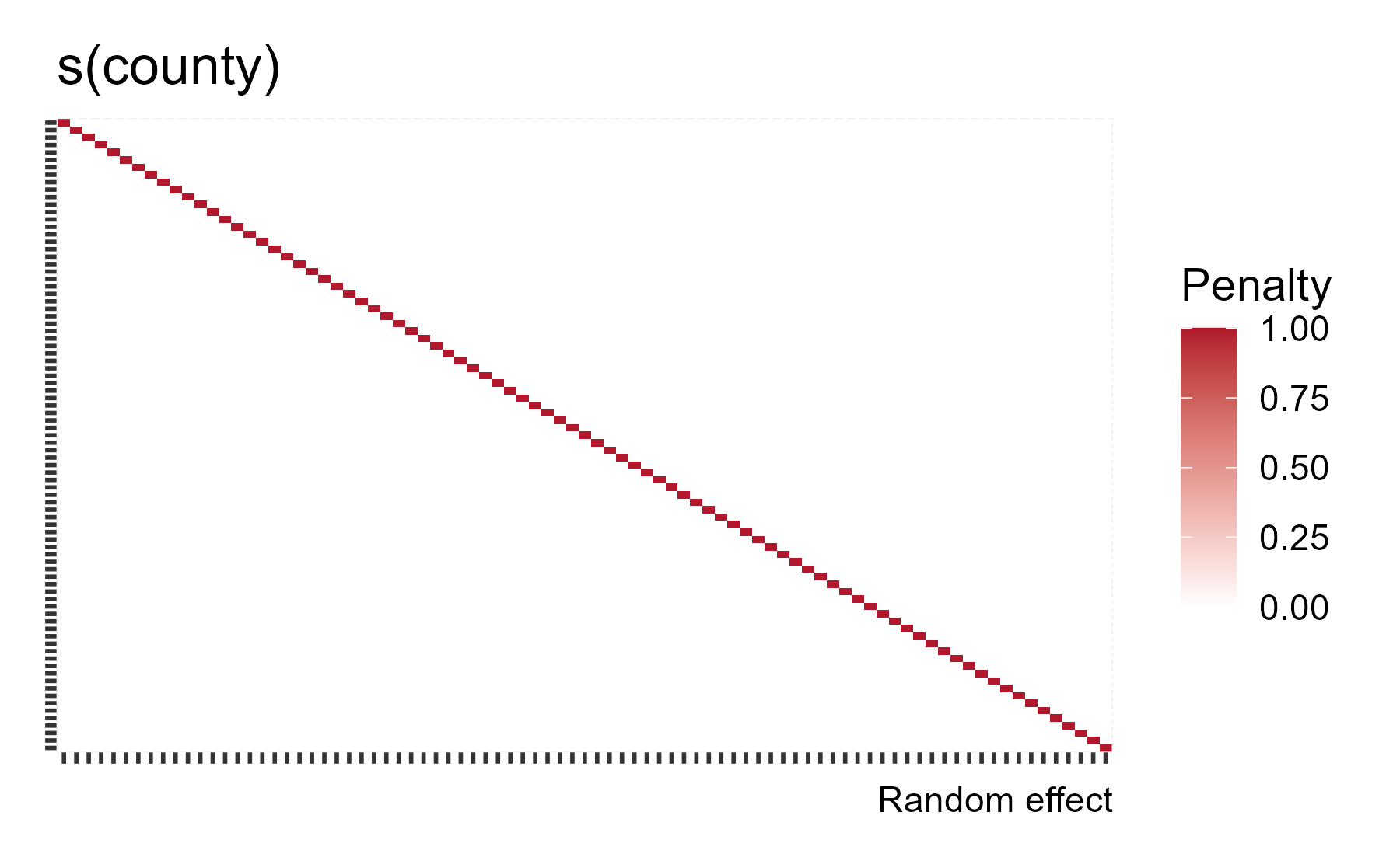
mgcv knows about how σ/λ = σb and it will provide the random effect variance estimate for us with gam.vcomp() (variance components):
gam.vcomp(gam_radon)
#>
#> Standard deviations and 0.95 confidence intervals:
#>
#>             std.dev     lower     upper
#> s(county) 0.2976671 0.2202676 0.4022639
#> scale     0.7660696 0.7304109 0.8034692
#>
#> Rank: 2/2
Which closely matches the estimates from the Bayesian model above:
b_radon %>%
  posterior_summary(pars = c("sd_county__Intercept", "sigma")) %>%
  round(3)
#>                      Estimate Est.Error  Q2.5 Q97.5
#> sd_county__Intercept    0.305     0.046 0.220 0.400
#> sigma                   0.767     0.019 0.731 0.805
What I think is the coolest feature of random intercepts as smooths is what the effective degrees of freedom tells us:
nlevels(radon$county)
#> [1] 85
summary(gam_radon)
#>
#> Family: gaussian
#> Link function: identity
#>
#> Formula:
#> log_radon ~ 1 + s(county, bs = "re")
#>
#> Parametric coefficients:
#>             Estimate Std. Error t value Pr(>|t|)
#> (Intercept)    1.350      0.047   28.72   <2e-16 ***
#> ---
#> Signif. codes:  0 '***' 0.001 '**' 0.01 '*' 0.05 '.' 0.1 ' ' 1
#>
#> Approximate significance of smooth terms:
#>             edf Ref.df     F p-value
#> s(county) 39.57     84 1.573  <2e-16 ***
#> ---
#> Signif. codes:  0 '***' 0.001 '**' 0.01 '*' 0.05 '.' 0.1 ' ' 1
#>
#> R-sq.(adj) =  0.126   Deviance explained = 16.4%
#> -REML = 1092.4  Scale est. = 0.58686   n = 919
The data have 85 counties, but there is effectively 39.5 counties worth of parameters here. For what it’s worth, we find a similar number when we ask brms to use the LOO method to estimate the effective number of parameters from its model.
loo(b_radon)
#>
#> Computed from 4000 by 919 log-likelihood matrix
#>
#>          Estimate   SE
#> elpd_loo  -1083.8 28.7
#> p_loo        44.9  4.0
#> looic      2167.7 57.5
#> ------
#> Monte Carlo SE of elpd_loo is 0.1.
#>
#> Pareto k diagnostic values:
#>                          Count Pct.    Min. n_eff
#> (-Inf, 0.5]   (good)     917   99.8%   398
#>  (0.5, 0.7]   (ok)         2    0.2%   227
#>    (0.7, 1]   (bad)        0    0.0%   <NA>
#>    (1, Inf)   (very bad)   0    0.0%   <NA>
#>
#> All Pareto k estimates are ok (k < 0.7).
#> See help('pareto-k-diagnostic') for details.
Here p_loo is the effective number of parameters from a leave-one-out cross-validation method. It’s around 45. Our mgcv model has around 41.6 parameters (39.6 from the smooth plus intercept and sigma). These two parameter estimating methods are unrelated (as far as I know) related (thanks Avi Vehtari!), and they both seem to telling us something similar about how much information in county variable we have after partially pooling down the model parameters.
For a deeper dive on random effects, Gavin Simpson recently wrote about how to use mgcv for random effects, so I encourage readers to look at that post.
Okay, why are you telling me this?
The purpose of this post was to demystify the connection between penalized smooths and mixed effects models. Formally, it all boils down to a hyperparameter that penalizes model coefficients (or pools information) so that the model uses a smaller number of effective parameters. This connection enriches my understanding of the two kinds of models. A by-county random intercept is a category smoother. We can estimate a smooth by putting a prior on the variance of the basis function weights (provided that we incorporate the penalty matrix somehow). It’s wonderful.
Random effects are funny things. We are first taught them in a repeated measures framework as a way to handle a problem in the data (non-independence in clustered units). But they are so much more. To use a Richard McElreath phrase, they provide an “adaptive regularizing prior”: Something that constrains our estimates to reduce overfitting but is actively learned from the data. Hodge and Clayton (2011) outline this problem between repeated-measures random effects and pooling/smoothing random effects in their paper Random Effects Old and New, and I think it’s worth remembering this distinction when we use the phrase “random effects”.
Last knitted on 2021-03-01. Source code on GitHub.
from Hacker News https://ift.tt/3dVc5E9
No comments:
Post a Comment
Note: Only a member of this blog may post a comment.