Over the past few years, I kept bumping into something called Hershey fonts. After digging around, I found a 1967 government report by a fellow named Dr. Allen Vincent Hershey. Back in the 1960s, he worked as a physicist for the Naval Weapons Laboratory in Dahlgren, Virginia, studying the interaction between ship hulls and water. His research was aided by the Naval Ordnance Research Calculator (NORC), which was built by IBM and was one of the fastest computers in the world when it was first installed in 1954.
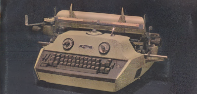
The NORC’s I/O facilities, such as punched cards, magnetic tape, and line printers, were typical of the era. But the NORC also had an ultra-high-speed optical printer. This device had originally been developed by the telecommunications firm Stromberg-Carlson for the Social Security Administration in order to quickly print massive amounts of data directly upon microfilm.
Perhaps you’ve heard stories of programmers waiting impatiently for printouts from mainframe operators? Well you would have waited even longer for your optical plots. Since they used film, they required chemical processing to become photos, slides, or microfilm. But despite this wait time, the printing speed was much faster than line printers of the day: 7000 lines per minute vs 150. While this printing speed was certainly impressive, the ability to plot entire graphs and figures in just fractions of a second was no doubt well appreciated by the scientists at Dahlgren.
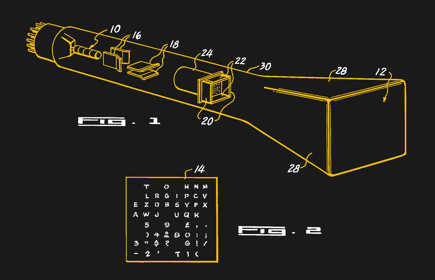
What made this device so fast? It was the Charactron Tube which we covered back in 2017. This special CRT has an internal metal screen into which a font is etched. The electron beam projects an entire letter on the phosphor face of the tube in one “flash”, which in turn exposes photographic film. No raster scanning or vector drawing was involved, so the process was fast. But soon the system would be utilized in ways not imagined by the original designers.
Inspiration
Back in those days, before roff, LaTex, and WYSIWYG word processors, preparing technical reports full of complicated mathematical equations and data plots was quite time consuming. The text itself would be prepared using an ordinary typewriter. But special-purpose typewriters like the Varityper were needed to typeset math equations. Plots and figures would generally be hand-drawn or by pen plotter. Hershey came to the realization that the NORC’s optical printer could take on a new role and be used as a typesetter. Dr Hershey not only saw this possibility, but possessed a keen interest in calligraphy and didn’t mind spending his evenings developing this new capability.
The key to make this happen was to define a new mode of output which bypassed the internal stencil fonts. Rather, the film would be exposed by using the period (full stop) stencil as a “dot”, and moving the dot under program control. When applied to text, this is of course slower than using the stencil, but it allows an arbitrary selection of fonts, or repertories as Dr Hershey called them. Furthermore, it opens up the ability to plot data directly onto film, bypassing the slower pen-plotter and even slower hand-drawing techniques of the day.
Dr Hershey learned that engineers at the Bell Laboratories in Murray Hill, New Jersey had developed a font for their optical printer using a similar technique, approaching it from a rasterization point of view. Dr Hershey realized he could expand this to embrace more exotic and artistic glyphs. He focused on using vectors to design his fonts, and embarked on the lengthy journey of researching and building his collection of vector-based fonts.
Works for All Languages (Except Dragons in Motion)
In hindsight, he not only built a set of tools to solve the needs of the Dahlgren community, but pushed the limits of the optical plotter to the extreme. In his reports he demonstrated fonts not only in English, but in other languages such as Greek, Russian, and Japanese. In addition to mathematical symbols, he showed how the plotter could draw electronic circuit diagrams, stellar maps of the galaxy, maps in general, chemical bonds, etc. An example of his thoroughness is found in his 1967 report “Calligraphy for Computers”. Although Hershey only implemented a subset of Japanese characters as a demonstration, he searched through over 5000 of them looking for glyphs which might exceed the limitations of his method. He could only find one such case, which he reasonably decided to ignore:
With some omission of detail in tight spaces and some overflow in complicated cases, this size [a height of 21 raster units] is believed to be adequate for all characters in Nelson’s dictionary except No. 5444. Inasmuch as this character represents dragons in motion, it is of doubtful utility.
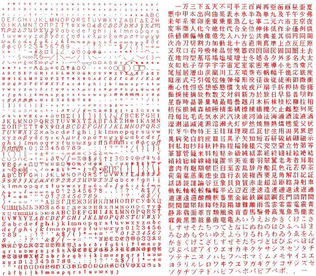
All in all, Dr. Hershey generated about 1400 western and 800 Japanese glyphs, all drawn painstakingly by hand on graph paper. There were five different optical font sizes and three different stroke types, not to mention all sorts of symbols used in mapping, science, mathematics, etc.
The Importance of Hershey Font Today
Hershey was trying to generate pleasing fonts for printed reports using the leading technology of the day. By far the greatest number of glyphs were complex — that is, they were constructed with multiple lines, or strokes, to give increased and variable stroke width. These strokes are often depicted today as thin lines when you search for his fonts online, but when properly drawn, taking into account the size of the SC4020 beam, solid letters will result. Today we have a plethora of fonts at our disposal, so why are Hershey fonts still being used? You might be tempted to say because they are public domain. But probably the biggest reason is the single-stroke family of fonts, which are still quite useful in so many different applications. Here are some examples I’ve encountered over the years.
OpenSCAD (not needed since 2015)
Today if you want to draw text in OpenSCAD, there is built-in support. But when I was first learning OpenSCAD in early 2015, this wasn’t available. A project I was working on needed text, so I decided to make my own. As I went down the rabbit hole of simple lettering that I could implement using the graphics primitives of OpenSCAD, I discovered this is a technique with a long history.
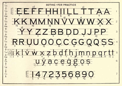
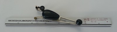
It was during this research when I first stumbled upon Hershey fonts. I have since learned that these classical lettering styles were a source of inspiration for Dr. Hershey, including the Leroy lettering sets used by draftsmen and some comic book letterers.
At the time, I passed on Hershey fonts because they only used lines, and it seemed that real curves would look better. I made my own vector font based on these simple drafting lettering styles which used only lines and circular arcs — things I knew how to make with OpenSCAD. Looking back at this now, I see that text was integrated into OpenSCAD in March of that year. If I had just waited three months, I would’ve saved myself the time and hassle.
Front panel lettering
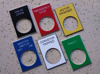
As a young engineer, some of my company’s projects required durable front panel markings. We made these by having the lettering and symbols engraved into the panel using a CNC machine. One well-proven way was to engrave a panel then fill in the grooves with epoxy paint. Today we can even skip the hassle of machine engraving all together. Low-cost direct laser etching provides a cleaner and often more affordable technique. Both these methods work by moving the head, a milling tool or laser beam, along paths which are defined by X-Y pairs. This is a perfect fit for vector fonts. They can be made more or less bold by changing the diameter of the milling tool or laser beam size, and can be easily scaled or rotated as needed using basic trigonometry. Trying to do this with a bit-mapped font would be awkward at best.
PCB Artwork Lettering
We’ve all put text on our PCB’s silkscreen and copper layers, but perhaps didn’t stop and think about the details. When you generate files for manufacturing, the traces and features of your board, themselves naturally vectors, are expressed in the familiar Gerber format (RS-274X). Letters are expressed in the same way.
The first photoplotters used for making PCB film artwork were made by the Gerber Scentific company in the 1960s. This device grew out of a family of large computer-controlled X-Y tables. These were originally used for tasks like cutting patterns from fabric and making prescription eyeglass lenses. The Gerber Photoplotter’s basic operation was not unlike a pen-plotter or CNC engraving machine, except that a beam of light would shine through a selectable aperture to expose photographic film. A wheel containing different aperture sizes allowed you to change the line width and also used to “flash” pads. It was only natural that vector commands were used to control the photoplotter. Rather than reinvent the wheel, Gerber defined a subset of the CNC digital interface standard RS-274D that had been around since the 1950s. With a few extensions and revisions, this is still the format we use today to convey our PCB artwork to the fabrication shop.
As in many fields, technology marches on. PCB fabrication shops don’t actually use Gerber-style photoplotters anymore. These days, more often than not, the manufacturer will convert your Gerber files so that the artwork is transferred to film using a high-resolution, high-speed raster printer. In some cases, the artwork is projected directly onto the PCB itself, entirely bypassing the film and intermediate transfer step.
That said, I don’t think we will ever send rasterized PCB artwork to the manufacturers. The features of the PCB that we send to the shop, traces and pads, are inherently vector-like in nature. And for proper results, the manufacturer needs to identify these features in order to tweak them according to their own unique manufacturing process. That’s the meaning of fabrication notes like “Line, pad, and via dimensions are specified as finished size” and “Controlled impedance traces xxxx should be 75 ohm”. Even silk-screen lettering widths may need to be adjusted depending on the process being used. Adjusting these parameters on a raster-based image, while not impossible, would be much more complicated.
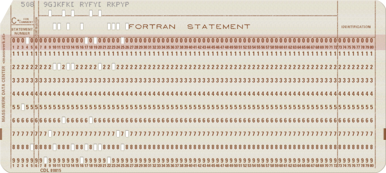
I needed to put some Korean text on a PCB for a client awhile back. After discussing this on the KiCad forum I learned that within KiCad, the PCB lettering is stored internally as vectors — using the original Hershey font format. I won’t go into the gory details, but the original Hershey format is peculiar, to say the least. Hershey used only printable letters, what we could call printable ASCII today, to describe the coordinates in very compact style. There is a letter-based Cartesian grid system with the letter R as zero. The letter S is 1, P is -2, etc. The letter H would appear as 508 9G]KFK[ RYFY[ RKPYP in this notation.
TTGO
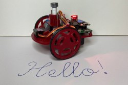
I was recently playing around with Micropython on the ESP32-based TTGO module, in order to experiment with text on the tiny TFT screen. I discovered that Hacakday.io user [Russ] used Hershey fonts in his Turtle Plot Bot. This gave me a great jump start for some of my experiments, and is yet another example of finding Hershey fonts under the hood of modern projects.
CRT Vector Drawing Machines
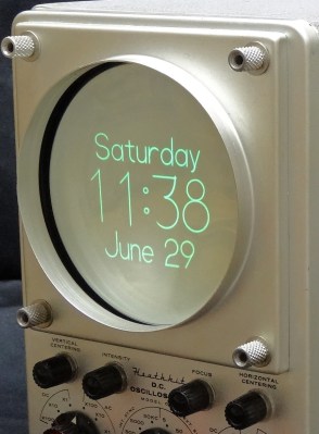
CRT-based projects using vector graphics have become popular in recent years. There are clock projects and general purpose vector displays. This is yet another application where describing fonts with vectors matches nicely with the underlying operation of the display. And you won’t be surprised to learn that Hershey fonts are commonly found on these projects. For example, this tutorial by [Trammel Hudson] on vector display basics shows how to draw Hershey font letters on the screen.
The Hershey Legacy
What would Dr Hershey think about his simplistic single-stroke fonts still being used over 60 years later? Considering all the multi-stroke letters and Japanese symbols that he so meticulously designed by hand, he might be a little surprised if not disappointed. Let us know if you have encountered or used Hershey’s fonts in your projects. If you want to learn more, here is an interesting presentation by Frank Grießhammer about Dr Hershey himself and the development of his fonts .
from Hacker News https://ift.tt/3cx3nem
No comments:
Post a Comment
Note: Only a member of this blog may post a comment.