FrontPage: The Good, The Bad, and The Ugly
PLEASE don't use FrontPage for modern web development! It's filled with security vulnerabilities and obsolete standards. The goal of this is not to convince you otherwise. The newest version came out almost two decades ago!
Microsoft FrontPage. The mere mention of that name is making most (if not all) of you seasoned web devs groan. "FrontPage was utter rubbish from dark ages of GeoCities" you say. "Everything it touched was ruined with horrific output and proprietary nonsense!" And yes, it was.
But... FrontPage as a concept. As a dream of what could have been, and a window into what was. Letting the typical home user at the time create websites, express creativity, and conquer the world by storm, all without being forced to learn HTML or CSS or JavaScript... In that regard, FrontPage couldn't be beat.
Let's talk about why Microsoft FrontPage was for a brief period of time the ultimate content creation tool of the Internet, and why it later fell from grace.
History
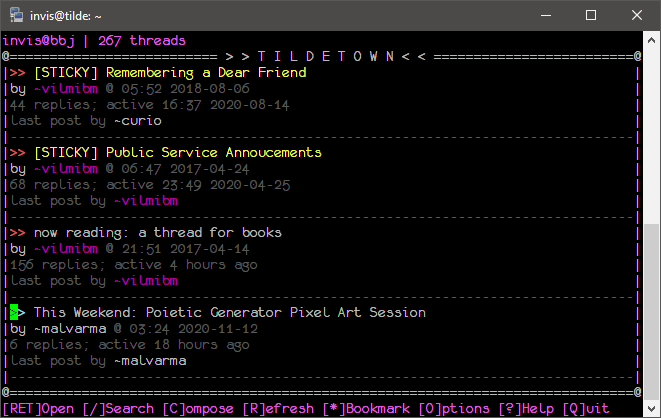
Before we can talk about goodness and ugliness, we need to talk about carphones and business meetings. Because this was 1994, when the Internet was still really new. At that point in time most internet chatter occured on Usenet groups (think something like Reddit) or BBS systems (think something like old AOL; example pictured below). If you needed buisness stuff, like stocks or the such, you had to log onto the BBS of whoever had what you needed. This was kind of a pain.
Enter Randy Forgaard and Charles H. Ferguson. Ferguson, renowned computer industry consultant, contacted MIT graduate Forgaard (over carphone, in case you were wondering) to discuss starting a new, internet-based company.
His idea was that many corporations such as the Dow Jones, Bloomberg, Apple, etc. were sinking millions into building their own, completely incompatible dial-in Internet services. Therefore, they should create a standardized, completely open server/client combo to replace all the independent efforts. This hopefully would reduce the cost of development for those corporations, and provide a market for growth by making buisnesses want to have an Interent presence.
The two decided to found their own company, Vermeer Technologies, Inc. A month later, still in the planning stages, they caught wind of the brand new World Wide Web out of CERN. It was decentralized, open, and even more robust than they were planning. It was just about perfect. The only issue was that it was rather a pain to make websites if you were just some lowly advertising manager or whoever. The web needed an authoring tool for websites.
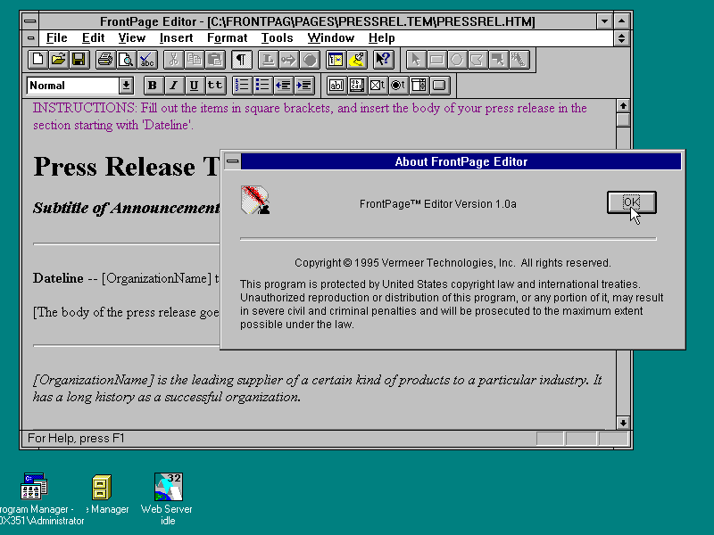
So, somehow, they managed to hire many professional coders for no salary whatsoever to work on FrontPage. (Early start-up culture, perhaps?) Evidently it worked, as FrontPage was released (only!) a week behind schedule on October of 1995. By then the World Wide Web was exploding, with a 20% increase in sites per month. FrontPage also managed to explode, receiving many awards and positive reviews. In fact, it was so good that Microsoft ended up buying them out. According to them, not only did it feel like a native Office application, it was perfect for their ongoing plan to become more internet centric.
FrontPage over the years got integrated into the Office suite and made a flagship product for Microsoft productivity products. By Office 2000, FrontPage had more Office integration than you should shake a stick at; nailing down the Office user interface and allowing imports and exports across the whole suite. There's... other stuff as well, but let's stay positive for now.
I'll be covering FrontPage 2002, as that's the version I own, and the one I have the most experience with.
The Good
The interface... is (in my opinion) one of the best interfaces for any program ever. No hyperbole. I think only the other Microsoft applications of the era like PowerPoint and Visio can top it. I can see why it won awards.
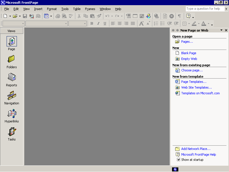
Like any other Microsoft Office XP program, there's the sidebar on the right with common tasks. What you'll probably want to do is, of course, make a new site.
FrontPage's equivalent to "projects" are called "Webs". These Webs contain the files (all your HTML, CSS, images, etc.) and preferences (such as which web server to sync up with or what compatibility settings to use) for that website.
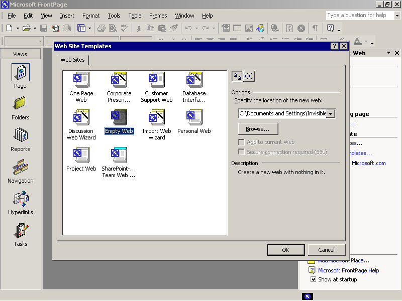
Start by selecting a new "Empty Web". Up pops a bunch of templates, including the "Empty Web" template. A bit odd, but sure.
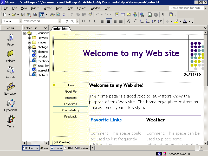
If you were to choose a template, it would give you a pre-populated fill-in-the-blanks site ready for your words and pictures. It takes some of the layout work and design originality out of it, but that is the purpose of a template after all. (Although, as a word of advice, don't use these. They're rather awfully designed from a web standards point of view. You can see it barely fitting in my window there. Imagine that on a smartphone.)
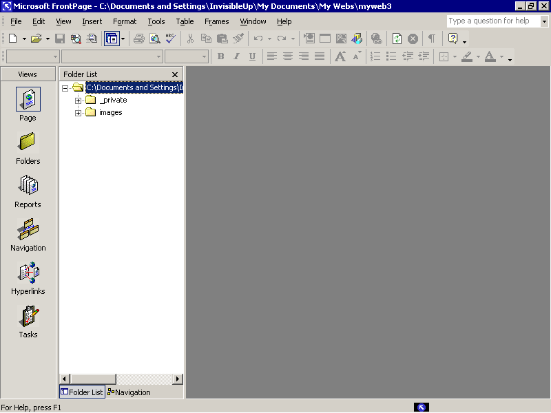
Anyways, once you open your blank web, you get... nothing! (That's what you asked for, isn't it?) No worries. Really, if you think about it, it would be rather silly to start making a page off the bat. You see, FrontPage takes a project oriented approach to things. While you easily could just sit down and start banging stuff out, that's really not the way FrontPage wants you to go.
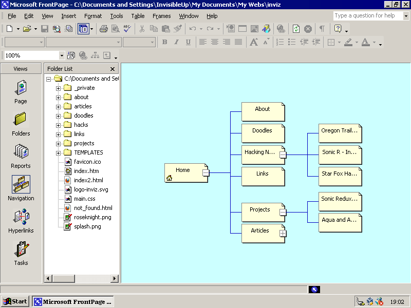
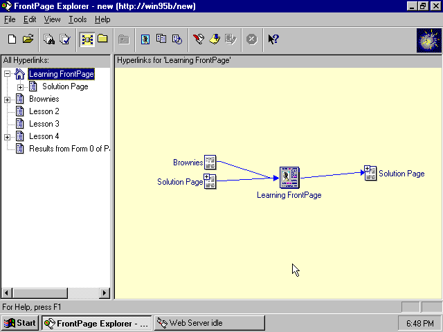
Here's probably my favorite FrontPage feature: the Navigation editor. Here you create blank pages and link them together in a logical hierarchy. This closely resembles the process you'd usually take on paper when designing a website.
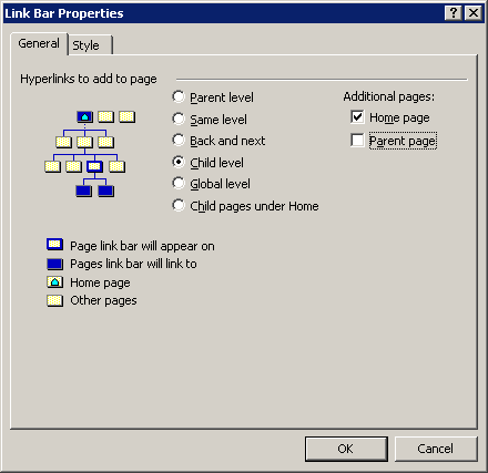
With this hierarchy, you can automatically create a navigation bar in all your pages that are properly linked. If you decide to make a new top-level page, for instance, every page on your site will be updated to feature that page. (To replicate that feature on this site, I had to use some pretty tricky template scripting with my custom Flask server. I'd vastly prefer something like this.)
This feature is also nice because it forces you to think about your site. You can't just sit down like it's Microsoft Word and bang out some pages. You need a coherent plan. Before you can even start, you need to sit down with your client/team/self and ask "What do you want on your website?" To most people it's obvious that you need a website. Everybody has a website. What's significantly less obvious is what needs to be on the website. And FrontPage's web editor allows you to play around with hierarchies and layouts before commiting to anything.
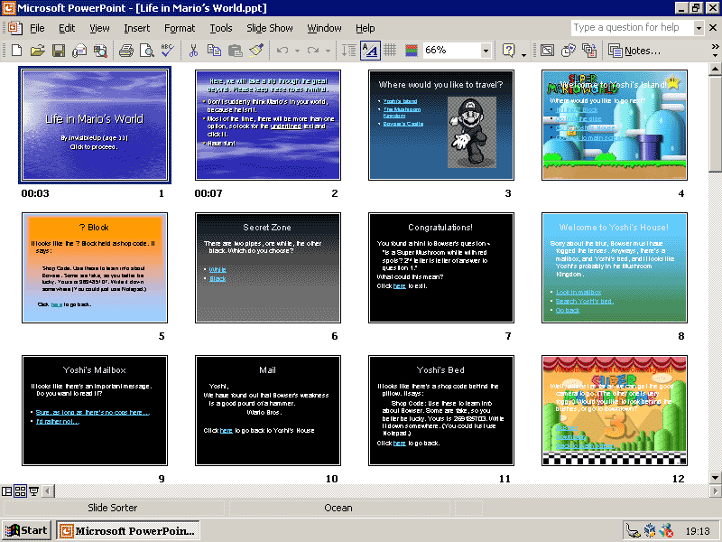
One thing that's intersting is that Word, PowerPoint and Access all (vaguely) follow a similar model. Word has the Outline editor, PowerPoint has the Slide Sorter mode (pictured above, showing an interactive game I made when I was 11), and Access, being a typical database program, requires you to declare your tables before you can work on them.
What's even more interesting is that, with the exception of Access (which not many people used, mostly due to its cost and relative rarity), you were never required to have a plan before starting. Most people I've seen use Word just do straight typing, or perhaps work off another document with an outline. But the option was there! One could do their outline in their document and flesh out around that. Likewise with PowerPoint, as well.
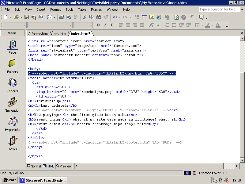
Another common task in web design is defining a "template" page where you fill all your content into. For example, every page on this site you're reading on now has the same header and footer, and every article has the same sort of thumbnail image at the top. That was all scripted using template features.
FrontPage, being an Office product, supports templates. The implementation admittedly is super janky, but it's there. You can include pages within other pages just fine, it's just a little tricky to set up. (FYI, Word, Excel, and PowerPoint do templates too. It's one of their lesser-known features, IMHO.)
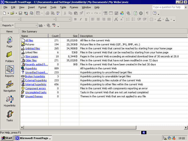
Another really neat feature: reports. Like a compiler in an IDE, FrontPage produces warnings, errors, and statistics for your site. At a glance I can view all broken links, orphaned pages, oversized images, etc. This is a fantastic feature, something that modern web dev software just doesn't have.
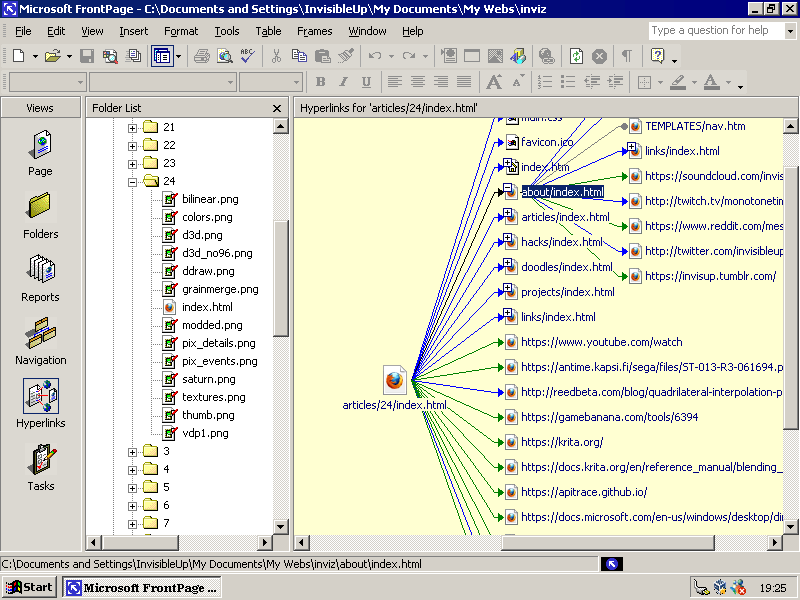
In the same vein as the Reports, you can see at a glance what links to what. It's a lot like the call chart in a software development IDE. I can see quickly every site linked from any page (shown here is the Sonic R color fix article) and any subpages.
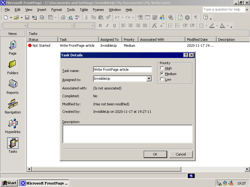
Last feature, although this isn't nearly as useful in the year 2020. In the tasks view, you can put up a list of tasks that needs to be accomplished. Already that seems rather nice for keeping track of what you need to do. It's a lot like GitHub or GitLab's issue tracker, in a sense.
However, if you connect to a server with FrontPage Web Extensions (I'll get to that...), you can share this task list with other people. You can (again, like an issue tracker) put up a task to be done by someone else and work on a task that somebody else put up. It's a very nice feature for web development, but nowadays this is normally handled by source control providers like GitHub or GitLab.
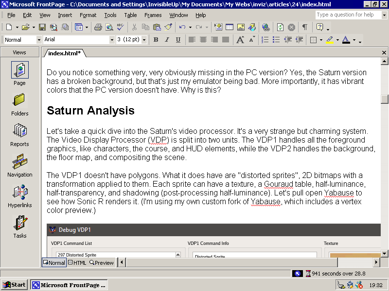
And, of course, there's the webpage editor. This works almost exactly like Microsoft Word, with some web-flavored spice. You type words and they appear in the page. You make those words blue, they're blue. That said, when you edit elements like that, it inserts an HTML 3.2 style <FONT> tag instead of trying to match it to a CSS rule. There's ways around this, but you have to be very diligent in doing so. This is mostly just due to FrontPage being a product of its time, though.
FrontPage is a program about planning, executing, and reviewing. Take the Navigation editor. You plan out the content of your site. You sketch up the layout. Then you reflect on if your layout matches your requirements. Or the Reports. Create content, check reports. Or the Tasks. Plan out what you need to do, do that, and then check if the task is complete. That, right there, is what makes FrontPage stand out and shine.
An Aside: Standards-Compliant Web Dev with FrontPage
Also, for the record, it is possible to create clean, somewhat modern code with FrontPage. (And by that, I mean "use CSS" and "don't require IE", not anything involving HTML5 or CSS3.) There's two things you need to do.
The first thing you need to do is to set FrontPage's feature set to something more reasonable for the modern age. To do that, open any page and go to Tools → Page Options → Compatibility. Then make the form look like this:
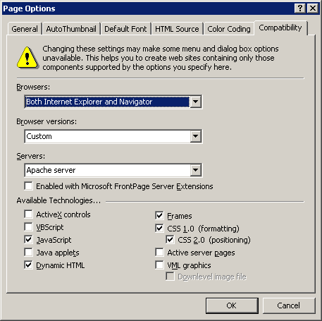
Doing this removes Internet Explorer-specific code, obsolete web technologies and reliance on the FrontPage Server Extensions (which nobody runs anymore). Keep in mind this does disable a lot of features of FrontPage, but frankly that's probably for the better.
The second thing you need to do is a bit more complicated. Pretty much, instead of using the formatting options in the toolbar, you need to create a stylesheet. Doing this allows for more cross-device compatibility and easier site-wide changes in the future.
To create a stylesheet, go to File → New. Open the Page Templates and go to the Style Sheets tab. Select "Normal Style Sheet." and press OK.
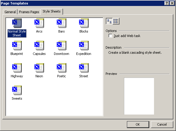
You should now have a blank document with all the formatting options disabled. Go to Format → Style, and under "List:" select "User-defined Styles"
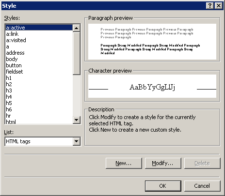
From here, press "New". When asked for a name, type the name of the element or the name of the class you wish to apply the style to. (It's a standard CSS selector, so all those rules apply.) From there, use the menu in the bottom-left to modify the style. Repeat until all styles are made.
To use the style sheet in a page, go to that page and go to Format → Style Sheet Links. Click "Add", select the style sheet, and press "OK". Your page should be styled! (However, the built in "Preview" mode won't show them for some reason.)
To give an element a class, select a chunk of text and look in the toolbar for the first dropdown menu. (It should say "Paragraph", "Header 1" or the like.) Select the class you wish for your selection to have. Your selection should now have the style of that class.
I will absolutely admit this is needlessly confusing, especially considering that CSS was supported by Microsoft as early as 1996's Internet Explorer 3, but at this point the <COLOR> and <FONT> tags had yet to be deprecated.
The Bad
Remember how I said that Microsoft bought out Vermeer because it was "perfect for their ongoing plan to become more internet centric"? Let's talk more history.
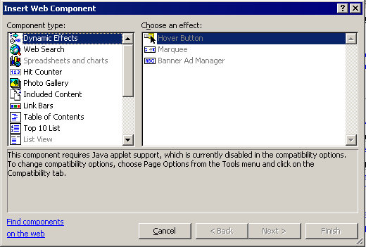
When Vermeer FrontPage was released, it supported these "plugins" called WebBots. The idea behind WebBots was simple: you dragged them onto the page and you instantly got dynamic content such as a search page, registration, table of contents, etc. These "WebBots" were saved in the HTML produced by FrontPage as comments. On a "standard" web server, these Bots would do nothing. However, if you ran it on Vermeer's (and later Microsoft's) Personal Web Server, the WebBots came to life. In keeping with the open nature of the WWW, Vermeer released FrontPage Sever Extentions for all the popular web servers at the time, such as NCSA, CERN, and Apache.
Before I go further, let's talk about Internet Explorer and Microsoft. To put it lightly, Microsoft was determined to win over the Internet. Back around ~1996, Internet Explorer 3 was out. It was doing okay, with about 20% marketshare, but it was still losing massively to Netscape Navigator. So, in order to push adoption numbers, Microsoft included the Windows Desktop Update with Internet Explorer 4.
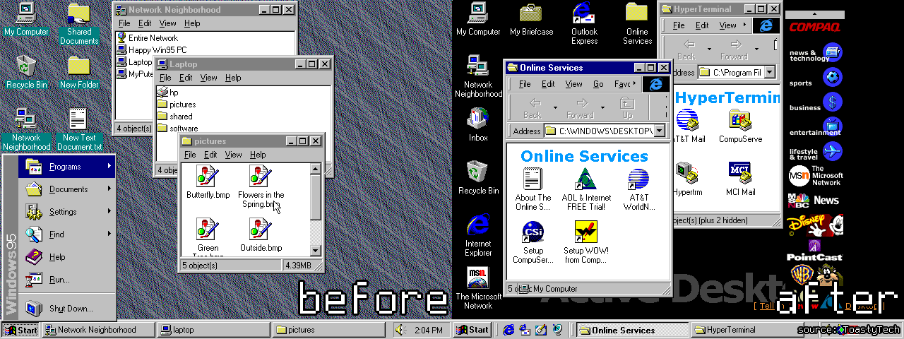
What this update did was, more or less, replace a good chunk of the Windows interface and API with Internet Explorer guts. While it was advertised as "The internet the way you want!" and "Brand new features for Windows Explorer!", it also served as a front to push IE adoption.
Even if you disabled the Desktop Update, some programs still required that IE4 be on the system. Why? One of the things IE4 did was provided a convenient API to add an embedded webpage to any Windows application. It also provided features such as HTML Help and more common controls for your programs. The logic behind this was to provide a unified API and consistent featureset for adding Internet features to any Windows application.
Unfortunately, they did this in such a way that using non-IE browsers (primarily Netscape Navigator) felt alien. Why use the weird, external program when you can use the one that looks and acts just like Windows Explorer and Windows Help and the rest of the OS. Plus, a lot of new computer owners haven't even heard of Netscape, and there really was no reason for them to investigate. (The strange thing is, in usability testing people found Netscape to be better than IE!)
In addition, to hasten Netscape's death, Internet Explorer added some unique features. The most well-known of these are ActiveX controls, added in IE3. ActiveX controls were programs put on a web server and downloaded by the web browser for rich dynamic content. Problem was, ActiveX controls only worked on Internet Explorer, and were typically programmed for Windows 9x. This locked out a good chunk of the internet to Internet Explorer running on Microsoft Windows. There was also VML (vector graphics), various CSS attributes, VBScript (hate JavaScript? How about Visual Basic?), etc. All of this eventually cumulated in a 2001 anti-trust lawsuit against Microsoft
What's my point here? Microsoft FrontPage extensively used these Microsoft technologies. You could, if you wanted, make all the scripts run on VBScript, and therefore exclusively Internet Explorer. You could draw vector graphics via AutoShapes, and it'd only be vectorized in Internet Explorer. (Although, to be fair, SVG [the only other alternative] wasn't finalized until 2001.) It could embed webpages generated by Microsoft Office, which only rendered properly in Internet Explorer. It could include video, which only worked with Windows Media Player.
Of course, you had to go out of your way to do all these things. The problem was, however, there was often no Netscape alternative for many of these features, leaving the program's features crippled if you want compatibility. But wait, there's more!
Most of the WebBots required the FrontPage extentions. While the UNIX server versions still existed and were still updated, they weren't very good. The Apache version had gaping security holes, for one. Evidently Microsoft was trying as hard as it could to shove these under the carpet, as in the FrontPage Server Extensions 2002 Installation documentation, which barely acknowledged UNIX. (In fact, to get the Server Extensions today, you have to go to some weird 3rd party website (endorsed by an official Microsoft website!) and purchase it. For money. Why.)
Plus, on top of that, there were some features that REQUIRED Microsoft's IIS web server. The biggest one of these was database integration. Database-connected pages were served with ASP, a proprietary Microsoft technology. And, if you were dealing with any sort of user interaction of dynamic content, databases were not optional. Plus, on top of that, the only non-Microsoft database it supported was Oracle's. Plus, on top of that, there was a one-click option within FrontPage to create a database connection to any Microsoft Excel workbook or Access database. Plus, on top of THAT, some of the collaboration features only worked if a Microsoft SharePoint server was installed.
Pictured: Microsoft's roadmap to world domination.
FrontPage, although a fantastic product, was little more than a pawn in Microsoft's toolbox. And all this worked. Immensely. Best Buy of all places had a FrontPage site in 2000, along with many, many others. Heck, they even managed to get GeoCities, AngelFire, Tripod, and Talk City to run the Frontpage Server Extentions. FrontPage was taking the Internet by storm. And by 2002, Internet Explorer reached 96% market share (compared to 1997, which was more around 18%).
And you know what the best part about all this is? Because Microsoft technolgies were so prominent while companies were creating Internet sites and corporate Intranets (especially around the Y2K fiasco), they're stuck. Stuck for a very, very long while. For years is was common for internal corporate sites to require some form of Internet Explorer due to being based on Microsoft server technology. Japan's government switched to ActiveX-based technology in 2016 for some reason. And as far as consumers go, we're still stuck trying to transition away from Windows programs, Office documents, and program development with Visual Studio. They were just so prevalent at the time when everyone was getting their first PC.
The only reason you probably aren't viewing this on Internet Explorer is because of one piece of software: Mozilla Firefox. It was the first popular web browser since Netscape to provide things IE didn't have, such as tabbed browsing and a download manager. (There was Opera, too, but you had to pay money for that.) Evidently, people really wanted Firefox.
The rise of Firefox made the use of Microsoft servers for public internet use simply not worth the several hundered dollar license cost, leading to the increased adoption of free Linux-based server software. Having served it's purpose of pushing the increasingly useless IIS, Windows NT Server and MS SQL Server trio, along with it's HTML output becoming increasingly dated (this is speculation; Microsoft hasn't given an official reason), FrontPage was discontinued in 2006.
The Ugly
Despite being discontinued for that last 13 years, producing awful HTML by today's standards, and totally being a front for Microsoft's domination of the computer industry, FrontPage is still the one of the best programs for the inexperienced user to produce webpages. Yes, seriously. FrontPage is absolutely not a program you should be using to produce websites in the year 2020. But, strangely enough, no other program had the easy user interface linked to great power that FrontPage had. All other offerings either require you to know a thing or two about HTML, or simply haven't been updated in years.
Microsoft Expression Web
The recommended alternative Microsoft gave to replace FrontPage is it's own Expression Web. I tried it out (it's free, mostly because it's been discontinued since 2012) and... and it's literally just FrontPage drowned in an oppressive coat of Visual Studio-inspired paint.
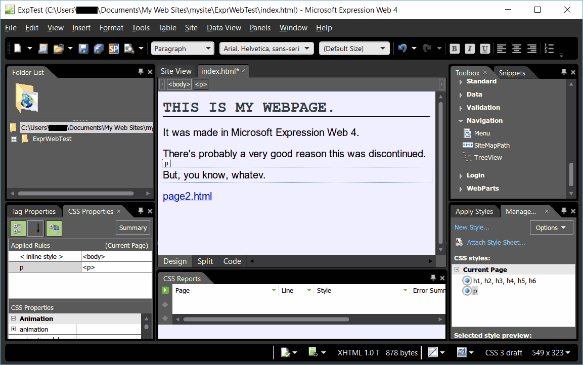
There's pretty much 4 key differences here between FrontPage and Expression Web.
#1: CSS. You can't avoid it. No more <FONT> and <COLOR> tags for you. Instead every time you change the font or whatever it makes a new CSS class for you. I don't love that, and I would have preferred inline styles, but whatever.
#2: They're pushing ASP.NET. Hard. Remember WebBots? They're gone. You know what you get instead? ...Pretty much nothing! No hit counters or navigation bars for you. What you do get are things like CustomValidators and DataLists that I honestly don't know how to use. Also, as the cherry on top, ASP.NET support on Linux servers was very hack until the recent development of .NET Core. One could say this goes back to that whole "world domination" thing, but this is a frankly puzzling product.
#3: They got rid of half the web management features. I mean, Webs still exist. You can still generate reports and view hyperlinks and publish to servers and all that. But there's two key features missing: the navigation editor and the collaboration features. I get the collab might be hard with the removed requirement for FrontPage Server Extensions, but it was useful, to say the least. Also, they got rid of the navigation editor, and therefore the navigation bars in the pages. This leaves you in that weird stone age of making links manually and hoping they don't break or get outdated.
Lastly #4: The user interface is not very good. At all. Compared to FrontPage, the layout of the UI here seems absolutely illogical. You have junk on both sides plus the bottom that you probably don't care about. (Folder View and CSS Properties can easily be folded into other panes, for one.) The CSS Manager, compared to FrontPage's Format → Style menu, makes little sense. Automatic styling is easy; just hit the format buttons and you'er done. Actually giving a tag a particular style is unreasonably difficult, requiring you to manually set the class in the Tag Editor. Also, like FrontPage, making a site-wide stylesheet is harder than it has any right to be. The Site Manager is a bit weird too, as the giant sidebar from FrontPage 2000+ has been replaced with tiny tabs at the bottom. And, for no logical reason, it shares all the same sidebars as the page editor despite being a completely seperate thing.
Overall, my quick review is this: It's certainly easier to get a hold of than FrontPage and it produces much better HTML. Unfortunately the user interface seems to have been hit by a bus of Visual Basic enthusiasts, losing some key features on the way and gaining some weird ASP.NET server things nobody would ever use. It's confusing, designed for two audiences at once (pro backend web-dev and complete novice) and honestly the interface alone makes FrontPage better. Also really, besides more reliance on CSS and ASP.NET, this doesn't add a whole lot of new features compared to FrontPage. If anything it just removes features.
Dreamweaver
Of course, there are non-MS alternatives. There is also Adobe's (formerly Macromedia's) Dreamweaver. Dreamweaver, unlike Microsoft's offerings, is still being actively developed. You can buy it for $20/month from Adobe. (Assuming, of course, you want nothing else from them.)
I'll be looking at the 2016 version of Dreamweaver here, as that's the version I used when recording myself using it in....2016. (This article has been on the backburner for a while.)
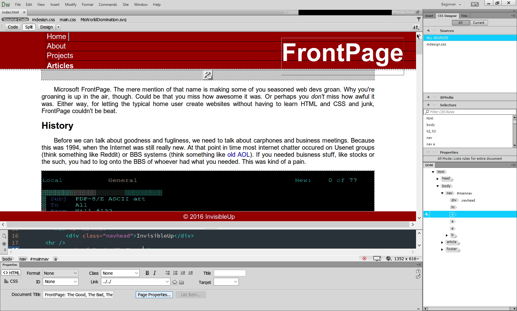
Dreamweaver is an interesting little thing. Certainly, compared to FrontPage, I'd use Dreamweaver any day. It actually produces websites that makes sense in the current year. It allows you to create media queries for mobile responsiveness and generally produces cleaner code. If you know HTML and CSS and like taking shortcuts, Dreamweaver is perfectly and totally okay. But, unfortunately, the interface is still lacking compared to FrontPage for the inexperienced user. (Yes, I'm still serious.)
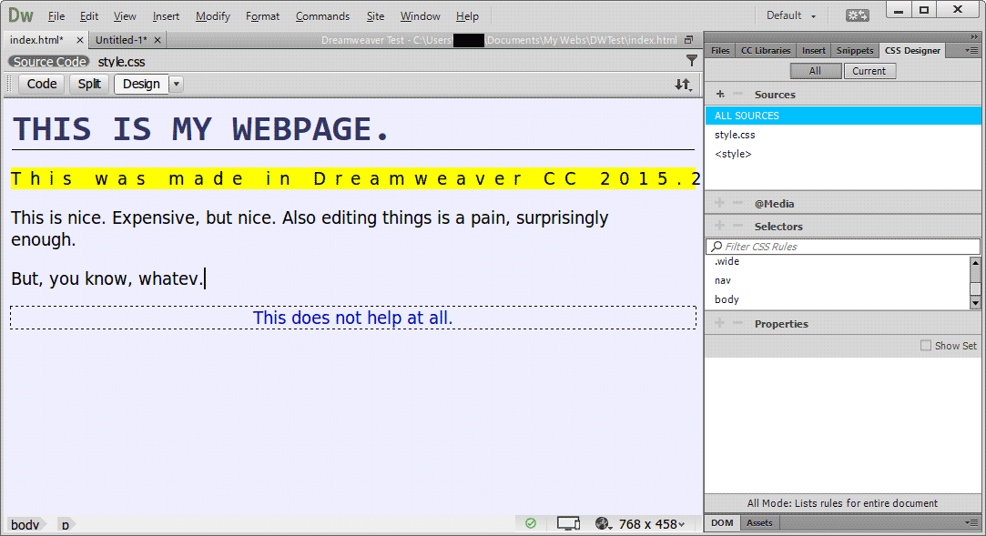
Here's an example. I want to make a paragraph and make it highlighted yellow. Seems easy, right? Well... Making the paragraph is easy enough. There's an "insert" pane at the top right. Click that, click paragraph, drag where you want it to go, done. Plus, you can rearrange things with the DOM editor. Going well so far, right?
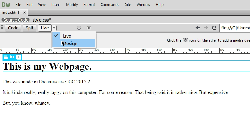
If you actually start typing, you'll notice the interface is really laggy. Like, you type something, and it shows up 5 seconds later. Turns out by default Dreamweaver shows your site in "Live" mode, which I guess rerenders the entire page every time you edit it or something. What you have to do is switch it to "Design" mode, which is almost identical but has different features and runs on a different rendering engine. I guess "Live" is an interactive version of the "Preview" mode from FrontPage.
So, let's actually color that paragraph. If you look around, there's a stunning lack of color options. The closest thing is the CSS Designer, which is just begging for you to add a source. So, let's say you know what a CSS is and decide to do that. All that happens is that the Sources panel now has a name, which you cannot interact with. Also, a STYLE tag appears in the DOM. This does not help you. At all.
So you experiment some more. Let's right click on that paragraph. Assuming you changed it to Design mode instead of Live mode (a very easy thing not to do), you get two seemingly relevant menu options, Font and Style. Alright, we're getting places! ...Except "Font" just changes fonts (makes sense) and "Style" lets you pick between Bold, Underline, and Italics. Great. We've gone nowhere. There's also a menu called "CSS Styles". The only usable option is "attach a stylesheet". Doing so does nothing.
Alright. Whatever. I needed a custom font anyways. Right click, select a font, and...
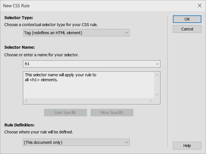
So, okay. I guess I can do CSS now? Uh, sure. Let's say I want to make only this certain "p" tag yellow. Maybe I'll check that CSS Designer thing again. There's a little bar labeled "Properties". Let's click on that. All of a sudden, I get... a single field where I'm supposed to type in the name of the CSS attribute and it's value. Pretend I don't know any CSS attributes. Pretend I barely know what CSS is. Not very useful. ...But it is.
To "fix" the CSS Designer, you have to uncheck the tiny checkbox labeled "Show Set" on the Properties sub-panel titlebar. Then can you edit the styles and make the background yellow. Can I just say that was ridiculously convoluted? Because it was.
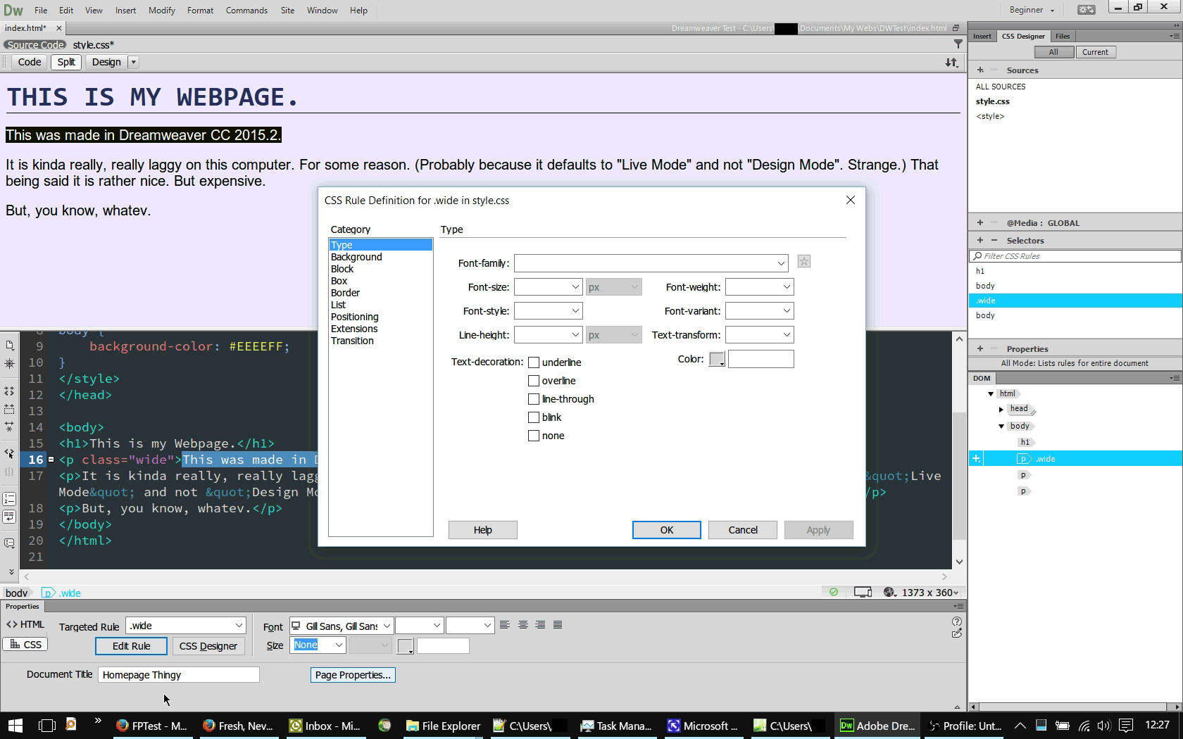
Oh. And to set multiple things to the same style, you need to select the element you want to change the class of, right click on the DOM breadcrumb at the bottom, and select a class in the "Set Class" submenu. Frankly I'm not even sure how I figured that out. Also, if you stumble through the "Window" menu, you can set the Workspace Layout to "Beginner". This places a little bar at the bottom with a bunch of simple formatting stuff and a nice Rule Editor. That would have been kind of nice as the default, don't you think?
So styling is incredibly difficult. Fine. Let's tone it down a bit. Let's say I want to link to my website. Seems easy enough. Right click, "Make Link", and...
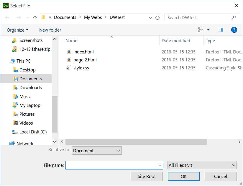
Well, alright. Let's just type the address into the filename box. I remember having to do this with stuff like PowerPoint back in the day. So, we type in the address, hit OK, and...
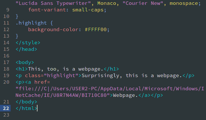
I'm done. Dreamweaver is utterly broken from an end-user standpoint. Dreamweaver is only an usable project if you already know HTML and CSS to the point where you don't need Dreamweaver.
Adobe Muse
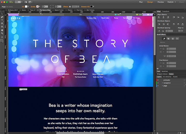
One more program. Adobe Muse. For various reasons I can't get my hands on a trial copy, so instead I'd recommend you check out this walkthrough/tutorial video. You'll notice it's pretty much exactly what I'm looking for. It's got a Web hierarchy editor. It's got "Widgets" for navigation bars and the like. It does collaboration via the Creative Cloud. It uses CSS and thrives on templates and pre-planning. What's wrong?
The answer: Vendor lock-in. You see, like Dreamweaver, you needed to shell out $20/mo to use Muse. If you don't, you can't use Muse. Seems simple. Let's just say you forget to pay for Muse for a month. Let's also say you need to update your website, today. If you somehow lost your FrontPage install, you can still edit the website with something like Notepad, push it to your server and the FrontPage Server Extensions should kick in and take care of the WebBots. (And if they don't, it won't be the end of the world as FrontPage caches the contents of WebBots in case of situations like this.) With Muse, well...
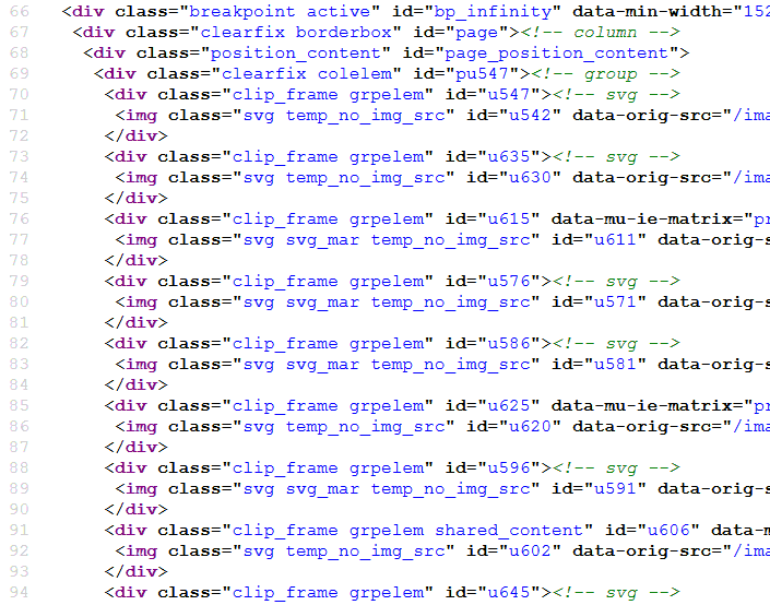
That's a snippet from the official Adobe Muse website, circa 2016. You cannot edit this without Muse. It is incomprehensible what you're looking at here as it's just random DIV elements with Muse-specific attributes and classes shoved in. If you, say, wanted to add a new section to the page using a text editor, you're SOL. This mess of tags also makes a lot of things like device-specific stylesheets or handicap accesibility impossible. (Need proof? Try printing the Muse website. From my experience, it was a completely white sheet.)
Unsurprisingly in retrospect, Adobe Muse has been discontinued. Thankfully, it's still possible to use the Muse software even if it's discontinued. Unfortunately, doing so requires the "Creative Cloud All Apps Subscription", which is very expensive. Even worse, if you ever wanted to switch from Muse to another product, you'd have to completly rebuild your website as there's, again, no way to edit a Muse site without Muse and no way to export Muse layout and style information to usable CSS. (The funny thing is, I wrote most of this section before this happened, and I had a big warning that this was going to happen.)
Wix, Weebly, Squarespace, etc.
On that note, there's also a new trend with Software-as-a-Service web builder sites such as Weebly, Wix, and Squarespace. These claim to let the average layperson develop their own webpage. The problem with these is like Muse but on steroids. Not only must you only edit your site through their web app, they own your site. I mean, you still own the copyright for your words and pictures and stuff, but the existence of your site on the Internet is totally dependent on the service provider.
Hypothetically, say one of them went bankrupt and was unable to host websites. Your site is gone. Period. They might have a backup, but there's no way you'd easily be able to migrate it to anything else. It's in a completely different and totally closed format! In addition, you're at the whim of Weebly/Wix/whoever as far as features go, sometimes needing to pay money to "unlock" more. (For instance, with WiX you need to pay at least $10/mo. if you want to remove ads, and $17/mo. just to have an online store.) At least with FrontPage you had the ability to create your own WebBots if you needed more functionality. (Granted most people probably would have paid for them, but at least it's not a montly fee.)
If you don't think any of these are problems, I'd like to introduce to to GeoCities. It used to be a simple web host with a couple megabytes of storage. Then Yahoo bought it. It gained some "cool", Geocities-only features such as it's Website Builder and guestbooks and some fancy PHP schenanigans you could add yourself. Then, in 2009, GeoCities faced a very sudden and very terminal fate. Wix, Weebly, Squarespace and the rest will eventually die. Geocities was king of the 90's, and now look at it. Please, don't put all your eggs into one basket.
If you look out for them, you'll find a dozen more website editors. These are either heavily locked down like Muse, Weebly, Wix, etc. or glorified text editors capable of not much more than syntax highlighting and having a couple of shortcut buttons for common HTML tags.
Conclusion
Alright. So what if the secretary can't produce the company webpage? Who cares? Just hire a web design firm who knows what they're doing, right? Here's the thing: I do agree that you should probably get a web design firm that knows what they're doing if you're dealing with, say, financial transactions, personal information, massive amounts of data, or really complicated server stuff. But that's no reason to exclude the other 95% of people.
The Internet is a really cool thing, in my personal opinion. And it's full of tons of creative folks. Want proof? See Tumblr, YouTube, Twitter, Soundcloud, my links page, etc. But locking up the Internet to some predefined painted corners is a bad thing. I've discussed this in great detail in one of my previous articles. But what if you want to do something different? Take this website. Sure, it could be a WordPress blog and it would be just fine.
But say, perhaps, I want to start a range of interactive programming tutorials on this site. Say I'm teaching you how to make a Game Boy game, and I want to have a code-along section. On the side there would be text explaining how a bit of code works, and in a little textbox you could experiment with that! And you can't continue until you've mastered the concept. (For an example of this sort of thing, see the excellent Book of Shaders website.) If I wanted to do that on my hypothetical WordPress site, I'd be out of luck. What I need and what WordPress provides are two entirely different things.
Or say there's a musician who wants to make a website. (For no particular reason, let's say Dennis DeYoung circa 1983, rocking that pink suit.) He doesn't want just a cookie-cutter Bandcamp page. Maybe he's feeling experimental. Who said he can't have a video of a live performance next to a blurb of the inspiration for the song and a link to iTunes? Or some unique interactive experience meant to drum up interest? Bandcamp. That's who.
Or say a gardner from Alabama wakes up tomorrow with a very sudden urge to run a marathon. Several hundred marathons. After doing that and not dying, he wants to cash in on his publicity. So he makes this cool website with this map that tracks everywhere he's ran, how far, how fast, etc. And then he could have tips on endurance running and cool spots around America in a newsletter or a blog or something. (Not that this particular gardner from Alabama would bother, but maybe his fans would.)
Okay, enough absurd hypotheticals. Point is, the Internet is the land of innovation. Throwing the 95% of the population who doesn't know web design and never will blocks out a lot of creative uses for the internet. Right now, poor old Dennis DeYoung doesn't really have a place to showcase his music short of getting a Wix/Weebly/whatever page or hiring a web designer. Forrest Gump right now is stuck with Tumblr at best, which has had it's fair share of issues lately.
You look at something like Neocities and you see endless, totally freeform creativity. You got My Little Pony episode trackers, a bombastic Y2K homage site, a guy who likes experimenting with cool JavaScript stuff, very experimental and artsy sites, etc. The thing is, all of those people knew HTML and CSS to some degree. Imagine the people out there that want to make stuff like this but only know art or music or the such.
What I'm saying is that we need to a simple way for any person to create anything and put it on the Internet. It is not enough to be stuck between the extremes of "no control" and "hideously expensive and time consuming". And, as silly as this sounds, Microsoft/Vermeer FrontPage was almost that thing. It let multiple people work on a single site with planning utilities and WYSIWYG editing. Problem is, it's stuck in the 90's. FrontPage never produced "good" websites; it just produced something on par with an old GeoCities fansite. (Also it's owned by Microsoft and totally dead, which doesn't help matters.)
We need a new FrontPage. A FrontPage that uses HTML5 and CSS3 and modern JavaScript and cool PHP stuff. A FrontPage that follows modern design principles like semantic HTML and powerful CSS styling. A FrontPage that is totally open, totally not a pawn in world domination schemes, totally not locked down to one greedy vendor, and totally not abandoned. A FrontPage that outputs usable, sensical, and simple HTML and CSS. A FrontPage that integrates with version control software like Git and planning programs like KPlan and communications programs like email or IRC to allow planned, meaningful collaboration. A FrontPage that lets people write and share useful and versatile WebBots like people do WordPress plugins today. (Probably using JavaScript instead of custom server-side plugins, though.)
In summary, we need a FrontPage that lets the incredibly talented common folk retake the internet with creativity and originality. Because as nice as Facebook and Twitter are, let's face it, we all kind of miss the old days of lovably terrible hand-crafted sites.
References
from Hacker News https://ift.tt/36Ge8H6
No comments:
Post a Comment
Note: Only a member of this blog may post a comment.