This was originally posted as a thread on Twitter, but I thought I'd republish it here to give it a proper home.
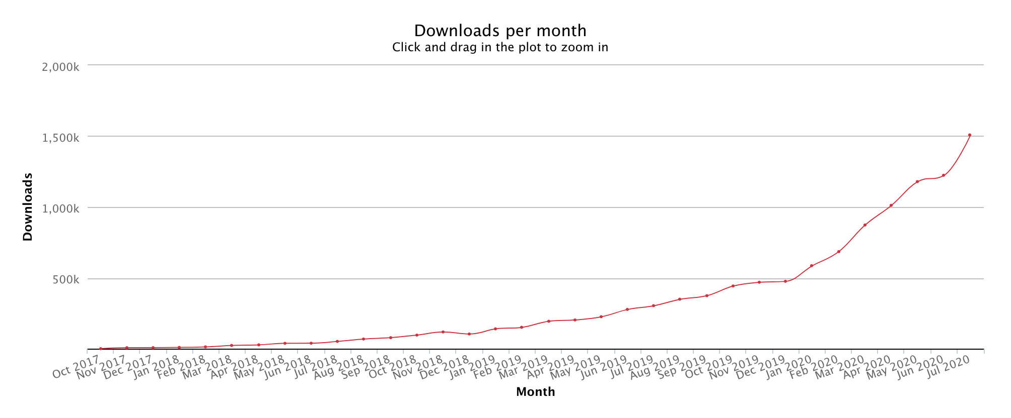
So about a month or so ago, Tailwind cracked 10 million total installs, which given its humble beginnings, completely blows my mind.

We're also about to cross $2 million in revenue from Tailwind UI, our first commercial Tailwind CSS product which was released about 5 months ago — a bit under two years after the very first Tailwind CSS release.
Here’s the story from the beginning, while it’s still fresh enough to remember…
Reddit meets Pinterest meets Twitter
Way back in 2015, I told my now-business-partner Steve Schoger about a side-project idea I had for a site where companies could share interesting links with their team, and outsiders could subscribe to see what teams they admired were reading.
We called it “Digest”.

We were pretty excited about it, and I decided to take a week off work to build the initial prototype. In classic developer fashion though, I spent the entire week making decisions about the tech stack, and had maybe one full day at the end to actually hack on the real functionality.
One of those decisions was what to do about the CSS. I’d always been a big Bootstrap fan, but the first Bootstrap 4 alpha had just come out and they had dropped Less for Sass. I hated Sass!
Sass had sort of beat out Less in the preprocessor wars of the mid-2010s, but in my opinion Less was the nicer language. It was functional and declarative, rather than procedural and imperative like Sass, and it had one killer feature Sass didn’t have: classes as mixins.
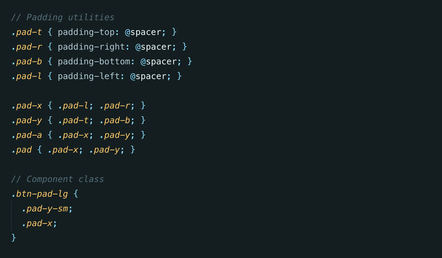
You see in Less, any existing class could automatically be used as a mixin. You didn’t need to explicitly define a mixin like you did in Sass. This let you easily create larger class abstractions out of smaller utility classes.
If you've used @apply in Tailwind, this will probably look familiar…

So anyways, back to Digest. Normally I would’ve used Bootstrap, but the Sass thing killed it for me. I wanted to keep using Less. So of course my only choice was to author all of the styles from scratch.
I spent most of the week on this initial styling system.
What I was building was very Bootstrap-inspired, and had lots of component classes like btn, card-list, and radio-box. But it also had this small set of utility classes.
(Here’s where we kind of ended up by the way, I think it still looks pretty good even 5 years later!)
Anyways, we got busy with other projects, lost enthusiasm for this idea, and ultimately it all landed in the side-project graveyard (as most things do).
All but the stylesheets.
On every new project, I kept copying and pasting all the Less files from Digest and using them as a starting point, customizing them as necessary to suit whatever new design I was building. I must have brought them across to at least 4 or 5 other projects after we abandoned Digest.
I noticed something as I copied the styles across though: the utilities (which started as simple padding and margin utilities) kept growing and evolving, covering more and more CSS features, while the components files kept getting shorter and shorter. The utilities were the only things that were truly “portable”, while the component styles were always too opinionated to reuse on another design.
This is when I really started to identify the whole “utility-first” thing as an architectural philosophy, rather than seeing utilities as being just a useful bag of tricks to slap in my HTML here and there as needed.
Abandoned side-project #2
Fast-forward a few years later and Steve and I started working on KiteTail, which was going to be a developer-focused, webhook-driven checkout platform:
We were taking this one pretty seriously at the time, and — using those old Digest styles as a starting point — I started building the thing, trying very hard to make the styles as “project-agnostic” as possible.
You can watch me build a ton of the app on YouTube, and you can see all these utility styles in there the whole time:
Watch the "Building KiteTail" series on YouTube
Now at this point I had zero intention of maintaining any sort of open-source CSS framework. It didn’t even occur to me that what I had been building would even be interesting to anyone. But stream after stream, people were always asking about the CSS:

This is the benefit of working in public — Steve and I would have never built this Tailwind Labs business (which has now done over $4m in revenue in under 2 years) if I hadn’t been live-streaming my work on yet-another-abandoned-side-project.
Anyways, eventually I thought “maybe I’ll open-source this little Less framework?”
Going open-source
A few people reached out to me about it around this time in case they could collaborate on it with me in any way. One of these people was Stefan Bauer, who if I remember right actually was the person to suggest prefixes like sm:font-bold instead of sm-font-bold for Tailwind's responsive utilities.
My good friend Jonathan Reinink also messaged me about the framework around this time, saying he was about to do a big redesign of his SaaS project and wanted to try this crazy utility nonsense I had been blabbering about.
This turned out to be key for making the framework actually good, because our projects had completely different designs, and what-would-become-Tailwind needed to support both of those projects. This was a great forcing function for making it project-agnostic.
By the way, the name Tailwind? It came from me wanting the name to be tied back to KiteTail in some way, since Steve and I were still pushing hard on that idea, and had dreams of it being this awesome company we’d run one day. I just threw “tail\*” into onelook.com to see if I could find any cool related words.
Back to the story — this was around June/July 2017, and for the next 2-3 months, Jonathan and I worked feverishly on making something that was good enough to open-source.
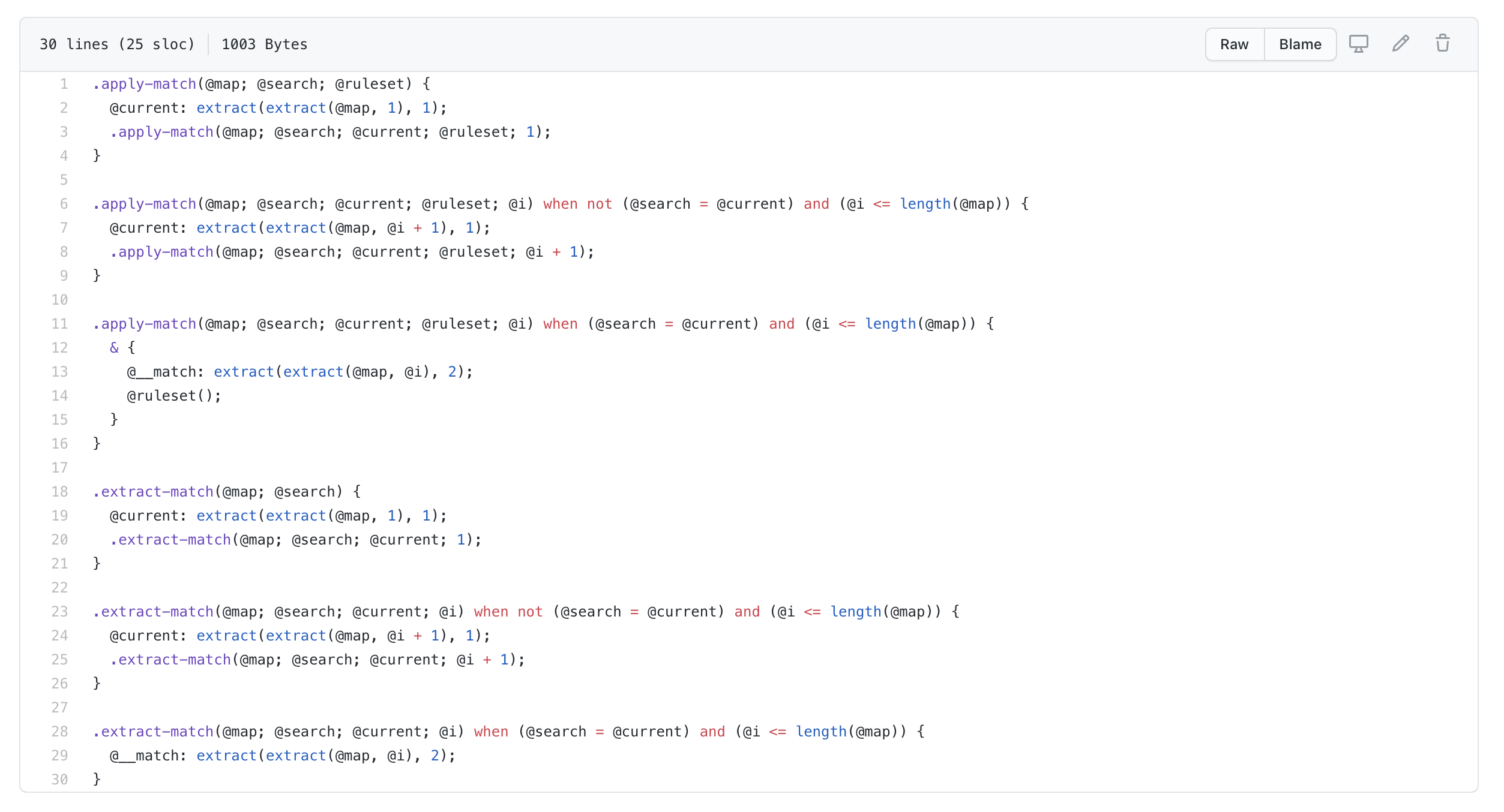
One of the challenges I faced during this process was that in order to make Tailwind as configurable as I wanted, I had to seriously push the boundaries of what was possible with Less, and write some truly cryptic and horrific shit:

Writing a test suite for this sort of thing was not really practical as far as I could figure, and it was getting to the point where I didn’t even understand the system anymore and just had to hope and pray that solving one problem didn’t introduce another.
This was maybe mid-August, and my friend David Hemphill suggested I mess around with PostCSS and see if I could write the framework in JS.
I had no idea what it meant to use PostCSS to build something like Tailwind (I thought it was limited to the sort of things autoprefixer uses it for), but David clued me in to some high-level tricks, like using custom at-rules and custom properties as “hooks” to insert generated code.
I started messing around with it and was immediately amazed by how much more confident I felt in the code, and the amazing things I could do given a proper programming language.
I talked all about it on Full Stack Radio a few weeks later:
Listen to "Building a CSS Framework with PostCSS" on Full Stack Radio
(By the way, to this day I feel like Tailwind is completely abusing PostCSS in a way it was never intended, and I secretly believe Andrey Sitnik cringes a little bit every time he thinks about what we’ve done with his beautiful library 😅)
Anyways, on Halloween night 2017 we were putting the finishing touches on the first release, and cranking our asses off on the initial documentation:
We got it out the door and had tons of positive attention, even for v0.1.0:
A few days later, Andrew Del Prete wrote what would be one of the most important blog posts in the history of the framework, introducing me to the wonderful world of PurgeCSS.
Read "Using PurifyCSS PurgeCSS to Remove Unused Tailwind CSS Classes"
After about a year of new v0.x releases with lots of cool new features and a growing community, I announced I was going to go full-time on Tailwind CSS.
Going full-time on Tailwind
I was supposed to be starting on a new SaaS project with a friend, but after the success of Refactoring UI (a book Steve and I had released in December 2018) and the growth of Tailwind, I knew I would regret not pushing it further.
Tailwind CSS is by far the highest impact project I’ve ever worked on — it felt like it was this close to being my "dent in the universe", and the idea of not putting in the work to push it over that hump made me sick.
I was lucky enough to have a big bankroll from Refactoring UI, and I knew there were ways to build commercial offerings around the framework itself (themes, UI kits, courses, something!) so I decided to go for it.
I busted my ass cleaning things up and applying what we’d learned to put together a proper v1.0 release, which came out on May 13, 2019:
After that, Steve and I went heads down for the rest of the year trying to figure out what on earth “Tailwind the business” was going to be. We prototyped and discarded tons of different ideas, but eventually decided to pursue what is now Tailwind UI.
Here’s the first glimpse of that idea, back in March 2019:
We worked tirelessly on Tailwind UI for months, and finally got our early access release out the door in February 2020, after working literally 36 hours straight before our self-imposed deadline.
It has been successful beyond our wildest dreams (going to cross $2m in revenue next week), and as a result we’ve been able to start building an amazing team (Brad Cornes, Simon Vrachliotis and mystery developer #3) to keep pushing the future of Tailwind forward.
Things are only going to get more incredible from here, and I can’t wait to turn some of the ideas rolling around our heads into new features, products, and tools to make the Tailwind experience even better over the coming years.
Thank you for supporting us ❤️
from Hacker News https://ift.tt/33jhb83
No comments:
Post a Comment
Note: Only a member of this blog may post a comment.