1
People in my corner of Twitter love to talk about Roam. It made me wonder: What makes it so cool?
If you haven’t heard of it, Roam is “a note-taking tool for networked thought.” In layman’s terms that means it’s a notes app that lets you create links between pages, except anytime you link to page A on page B, it also shows a link back to page B on page A. This is called “bi-directional linking,” and it’s a nice way to keep things organized.
Confused? That’s ok. In fact, I think the main reason people like to talk about Roam on Twitter is that it’s hard to understand. There’s a learning curve not just to use the thing, but to even understand why you might want to use the thing. If you can get over that hump, it shows people how smart you are. So naturally people like to tweet about it.
(No shade to Roam fans! I write a newsletter for a living, so I am technically a professional at wanting people to know how smart I am.)
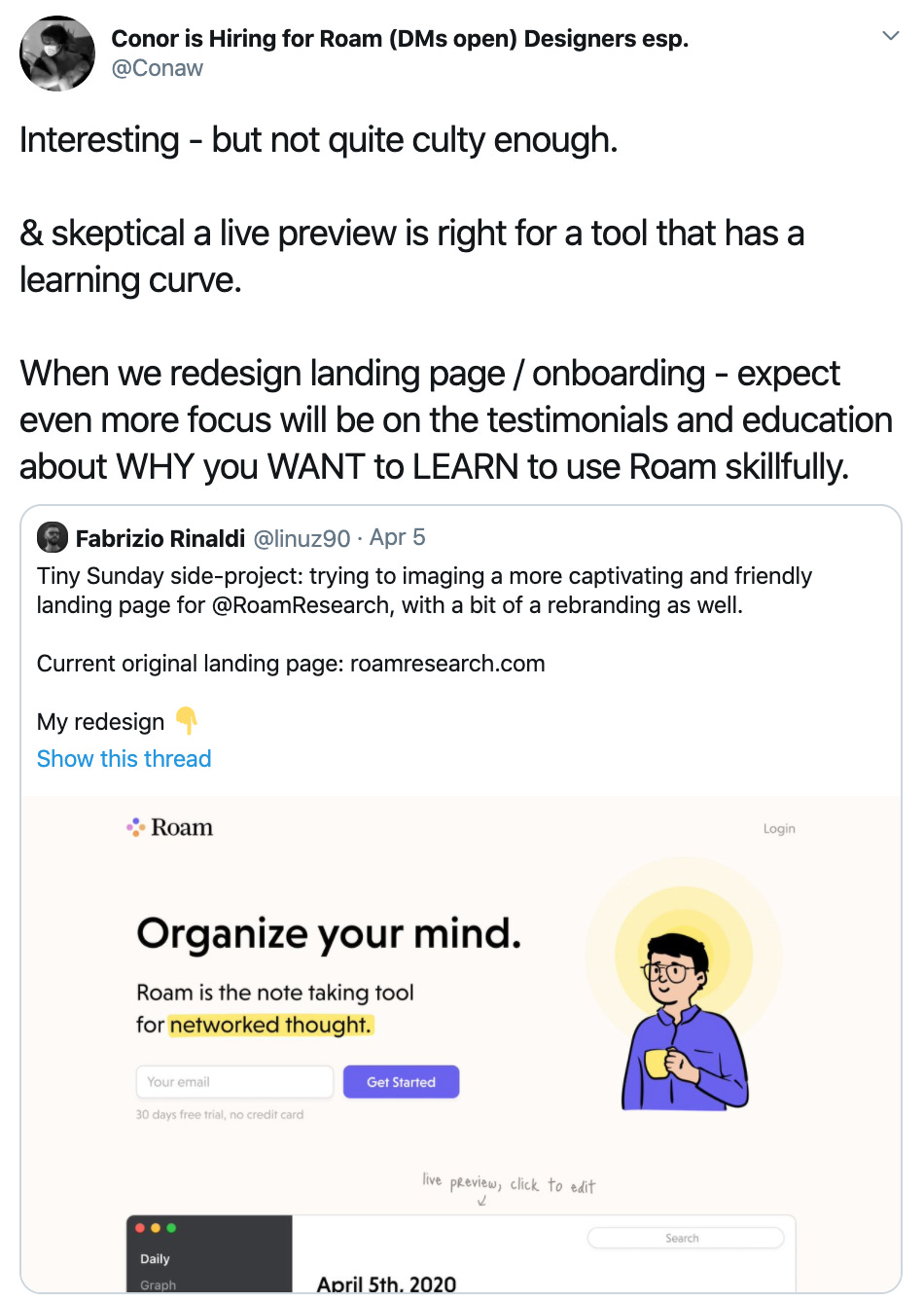
Anyway, the other day I saw a tweet from Roam’s founder that I think will be interesting to anyone who wants to create a product that achieves similar cult status:

“Not quite culty enough.” What does that mean? I think it’s a specific form of coolness.
(I’ll admit, I spent a lot of time this week reading about what makes things cool, because right now the opposite of cool is Quibi, and I was curious to learn what that was all about. Anyway, I digress.)
Coolness is a dance between familiarity and novelty. One way it’s often expressed is “most advanced yet acceptable.” The evolutionary psychology explanation is that we’re attracted to autonomy and independent thinking, so long as it’s not outright weird. The idea is that cool things don’t care too much about what other people (including you) think. They’re just doing their thing.
So how do you engineer that?
If you want to make something broadly cool, and you have a weird feature like bi-directional linking, you need to find a way to make it more friendly and familiar. That’s what Fabrizio Rinaldi was doing in his redesign.
It’s why he changed the logo from this scary-looking astrolabe thing:

To this friendly-yet-basic colorful circle quartet:

But if you want to make something culty, it has to have a hard edge. The coolness is derived from the parts you don’t get at first, It motivates you to come to it, because it’s not trying to come to you. The cultiness gives you a reason WHY you WANT to LEARN to use it skillfully.
I would guess that this is why Roam’s founder likes quirky, polarizing design. It’s why their features look kind of crazy and take substantial time to learn. He doesn’t want to water down the experience. He’d rather convince you it’s worth investing effort. In order to do that, you need cult-like motivation.
It’s definitely the coolness-maximizing approach. My question is whether it’s the revenue-maximizing approach, too.
2
As you may have heard, last week Notion raised $50 million on a $2 billion valuation. Apparently the round came together in 36 hours.
That’s certainly a shining light in an otherwise bleak time for startup financing, but it makes me wonder: is $2 billion a sensible valuation?
It’s hard to say; we don’t know much financial information about the company. But that won’t stop us from guessing! Using some napkin math and the public information we do know (pricing, and their 4m total user count) we can estimate some key statistics.
To start, let’s assume Notion was valued at 50x revenue. This is a big assumption, but Zoom (one of the fastest growing public software companies) is trading at a similar multiple right now. Since Notion was valued at $2 billion, we can divide that by 50 to get an estimate of $40 million annual revenue.
We know they have 4 million total users and we know their pricing, so let’s crunch some numbers to see if $40 million in annual revenue is a realistic estimate.
This is a free preview of a premium members-only post. There are two more “shorts” for paying members:
-
Assessing Notion’s valuation. Does it make sense? That depends on if you think it’s on a Slack-like trajectory, or whether it’ll get stuck closer to Evernote.
-
How “Time Preference” — the economic principle that says we should prefer having things now over having things later — actually makes us devalue the present and leads us astray.
Of course, these extra shorts aren’t the only reason to upgrade to a paid subscription. You’ll also get my complete overview of Michael Porter’s work, and access to everything new going forward. For example, next week I’m publishing a guide to one of Clay Christensen’s most underrated yet confusing ideas: The Conservation of Attractive Profits.
Sound interesting?
If the price is too high for you for any reason, let me know. I’d love to work something out.
Thanks!
from Hacker News https://ift.tt/2RuZ6Nx
No comments:
Post a Comment
Note: Only a member of this blog may post a comment.