Recently, I tried out the CSS framework tailwind. Tailwind is not new, but I had put off trying it due to a visceral reaction to its syntax. It is ugly.
Now I know what you’re thinking, “this is an atrocity, what a horrible mess!” and you’re right, it’s kind of ugly. In fact it’s just about impossible to think this is a good idea the first time you see it — you have to actually try it.
— The tailwind docs
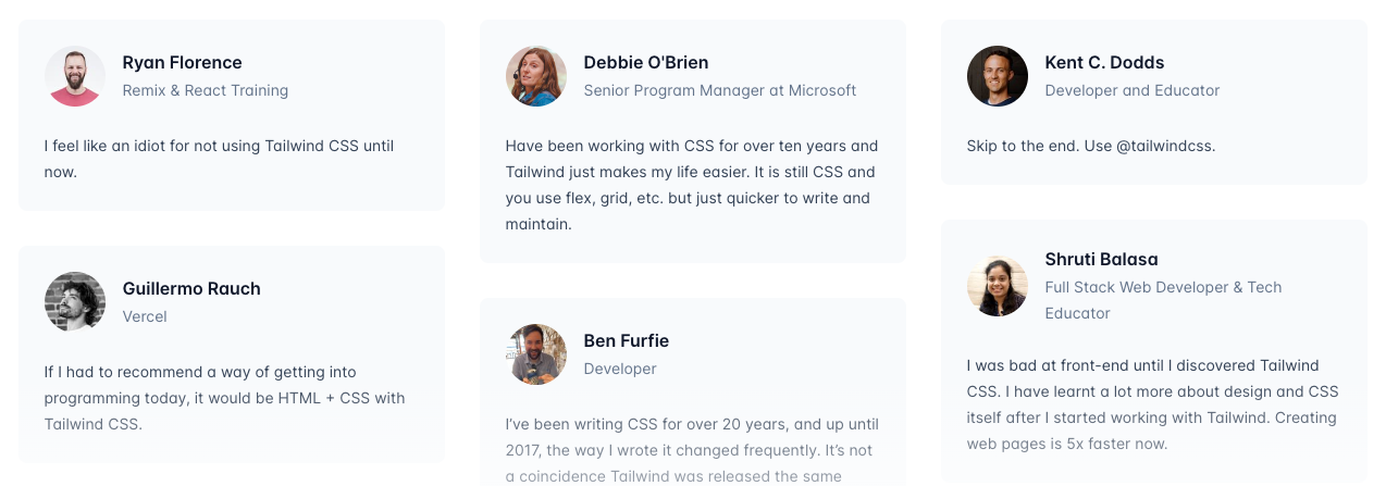
The thing is, lots of people I know and respect in the JS/ front-end world wax poetic about tailwind. In an attempt to understand why, I decided to use tailwind in a project: the blog you're reading this on (at least as I write it in July of 2023).
Through the experience of setting up this blog and reading through all the tailwind docs, I have found myself slowly but very surely coming around to the "Tailwind way." I will attempt to list the revelations I have had throughout that process in a series of articles. In this first one I will focus on perhaps the biggest benefit I've found with Tailwind...
#Minimizing the mental (and physical) distance you need to travel to understand your code
As I get deeper into my software engineering career I have realized an important aspect of what I consider "good" code is that it enables you to focus very tightly on the section you're working on without needing to jump around to other files (or even scroll down the same one.)
Perhaps my brain isn't as spry as it once was, but every intermediate step I need to traverse to understand the full extent of the code I'm looking at drastically increases the chances I will make a mistake when I go to update it.
For instance, a million helper functions abstracted away may look and feel "clean" and modularized, but if you constantly need to jump around in your editor to check on the internals of one of those helper functions you are forcing your brain actively juggle more concepts at once, giving you less flops to come up with elegant and quick solutions to the problem you're trying to solve.
#The problem with the HTML/CSS boundary
Modern CSS is a powerful tool with things like psuedo-classes, media/container queries, and animations. As a result there's a non-trivial amount of details about your component or site's behavior and appearance in that .css file.
#How Tailwind helps
Tailwind's inline styling-logic may look ugly, but what you see is what you get. There's just enough abstraction that you're not effectively writing inline styles, but you also can understand what your markup is going to look like while only looking at that markup.
#An example
The following is a rough version of the navigation bar at the top of this page. We have a series of links (in the component <NavLinks />) and we want to show them next to eachother on big screens and with a collapsible menu on mobile (in the component <CollapsingMenu />.)
#Tailwind's version
navbar.tsx
<nav>
  <div className="sm:hidden pt-1.5">
    <CollapsingMenu />
  </div>
  <ul className="hidden sm:flex align-baseline gap-4 text-xl">
    <NavLinks />
  </ul>
</nav>
There's some fairly complex logic here. Starting with the top div, the class sm:hidden means that, after the viewport gets beyond the "small" size (default of 640px) the div becomes hidden, aka hide the collapsing version of the menu when we don't need it. We also add a bit of top padding to balance the vertical alignment a bit with pt-1.5.
Beneath that, we have a <ul> tag with the class of hidden on it. Meaning that it starts at hidden. Then sm:flex un-hides the div when we cross that small size threshold by setting display: flex. We also add a few classes to manipulate that flex container, aligning the content with align-baseline, adding a gap between the links (gap-4), and making the text larger (text-xl).
#The "traditional way"
We can recreate this logic in the traditional way, too.
navbar.tsx
<nav>
  <div className="mobile-menu">
    <CollapsingMenu />
  </div>
  <ul className="main-menu">
    <NavLinks />
  </ul>
</nav>
navbar_styles.css
.mobile-menu {
  padding-top: var(--spacing-1_5);
}

.main-menu {
  display: none;
  vertical-align: baseline;
  column-gap: var(--spacing-4);
  font-size: var(--font-size-xl);
  line-height: var(--xl-font-line-height);
}

/* Adjust styles for when screen gets larger */
@media (min-width: 640px) {
  .mobile-menu {
    display: none;
  }

  .main-menu {
    display: flex;
  }
}
The html looks cleaner, and the CSS doesn't look bad.
However, imagine you are new to this codebase (or having been away for a while) and you want to know why the heck there are two separate menus with links in the same nav, you will need to...
- navigate to the css
- remember and find the appropriate classes/ possible selectors
- trace those classes/selectors through their default states and then their media-query states
- rectify that with the markup.
In theory you could (and should) make this easier with comments, but that's more verbosity and chances for things to get out-of-sync when updates happen etc (besides, you still need to go to the css to verify any details not explicitely laid out in the comments.)
In the tailwind version, the styles for elements are right there, (relatively) self-documenting, and even the complex inter-linking of showing one menu and hiding another at a break point doesn't require moving your eyes more than a few lines.
#Does it scale?
I was initially concerned that using so many classes in Tailwind would become unwieldy and difficult to manage as a project grows. However, in my experience so far (with the grain-of-salt that my experience is still new and the project not crusty with layers of added features), this has not been the case.
There really arent that many ways to style an element. So in reality, you seem to hit an upper ceiling of complexity that is well within reason.
#Next topics
I hope to continue this thread with some more surprising lessons I've learned from Tailwind. The next topics are roughly:
- Restrain choices while keeping enough flexibility enable creativity
- Gives a strong signal for where abstractions should occur (e.g. when to make break out some logic into a component)
- Great developer tools are important
from Hacker News https://ift.tt/0saVGdB
No comments:
Post a Comment
Note: Only a member of this blog may post a comment.