At Figma, we try to strike a balance between historic design principles, forged through the centuries, and new practices. Today marks another step on that journey: we’re altering the way we handle text. Figma will now distribute extra line height above and below letters, and it will measure line height in a more modern way. It’s a purely optional change — none of your existing files will change in any way, and you can choose whether to update old text at your own pace.
These modifications may seem simple; our path to get there was anything but. To find the right solution for our users, we dove into the beautifully complex world of type and vertical alignment, studying how laying out text evolved since Gutenberg, and how computers — first graphical user interfaces, then the web — further complicated the issues.
This historical baggage — and the fact that Figma is used in so many different ways — made it challenging to come up with one ideal solution. We did a lot of research and testing, and we're excited to introduce what we came up with.
If you’d like to get straight to the details, you can jump to them in this post or read about them in our support doc. Alternatively, you can stay here and join me on our journey through type history and into the modern times. We’ll chat with the creators of CSS, shed a tear for OS/2, and hopefully get a better understanding of all the changes happening to Figma today.
Things were simpler in the days when type was made out of metal. There were two main roles — type designer and typesetter — and their work was constrained by the rules of the physical universe.
It also helped that by late 1800s, the type industry had figured out most of the basics. A life of a typeface would start on paper, with a type designer spending weeks or months sketching all the necessary letterforms. After they were done, the drawings of the typeface were turned into a font: actual physical blocks of lead.
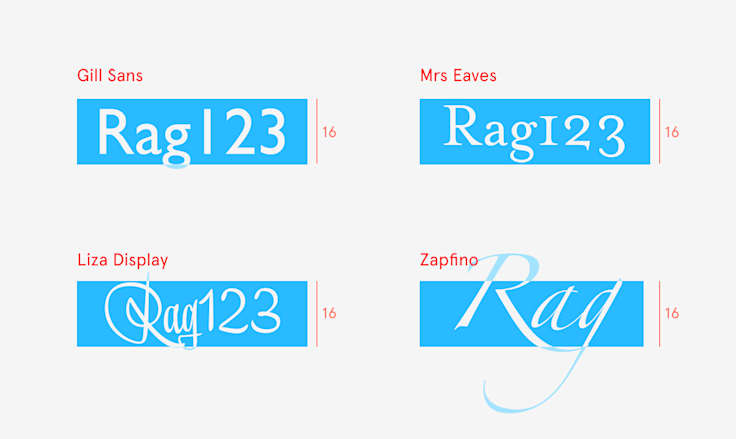
You needed to buy one or more such blocks for each letter. You also needed to buy additional metal blocks for different sizes of text. But font size wasn’t defined as the size of the letters — it was the height of the metal block holding them, expressed in a unit known as point (each point was a 1/72 of an inch, or about 0.4mm). The block height was known, but within it, the type designer could do whatever they wanted: Fonts of the same size could be bigger or smaller, their baseline (the line each letter “sits” on) placed higher or lower, and so on.
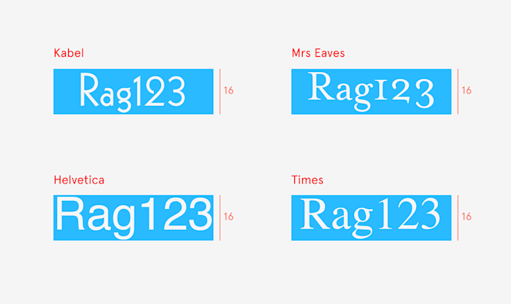
When the typeface was finished and the fonts made, the type foundry that employed the designer would sell them to printing shops. Those, in turn, would employ typesetters, whose job was to lay out the metal blocks into words, then sentences, then paragraphs, then pages.
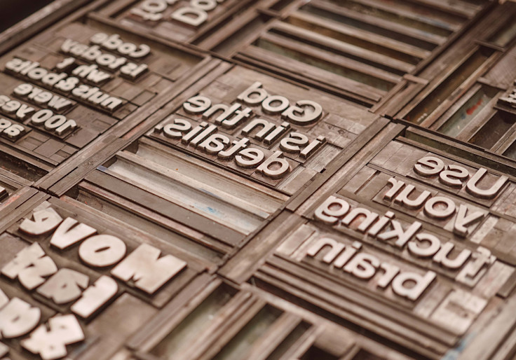
Typesetters could put lines of blocks immediately one after another, in a process called setting type solid, since it resulted in solid, unspaced blocks of lead. Usually, however, they inserted extra narrow strips of metal to space things out, let text breathe, and make it easier for the reader’s eyes to jump from one line to another.
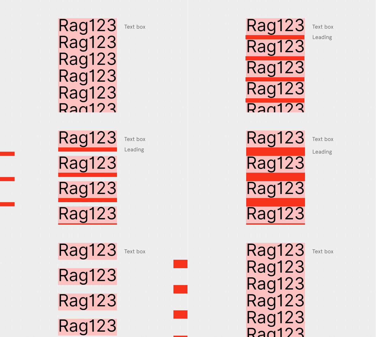
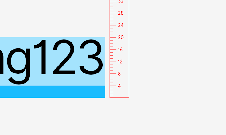
Since the spacing strips were made of lead, the practice of adding that space was called leading (pronounced “ledding”). Here is an example of a 16-point type with 4-point leading, which gives us text with a combined line height of 20pt.
Finding the right amount of leading was its own art. It needed to be different depending on the font sizes and lengths of lines. Even dealing with the same font size and identical amount of leading could make one font look cramped and another floating in space.
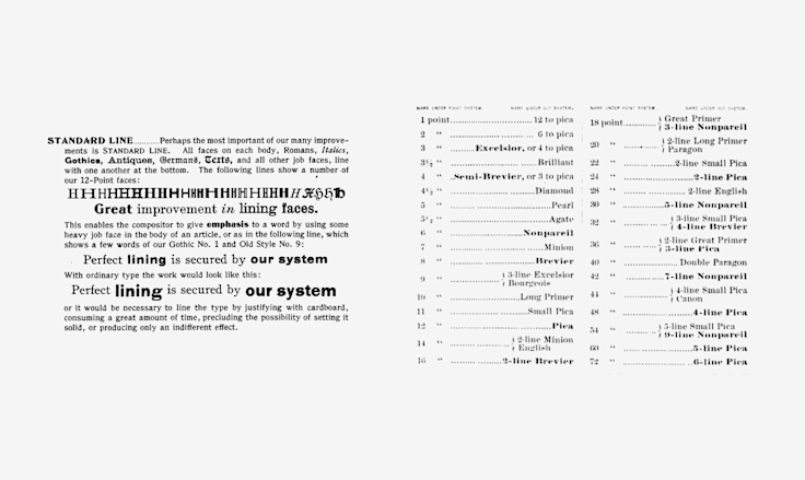
It was a relatively simple system, with clearly defined roles and rules. The font came from the type foundry as a monolithic, unchangeable block, and line height could only be added, never removed. Yes, you could order a font with an unusual line height built in, but that was uncommon. (Any such font came with a discouraging name — “bastard type”.) Your job was to lay things down and space them to your heart’s content.
Then computers ruined it all. As we transitioned from paper and metal to screens and software, typography inherited everything that computers have to offer — including bugs, incompatibilities, and updates.
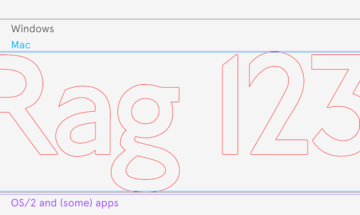
Fonts were no longer solid blocks of lead; instead, they arrived as collections of numbers packed into files. A type designer or type foundry also had to prepare their fonts in different file formats, subject to the requirements of early graphical platforms — Windows, Macintosh, and now-forgotten OS/2. (Plus, the platform’s rendering of fonts was sometimes quirky or buggy, and type foundries had to adjust for that, too.)
Not everything was horrible, of course. Computers gave both type designers and typesetters unprecedented amounts of freedom. Pixels were subject to few of the restrictions of the metal universe — things could overlap at will, or stick out of their once-rigid boxes. As a typesetter, you could add as much leading as you needed without requiring any actual lead. Alternatively, you could remove said leading. Even all of it, if you so desired.
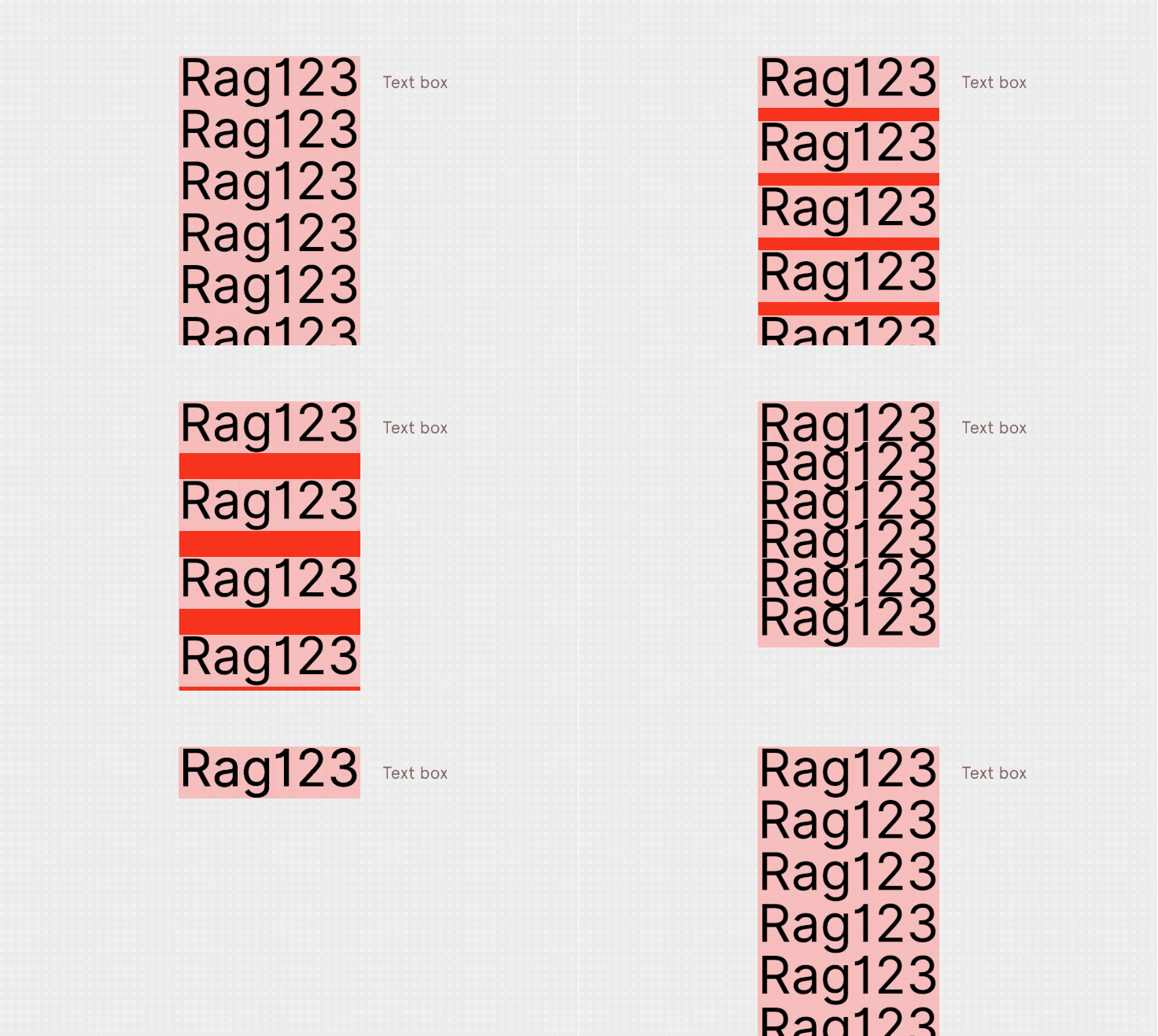
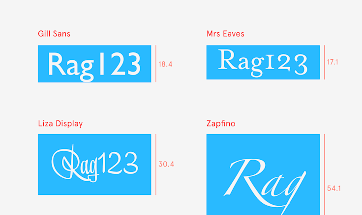
In the physical world, a box needed to have actual minimal dimensions, since leading could only be added. But in digital type, the default line height of a font could be set to a completely arbitrary number – and it often became taller than font size and more comfortable to read (as opposed to setting things solid, which usually felt too tight).
But getting used to the newfound freedoms took some time. Early graphic programs like Photoshop or QuarkXPress were still used to design for paper, where you had absolute control over fonts, and could measure and position everything with a lot of precision. As a result, they followed the same principles and the same vocabulary as print typography. A designer using Photoshop, for example, would still specify a 16-point type and then add 4 points of leading to it.
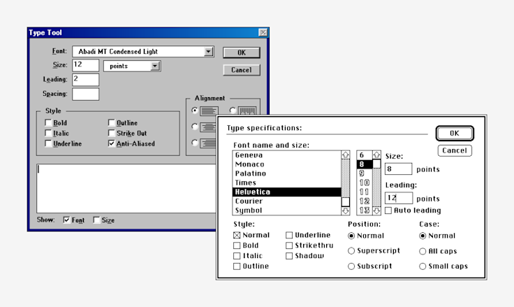
Other programs did it slightly differently. Sometimes, instead of leading, they would ask you for line height (in this case 20 points). Or, you could instead say, “I want a line height of 100%”, and this would mean the font’s default line height as specified by the digital font designer — which could be 16 points, 20 points, or any other value.
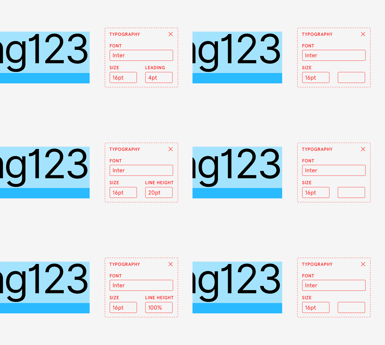
Things evolved from there. As computer screens spread, they became a destination rather than a stopgap. More work was designed for screens themselves, and different needs arose. Particularly in user interface design, it became much more important to carefully center text vertically next to an icon, or an avatar — an issue that wasn’t as crucial in the world of print.
At the same time, some of the old traditions disappeared. Fonts and line heights started to be expressed more often in pixels, rather than points. Following the disappearance of lead, the word "leading" was slowly replaced with the more abstract term "line spacing." (Thankfully, no one thought of “pixelling” or “electroning.”)
All the competing font standards converged, too. The industry invented OpenType, the one unified type of font that could work everywhere. It was a bit of an illusion, though — inside the font file, there would still be three different sets of values, and different platforms and programs would only pick one of these sets.
Then in 1989, the web was born — and the challenges compounded.
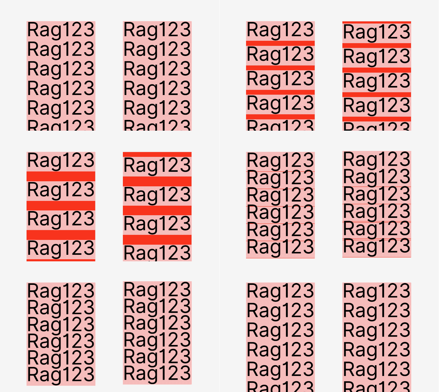
People putting together the building blocks of the early web made two decisions that changed the nature of line height. First, they distributed the extra space that was once a strip of lead both above and below each line. They nicknamed the new system “half-leading.”
I reached out to the creators of CSS to understand the rationale behind the change. They explained to me that while early proposals for web style sheets matched the print universe, they had good reasons for deciding to go with half-leading. Namely, web’s text boxes had more responsibilities.
In the world of print or early programs, a text box only needed to hold the text inside it. The web asked it to do more. “I was aware half-leading wasn’t a traditional typographic concept,” mentioned Bert Bos, who worked on CSS1 in 1995 and 1996. "But the problem I had with adding leading only below the lines was what happened to a paragraph when you put a background behind it or a border around it.”
If leading appeared only at the bottom of such a box, that box would feel bottom-heavy and would require additional work to look good. Half-leading offered a way out of this new problem.
The other change CSS introduced? The 100% line height was redefined as “100% of font size.” Before, a font designer might have given a 16-pixel font a default line height of 20 pixels. But on the web, 100% line height of a 16-pixel font came to be exactly 16 pixels, regardless of what the original designer dictated.
The reason for that change was simple: knowing the default line height of a font required loading that font, which could be really slow on the early internet. Multiplying line height by font size, on the other hand, could be done immediately. “We wanted to do as many calculations as possible without having to load the font,” mentioned Håkon Wium Lie, co-creator of CSS. Line height no longer understood the font inside — luckily, the fonts weren’t required to fit within physical boxes, so that wasn’t that big of a problem.
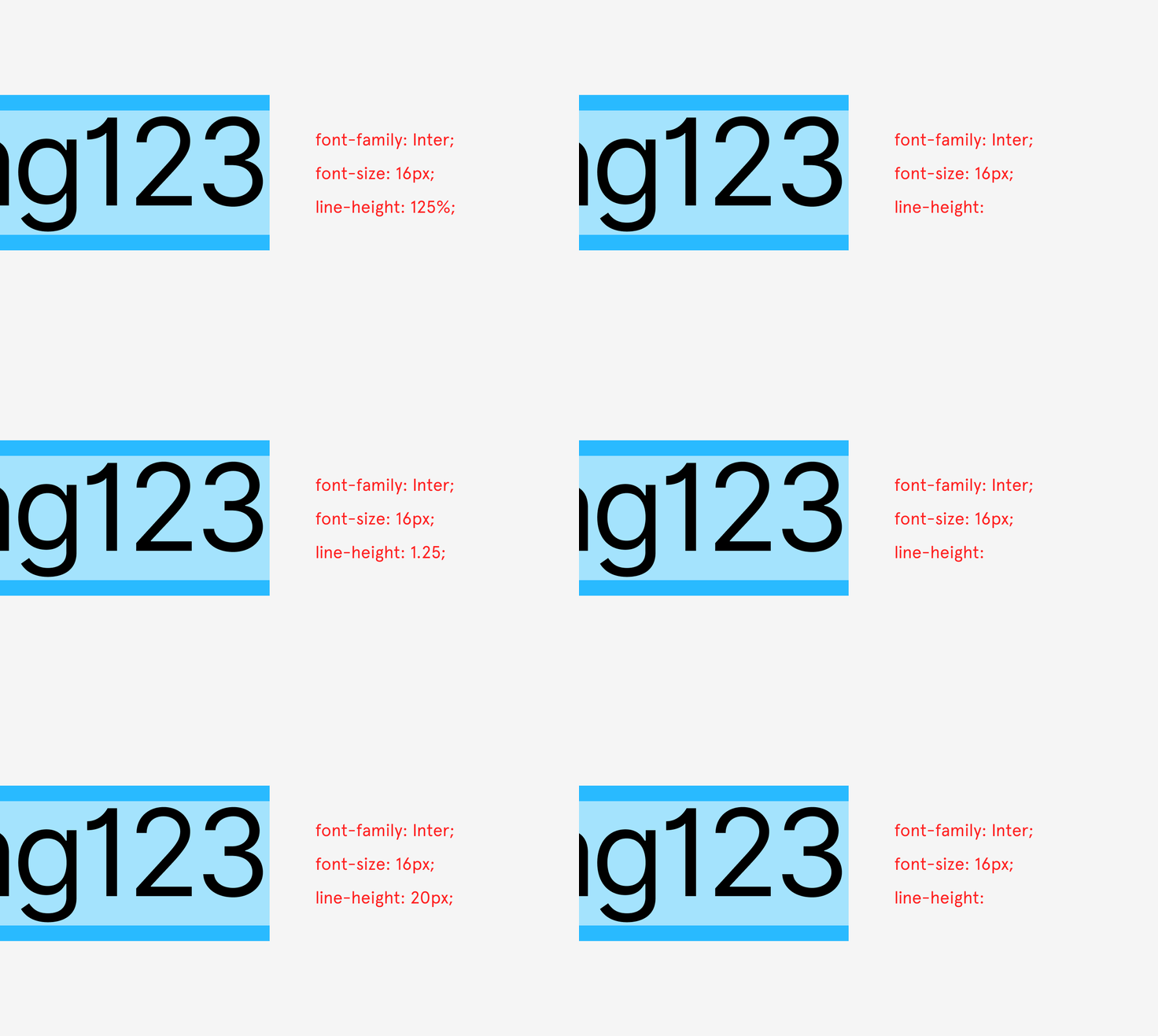
And so, the same font as before would have a size of 16 pixels — but a line height of 20 pixels would now be expressed as 125% or 1.25, since 16×1.25 gives exactly 20. (The traditional 100% was preserved in one specific instance, as line-height: normal.)
Web also took away some of the control from typesetters. What in the print era were absolute rules, now became suggestions. Positioning the text box exactly where you wanted it to be not only became harder — it was often discouraged. Web browsers, after all, could be found on vastly different computers, each one with a different screen and a different set of installed fonts.
Browsers, like platforms before them, now had to take some of the responsibilities for type rendering and typesetting — but, as you can imagine, they also came with their own sets of bugs and idiosyncrasies. Each one did things slightly differently: be it alignment, rounding pixels up or down, or interpreting the various incantations of CSS.
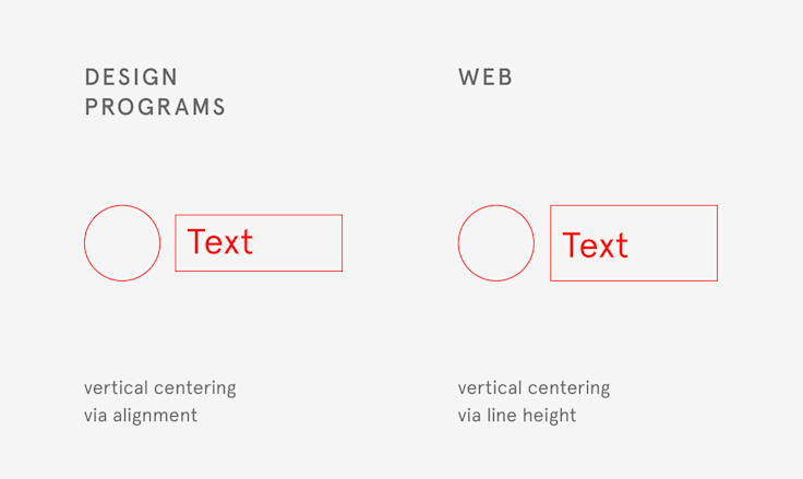
The history of web design can be seen as a set of tensions between designers wanting things to be positioned with utmost precision, and the web pushing back on some of that control. One of the unexpected casualties of that push and pull was line height. The early web didn’t allow for easy vertical centering of text — cue literal decades of jokes about aligning a text to an icon next to it being the hardest problem in computer science — but line height provided a quick workaround for a situation much more common in user interface design than in the world of print.
In a few short decades, Tim Berners-Lee’s invention grew beyond anyone’s imagination. But the web didn’t take over the entire world. Desktop applications evolved into native iOS and Android apps — and under the hood, they continued to look at fonts from the perspective of print.
Now on everyone’s computer, there were apps and websites — and both groups looked at fonts slightly differently. It was hard to say which approach was more proper than the others, but it was easy to notice that they weren’t compatible.
Still-young digital typography quickly amassed quirks and baggage, too. There is a joke in the keyboard world — why is this key in this particular weird place on a keyboard? Because it was there on the keyboard before it. The same holds true for typography.
Platforms and browsers started adding hacks and exceptions to make things look like they did on previous popular platforms and browsers, and type designers compensated for rendering quirks by moving things around. Most importantly: people developed different expectations depending on where they first started interacting with typography.
The end result? There was no longer one way to think of type.
This world, with all its line height baggage, isn’t the one we perhaps would’ve chosen to inherit when launching Figma ;·). We didn’t, however, have a choice. And, on top of all the previously mentioned challenges, Figma came with its own unique set:
- people use Figma to design on different platforms
- people use Figma to design for different platforms
- people do all these things while working together (using multiplayer)
- Figma exists in a larger ecosystem and needs to understand and respect it
There is no longer one way to think of type…and yet Figma needs to think of type one way. We couldn’t render things differently on different platforms, because that would cause trouble for people collaborating on one file. We wanted to support designing for iOS devices in your Chromebook web browser, or Android apps on your Mac, but we didn’t want a set of toggles to make Figma’s type UI feel like one platform or the other. We needed to create a convenient, powerful UI – but also understand that often the end result of work in Figma lives elsewhere as CSS, or native source code.
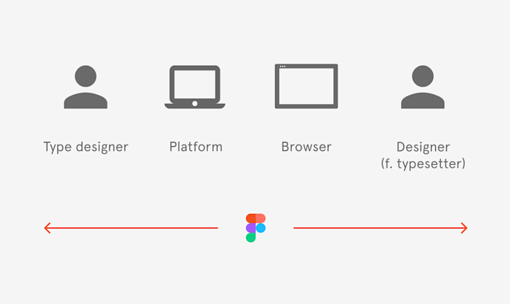
Figma originally borrowed from the world of print: line spacing was added below and “100%” meant “font’s default line height.” Over time, however, it became increasingly obvious that this is less and less how people think of or use type. Instead, most expect fonts to behave like the web; our approach to fonts caused trouble in the handoff between design and engineering, and even in designing itself.
We heard from a lot of you that Figma’s approach to text was confusing, so we looked at it more carefully. We observed how people used Figma to design visuals and UIs for all sorts of platforms. We built tools to help ourselves understand how different platforms use text. We dug into the history of where different line height and typography interpretations came from.
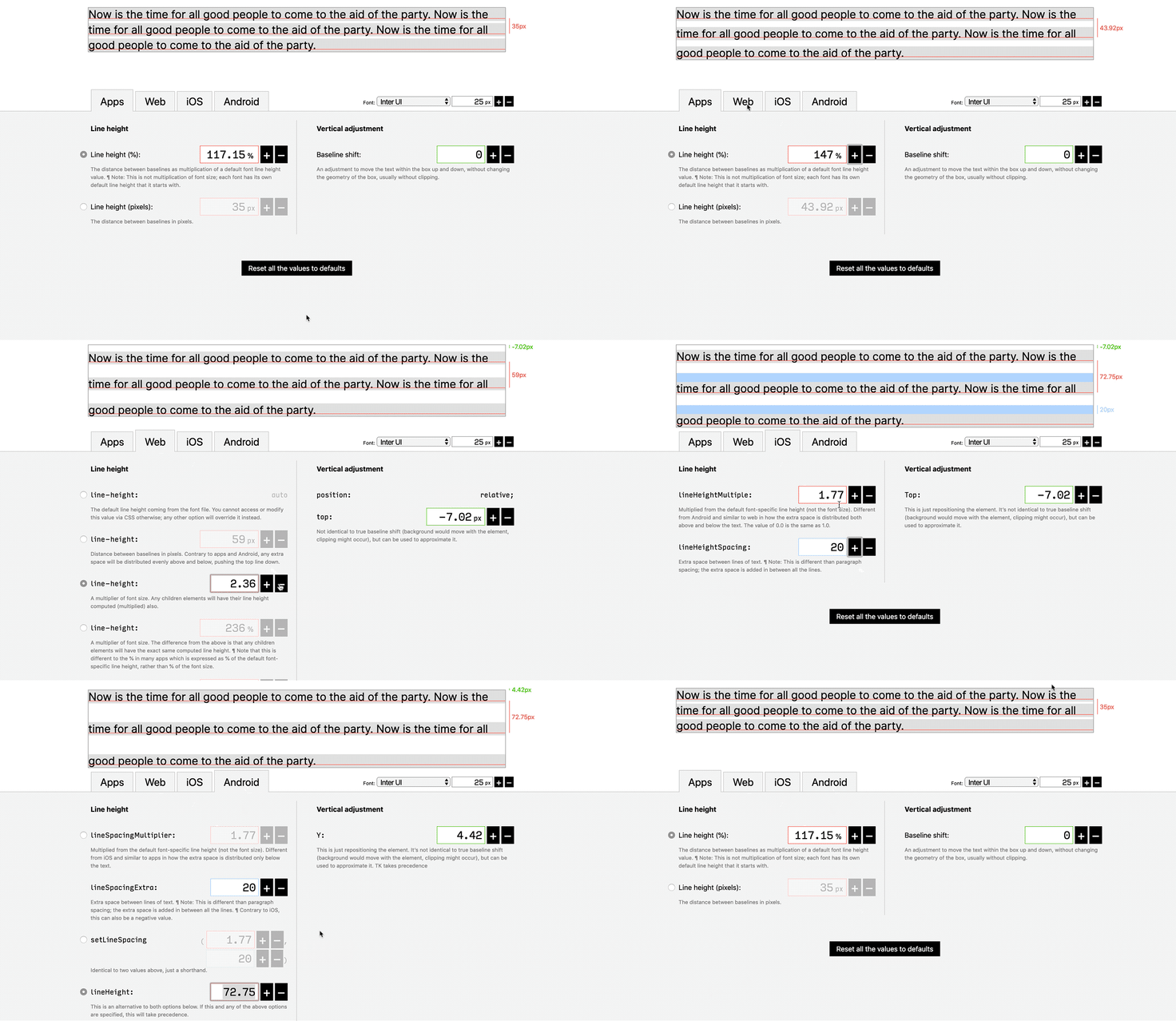
And we went through a lot of seedy alleys of typography, places I wouldn’t want you to ever encounter: rogue fonts, ridiculously tall text cursors, selections that overlapped or refused to.
After all the research and conversations, we settled on a particular set of changes to how line height is treated inside Figma. It’s a solution we hope will meet more of your needs and use cases, while not causing any trouble for the less popular ones.
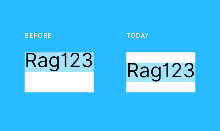
1. Line height distribution
In text boxes, Figma will now distribute line height just like web does. This should help most people with most tasks — not just designing for the web.
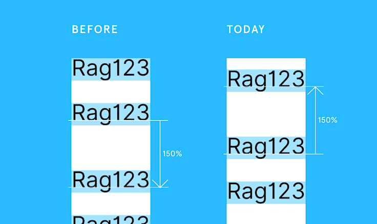
2. Treatment of subsequent lines
Every subsequent line will have its leading added above, though. This is different than CSS where the leading would be split above and below, and different than Figma’s prior behavior of putting all the leading below; we believe it’s easier to control text if the extra leading goes in one place, as people often use line height to space lines of text apart.
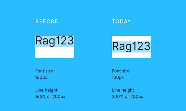
3. Font size percentage
Line height 100% now means “100% of font size” rather than “100% of font’s default line height.” This should make calculations easier, and remain in sync with how most people think of this value.
Text boxes also start with automatic line height. When you switch between the fonts, we will adjust the line height to match the font’s default line height. That will make it easier to explore different fonts and have the text feel great either way. We won’t do this, of course, if you specify line height in pixels or as percents.
4. Line heights in pixels
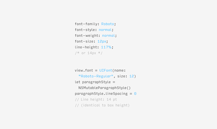
Speaking of pixels…from now on, whenever you say “I want my line height to be 20 pixels,” we will be more forceful in respecting that — even when the web wouldn’t be (line-height in CSS is really min-line-height). We watched people use specific line height values for aligning things, and we want to respect that.
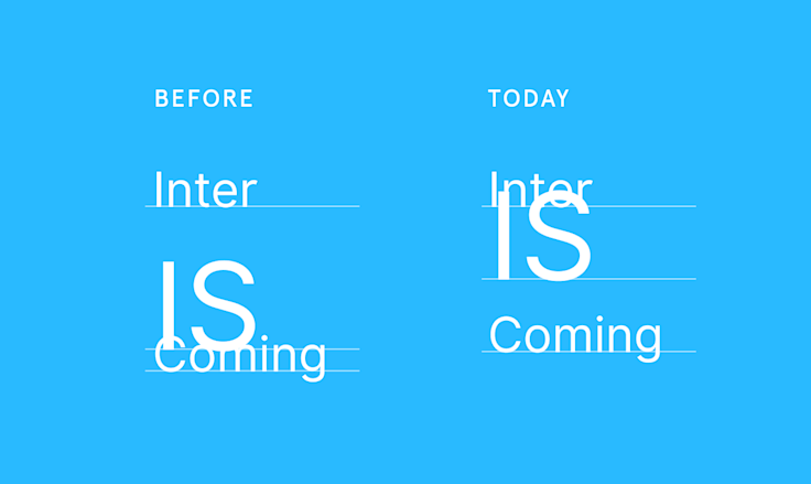
5. 🤗❤️✏️
We’ve also observed people (and ourselves) getting annoyed when inserting emoji stretches the line height and destroys the rhythm of text. Now, if you sprinkle your text with emoji, we’ll no longer expand the line box.
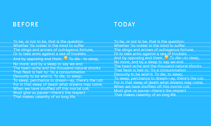
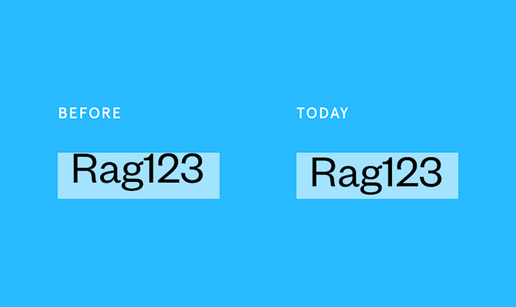
6. Font measurements
Previously, we interpreted font files according to one method. We learned that this method meant some fonts were drawn a little bit higher than people expected. This is now fixed.
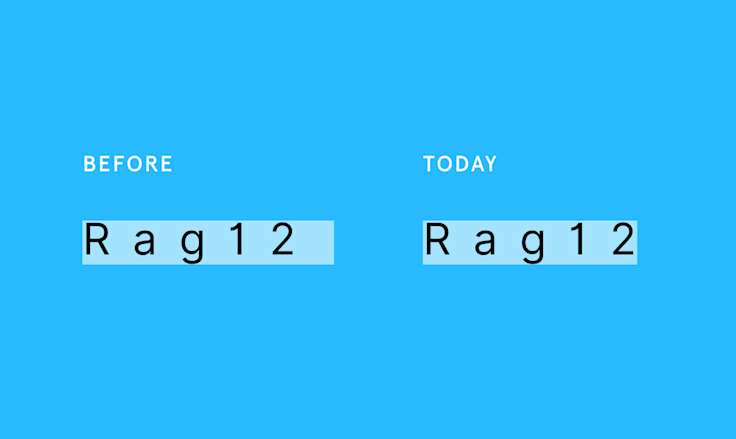
7. Letter spacing
And, while we’re at it, if the last letter on a line has extra letter spacing, Figma will now ignore it. This is different than web/CSS, but it should make it much easier to center text.
There is no one right way to look at fonts, but we believe this is a better way than before. It should solve more actual problems than our previous approach, and — as far as we know — shouldn’t make anything harder. In the Code panel, we now also output more information that should help the transition between design and engineering.
There are some things we cannot solve — a type designer can choose to put their font very tall in its box, for example, and we should respect their wishes. To make things more complicated, it’s hard to even agree what vertical text alignment really is. The world of type happens to be the world where things often feel right even when the measurements don’t quite add up. Any of the examples below could be considered vertically aligned — and it’s up to a designer, not Figma, to make those decisions.
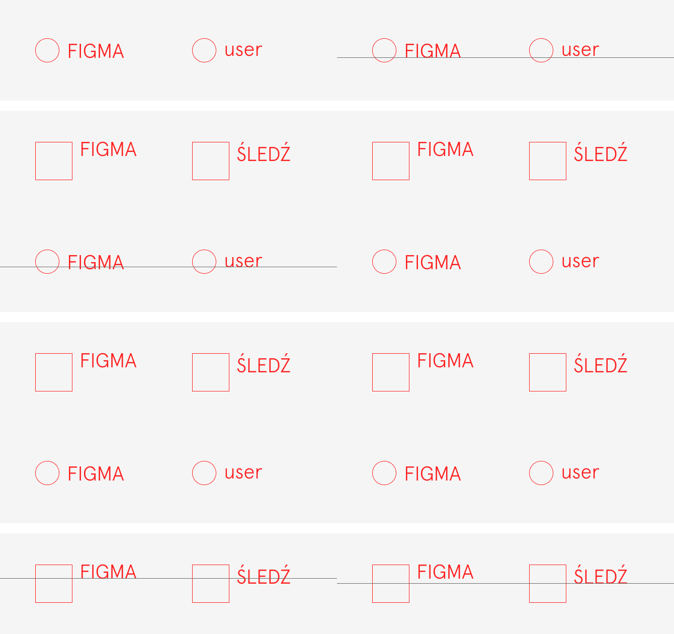
But overall, we hope that Figma will do the right thing more often than before and allow you to make decisions more quickly as a designer (and understand those decisions better as an engineer). I don’t think people should have to be aware of the seven nuances I just listed. The goal is for Figma’s type rendering to just work.
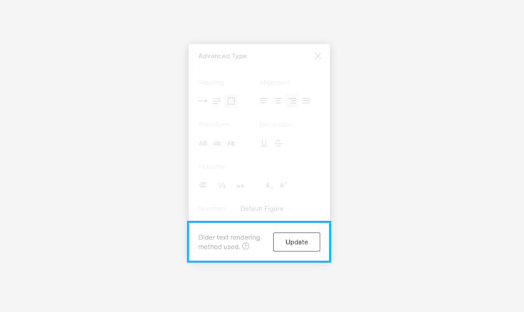
We also want to be respectful of the many designs you might have already made in Figma. You will only get any of the above updates to text rendering if you create a new text box — but we won’t automatically upgrade any of your previous text boxes, because that could shift things up and down.
You can update your previous text boxes at your own pace (either one by one, or by selecting all items on your canvas, and doing it en masse), and any of the changes will be reversible.
All of the above might seem like a world of pain, and it wasn’t an easy problem to navigate. I joined Figma's design team recently to work on typesetting and this was one of the projects I started with. I learned a lot about laying out text, and I’m pretty sure I barely scratched the surface of all there is to know.
There is a saying in urban design: “If you can understand a city, that city is dead." How people live and organize their buildings and lives evolves in all sorts of unpredictable ways. It’s easy to see that as messy or annoying, but one can also see it as beautiful and very human. I often look at typography that way, too, as a thing of infinite complexity, rich in history and meaning. I’m in awe of it all, and it feels like a privilege to be part of that journey.
We’ll keep working on Figma’s type and improving it, and I hope you'll continue to help us in doing so — just @ us on Twitter or write to us at type@figma.com.
We’ll also have more exciting font news to announce soon. I can barely wait.
from Hacker News https://ift.tt/2Qe1oSZ
No comments:
Post a Comment
Note: Only a member of this blog may post a comment.